“This isn’t my first rodeo.” —Guy at his second rodeo
A pioneering Italian polymath once wrote, “I think that tastes, odors, colors, and so on are no more than mere names so far as the object in which we locate them are concerned, and that they reside in consciousness. Hence if the living creature were removed, all these qualities would be wiped away and annihilated.”
The author of this eloquent bit of insight is none other than Galileo Galilei–and the quote is from his 1623 book, The Assayer. At the time this was written, the concept (that some perceived aspects of the environment exist only as subjective psychophysical qualities, as opposed to objective, physical properties) was not new. In fact, great minds of the past like Democritus and Aristotle debated such aspects of nature and reality nearly 2000 before Galileo. However, I thought it quite fitting to quote from The Assayer as the publication is a milestone in the history of science. It is in this text that Galileo describes the scientific method, which was quite a revolution at the time, given the prevalence of scholasticism, which, instead of relying on the observation of nature to make assumptions, relied heavily on ipse dixit (assertion without proof; or a dogmatic expression of opinion.) As such, it should be no surprise that Galileo’s statement above has been supported by the fruits of the hard sciences for nearly 400 years since the publication. Nevertheless, some continue to argue quite passionately, often from mere intuition, that qualities like color are indeed a property of the environment. I encountered one such argument regarding the nature of color this Summer and I felt it would make for an interesting paper. You see, the most fascinating aspect of the argument for me was not the all-too-common dogmatic reliance on intuition—but the “proof” that the individual put forward to substantiate it.
He stated that color MUST be a physical property of the environment “because a camera can record it.”
Now, to individuals unfamiliar with the fundamentals of color vision and color photography, the argument can seem to have some teeth. However, like an intuitive argument for a flat-earth, it quickly deteriorates with an increase in scientific literacy and critical thinking.
Now before I tackle this color/camera argument specifically, I would like to address how the argument represents a larger issue that continues to plague/diminish much public discourse–the equating of intuition or “common sense” with empirical fact and/or relevant expertise (something akin to what The Assayer was written in contrast to.) And although I have addressed this issue in a previous article–I feel a quick review would not be out of line.
All of us use some amount of what we could consider intuition or common sense to navigate new activities or ideas. What we need to be aware of is that common sense, generally speaking, is a vague notion of obviousness that emerges from certain cognitive heuristics (or mental shortcuts.) Two such shortcuts are known as the availability heuristic and the representativeness heuristic. While both of these can be VERY useful for us in many cases—they can both be highly problematic when exploring unfamiliar terrain. The availability heuristic can be defined as our tendency to make a decision via the ease with which a particular idea can be brought to mind. For example, people overestimate their likelihood of dying in a dramatic event such as a tornado or terrorism as such events are usually more highly publicized and therefore have a higher availability. The representativeness heuristic, on the other hand, can be defined as our tendency to make decisions based on how similar an example is to something else (or how typical or representative the particular case in question is). In this way, representativeness is basically stereotyping. While availability has more to do with memory of specific instances, representativeness has more to do with memory of a prototype, stereotype or average. Again, while these cognitive tools can be very helpful in many contexts–they can often lead to erroneous conclusions like the correlation-as-causation issues that I often introduce in my writings on pictorial composition.
Something that I had to come to terms with early on in my studies was that much of science is unfortunately counterintuitive. Neurobiology and neurophysiology were a tour through the backward, the upside-down, and the ridiculously absurd. But—that’s the way it is–and the experience of navigating that landscape truly liberated me from holding onto dogmatic ideas that were rooted in “intuition.”
With that said, let’s return to the notion that color is a property of the environment.
We will first need a basic definition of color. Color can be defined as a set of visual experiences that can be described by the attributes of hue, value (lightness/brightness), and chroma (saturation.) The experience of color is primarily associated with the experience of neural activity that arises when our visual system encounters a specific range of electromagnetic radiation in the environment (visible light.) Color vision, therefore, is the ability to make discriminations based on the wavelength composition of light.
It would also be useful to address the terms “sensation” and “perception.” These terms are often used synonymously–but they indeed describe two different aspects of what we normally understand as “sensory experiences.” Sensation describes a low-level process during which particular receptor cells respond to particular stimuli. At the level of sensation, our sensory organs are engaging in what is known as transduction, or the conversion of energy from the environment into a form of energy that our nervous system can use to yield successful behavior within that environment.
Perception, on the other hand, can be simply defined as the assignment of “meaning” to a sensation.
So what is actually happening when we visually encounter what we might understand as a “blue” sphere?
Putting aside scenarios in which the sphere may be an actual source of light, the likely scenario is that the surface of the sphere is absorbing all of the available wavelengths of the visible spectrum except for some that are relatively short. Now the standard observer (human in this case) has a specific species of receptor cell (photoreceptor) in the retina that is “tuned” for such short wavelengths. What that means is that when this particular cell type encounters this type of wavelength, it responds by initiating a complex cascade of electrochemical events that will eventually lead to more and more complex processes along a particular route we call the “visual pathway”. This low-level cascade initiation is what we could define as a sensation. The cascade of events initiated in the retina will eventually lead to specific activity in other, “higher”, or more complex processing regions of the brain such as, but not limited to, the lateral geniculate nucleus of the thalamus (LGN), the striate and extrastriate cortex of the occipital lobe, and the temporal lobe. It is through the aggregate activity of these brain regions that we find a perceptual response–in our case here–”blue.”
So as you might already be starting to suspect, the sphere itself is not physically blue, the wavelengths reflected off of the sphere’s surface are not physically blue, nor do the cells referenced above “sense” blue. Blue is not a sensation–rather, it is a perception. We assign “blue” to a particular sensation that is a reflexive response to a certain wavelength.
But color must exist outside of our brain because a photograph can capture it!
Ok, so let’s finally deal with this intuitive, but highly problematic, argument.
So that we all remain on the same page, we will define color photography as a type of photography that uses media capable of reproducing a percept of color.
In color photography, electronic sensors or light-sensitive chemicals respond to specific aspects of electromagnetic radiation of at the time of exposure. The recorded information is then used to reproduce the original colors by mixing various proportions of specific light wavelengths (“additive color”, used for video displays, digital projectors and some historical photographic processes), or by using dyes or pigments to remove various proportions of the particular wavelengths in white light (“subtractive color”, used for prints on paper and transparencies on film).
So how does the camera record this information if it cannot detect color?
To answer that we should look to the earliest attempts to create a color photograph. Early efforts in the 1840s gravitated to finding a “chameleon substance” which would assume the wavelengths of the specific light falling on it. Even though some early results proved encouraging in this search, this avenue initially proved to be rather problematic.
A significant advancement in this quest for color came in 1861 with the Scottish physicist, James Clerk Maxwell. With a concept he first introduced in his paper on color vision in 1855, Maxwell developed an additive color process to produce positive images, using three glass plate negatives exposed through water filters that allowed only certain wavelengths to pass through. From these negatives, positives were made and projected on top of each other through the same wavelength filtration, thus producing what we would perceive as a color image. While this was indeed successful, the procedure was quite complex, and the viewing method is not terribly ideal.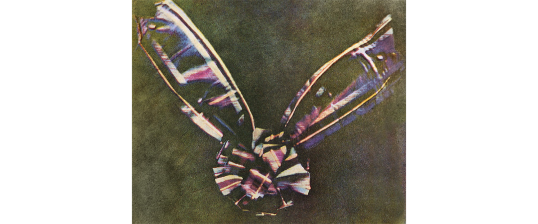 SHOWN: Tartan Ribbon, photograph taken by James Clerk Maxwell in 1861. Considered the first durable color photographic image, and the very first made by the three-color method Maxwell first suggested in 1855. Maxwell had the photographer Thomas Sutton photograph a tartan ribbon three times, each time with a different wavelength filter over the lens. The three photographs were developed, printed on glass, then projected onto a screen with three different projectors, each equipped with the same wavelength filter used to photograph it. When superimposed on the screen, the three images elicited a percept of a full-color image. Maxwell’s three-color approach underlies nearly all forms of color photography, whether film-based, analog video, or digital. The three photographic plates now reside in a small museum at 14 India Street, Edinburgh, the house where Maxwell was born.
A few years later, a French physicist and inventor, Louis Ducos du Hauron, announced a subtractive color process to produce color prints, using three glass plate negatives exposed through specific wavelength filters. From these negatives, “color positives” were made by applying complementary dyes.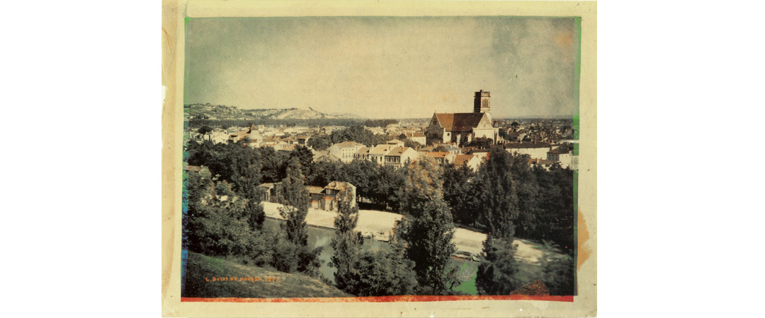 SHOWN: An early three-color print by Louis Ducros Du Hauron, 1877.
Later in 1903, France’s Lumière brothers would give rise to yet another additive process that would use, of all things, potato starch. The Autochrome Lumière process would use millions of grains of dyed starch in glass plate film emulsion to filter certain wavelengths of light. Potato grains were used primarily for their ability to take on colors quite easily (as opposed to rice grains which proved less successful.) The process was marketed by 1907 and is still considered by many to be the first commercial success for color photography. Although there were many other early attempts to produce color photographs, the autochrome remained the preferred method for creating color images until the 1930s when it was replaced by other techniques such as Kodachrome and Agfacolor.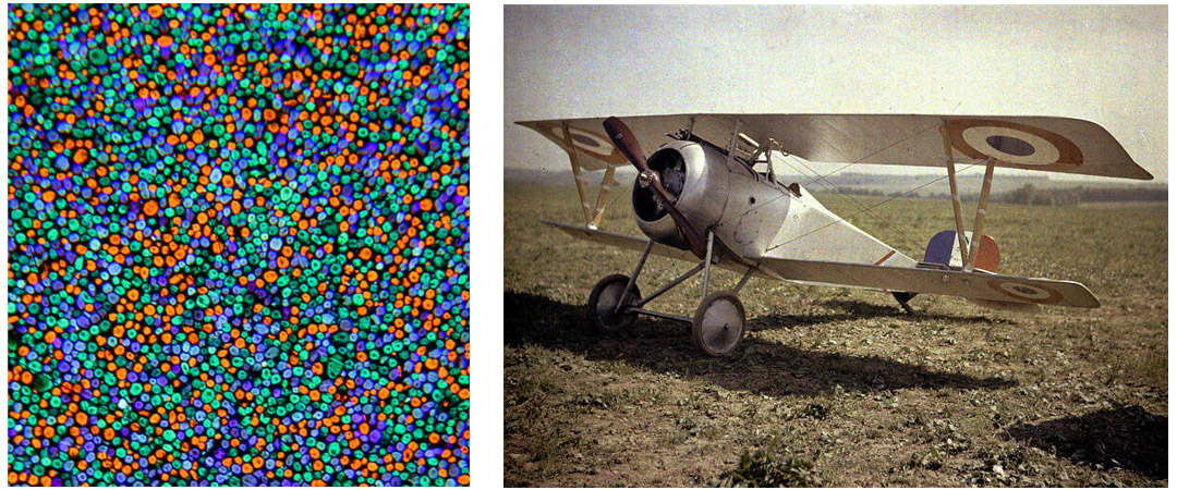 SHOWN: Left: A microphoto of an autochrome plate showing the colored starch grains. Right: An Autochrome of a World War I Nieuport biplane fighter, circa 1917.
Here is a link to a short video from the Smithsonian Magazine outlining the history of color photography: http://www.smithsonianmag.com/videos/category/history/the-history-of-color-photography/
For a complete timeline on color photography, you can visit: https://www.bu.edu/prc/GODOWSKY/timeline.htm
So hopefully you can now see (pardon the pun), that the idea that a camera can record or capture color is an intuitive misrepresentation of the processes of color photography. Rather, the process uses specific materials that react with exposure to, and/or manipulate, the specific wavelengths of electromagnetic radiation that would also give rise to our perceptions of color. The record of those reactions is then used to recreate, through the use of filtered light or colorants, a specific stimulus pattern that would give rise to a color percept when observed.
I am also hopeful that this short essay will help not only to address the intuitive misconceptions that serve as the foundation for the color/camera argument–but will also effectively correct some of the intuitive misconceptions that we hold about the nature of color in general. As you all continue to research and develop your craft, don’t be too quick to reject what you may find to be initially counter-intuitive. Remember that we have evolved to look for “shortcuts” in many endeavors that might ease our cognitive workload–thus improving our chances for successful behavior. We don’t always invest the effort into uncovering what is true–often rather opting to uncover what can be useful in the here and now. However, as science continues to show us, the roads to greater insight are often not short.
Happy Painting!



Thank you for another great article!
My pleasure Christopher! I’m glad to know that you enjoyed it— <3
Great article Anthony! I could get more insights from this article 🙂
Thank you!
Thank you! Glad to learn that you enjoyed it. 🙂
A lot of very smart thinking.
Thank you Walt. 🙂
Another problem with the human perception of color vs the physics of wavelength stems from the mistaken idea that the isolated mono wavelengths of spectral light are directly the cause of the human experience of color. Some people see Newtons prism and mistake the spectral separation as the foundation. It helps to clarify the range of human visision. But the reality is that each spectral stimuli happens to fall within a range of stimuli we perceive as any given hue, saturation or luminance. People see the spectral hue of red and think that is The RED. In reality the are a multititude of mixed stimuli that all yield a perception of a particular red. In fact most of our experienxe of color stems from mixed wavelength stimuli not spectral sources. We don’t even perceive color until the data has been manipulated. A simple mnemonic device is to remember that color is a pigment of our imagination.