It can seem like the cards are always stacked against the artist who is committed to communicating something in a very “realistic” fashion. Aside from the numerous factors and considerations that are somewhat obvious to the novice, less evident traps and procedural pitfalls await those that survive the early snares–daring to push onward.
One of the more insidious pitfalls that can plague both the novice as well as the seasoned observational representationalist is a failure to adequately consider the role of observational proximity. This issue is especially insidious in that it can pounce even when an artist has successfully communicated every measurement and observed proportion with great accuracy, mimicked each color and value relationship faithfully, and has essentially captured each and every relevant detail.
To understand how the concept of observational proximity can derail an otherwise successful observational representationalist effort, we will look to one of the early exercises found in both our Language of Drawing (LoD) and Language of Painting (LoP) programs–The Form Box.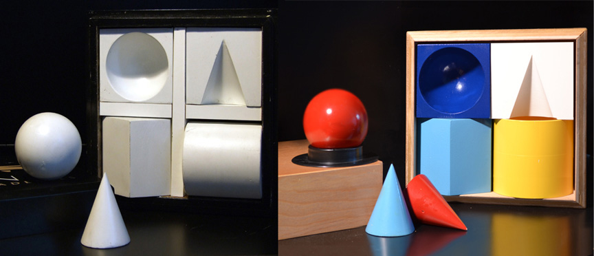 The Form Box contains several basic geometric solids, or ‘forms,’ that can be configured in a variety of ways so as to compare and contrast the way light describes each. At a certain point in our program, artists begin to draw from the Form Box and usher in their transition from conceptually two-dimensional reference sources (i.e., “drawing from the flat”), to conceptually three-dimensional reference sources (i.e., “drawing from nature”). I should mention that I use the word “conceptually” here as while the distal stimuli (objects themselves) cited are indeed different concerning spatial dimension–both sources are essentially two-dimensional to the observer at the level of the proximal stimuli (light patterns on the retina.)
It is during our Form Box exercise that our students begin to truly understand how working from nature can differ from working from a surrogate.
For example, changing an observer’s orientation to a natural subject will often produce far different changes in observed shape configuration as opposed to that of a surrogate. Here we can see how shifting the observer roughly 25 degrees to the right relative to nature (the Form Box) can result in a percept that will differ from the same change relative to a surrogate (photo of the Form Box).
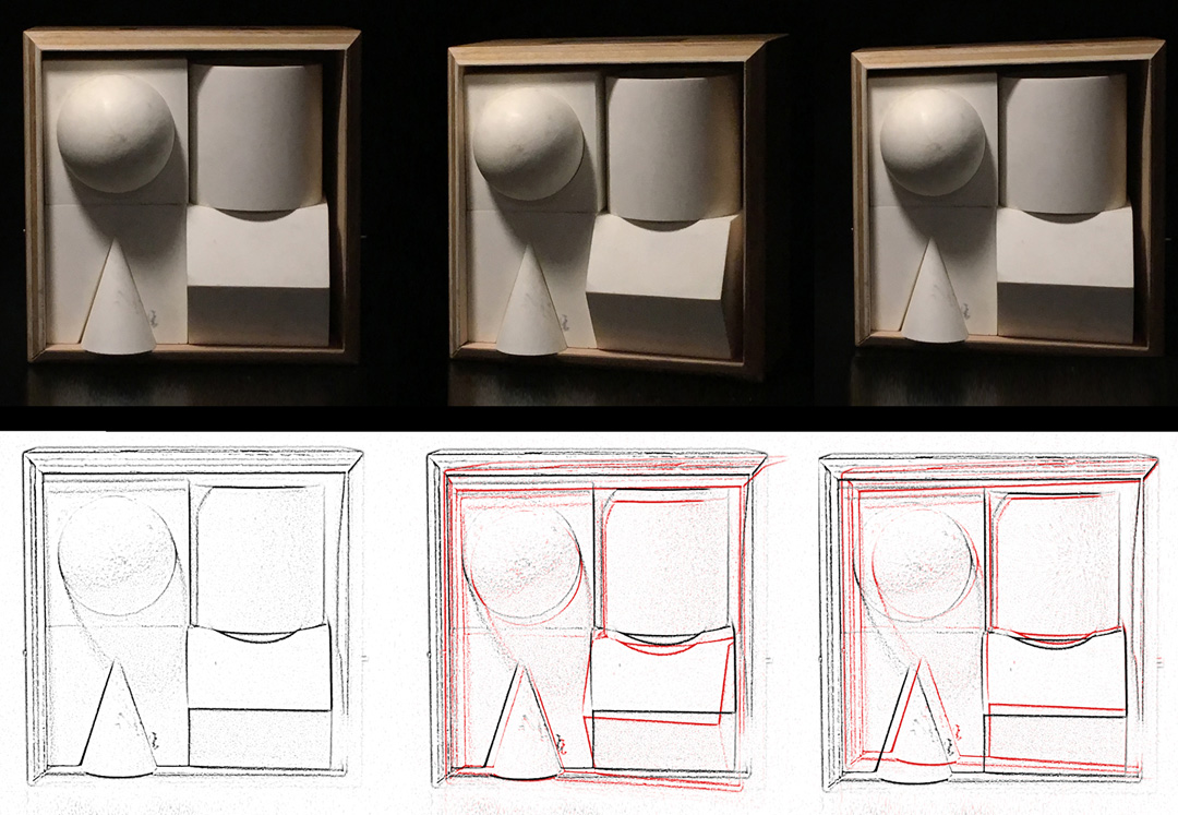
Shown left to right: Top Row: Straight View (nature), Right Shift (nature), Right Shift (surrogate). Bottom Row: Delineated Straight View (nature), Red Right Shift Overlaying Straight View (nature), Red Right Shift Overlaying Straight View (surrogate).
Now while both orientation changes indeed yield a significant change in line, shape, curvature, etc.—the later, (surrogate), often holds a significant advantage* in that it can be easily moved to eliminate (or at least, significantly reduce) such issues of shifting orientation (*an advantage that obviously comes at the expense of a change or loss of visual information that may be present in the original percept (nature.))
So how might exploring the Form Box exercise and this idea of perceptual changes due to shifting orientation be used to understand the impact of observational proximity?
Well let’s look first at how the Form Box exercise unfolds for a student:
The student begins by aligning the Form Box with a drawing or painting surface in such a way so as to ensure that visual comparisons are effective. (This is done in a manner similar to the Gradation Block* and Gradation Pattern* exercises which use model sheets as reference sources (*these exercises, occurring prior to the Form Box, would be our approximate equivalent of the “drawing from the flat” phase of some programs.)
Next, in an effort to “maximize” access to visual information, most students bring the Form Box as close as possible to the plane of the drawing/painting surface (although often this depth axis placement involves a slight rotation to maintain a “straight-on” view when standing or seated at the easel.)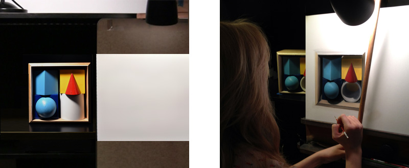 The student then proceeds to establish a general, but very accurate, survey and cartoon (relative to their orientation/perspective) which is then populated with carefully developed values/colors and gradations that yield highly effective perceptions of volume and depth.
However, when the artist begins to step back to view the developing representation, or the drawing/painting is viewed in a manner akin to gallery/museum display, (displayed at average “eye level” height (approx. 55-57 inches (average sightline height for a human being), at a viewing distance of least several feet), he or she may be shocked to find that the objects appear somewhat distorted, with curvatures/eccentricities seemingly exaggerated, and often with subjects appearing to “tip or fall forward.”
So what happened? The box had been carefully aligned with the drawing or painting surface, the student kept the subject close so as to maximize visual information, and each measurable line, angle, value and/or color was accurately recorded—so why would the overall representation exhibit these problems when the piece is viewed at an increased distance? And why do the objects look like they are falling out of the drawn box?
Again, observational proximity. It’s not the method of measurement or skill in mark-making here—rather, it is the artist’s proximity to the subject that can cause such visual miscommunication. It does seem quite reasonable to follow the logic that if we “get close”–we can see “more”—and can record “more”--and thus we create the potential for a “better” representation. Unfortunately, it is this idea that can distance us from our goal.
Now it should not follow, in any way, that it is somehow wrong to draw or paint from subjects at very close proximities–nor does it mean that close-proximity observation/study will produce a “bad” representation (whatever that means.) Rather it means that the lines, shapes, angles, and curvatures that are recorded at one proximity might not yield a percept that matches the lines, shapes, angles, and curvatures that one might expect in another.
In a very similar manner to the right-left axis shifting of the observer/artist that we examined earlier, here we can see another series of changes that can unfold from a change in proximity:
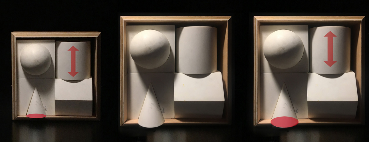
Here, in the image on the left, we see an image of the original nature model with graphics emphasizing the cylinder’s ellipses as well as the ellipse of the cone. Center: An image of the model created at a closer proximity. Right: An image of the model at close proximity with the graphics highlighting the disparities with those same attributes found in the far left image.
But still–if I measured everything “correctly” from a set perspective/orientation so that a consistent context is maintained, why does it still look “wrong” when I step back to look at it? And why does that darn cone look like it is falling out of the box?
Well, to answer those questions we will look at a very common visual demonstration that allows us to “see how we see.” It’s called “The Ponzo Illusion.”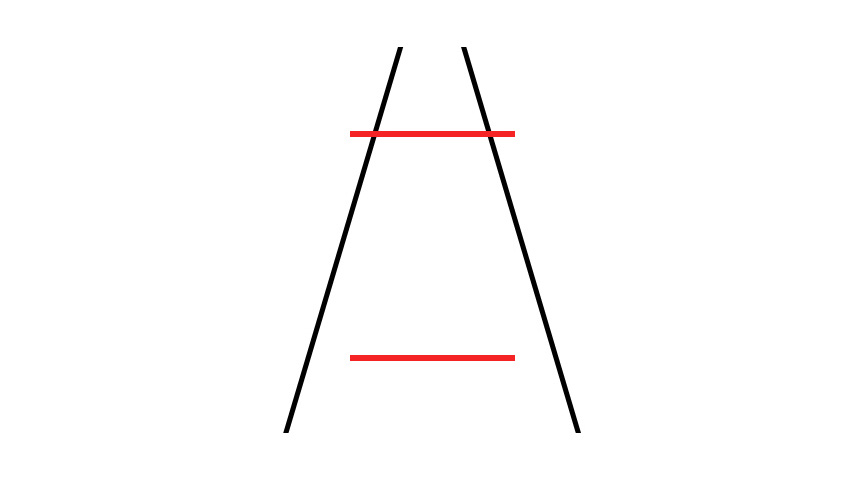 The seemingly simple line configuration presented by Italian psychologist Mario Ponzo in 1911 is an effective demonstration of how our visual perception works. The standard Ponzo illusion is configured so that a horizontal line or other figure that is nearer to the interior apex of two converging lines has a tendency to be perceived as greater in length or size as opposed to an identical line or other figure within the converging lines but more distant from the apex. If the standard Ponzo figure is interpreted as a distance or linear perspective cue abstract then an observer will interpret the “inducing lines” of the Ponzo configuration as parallel lines which are in fact converging into the distance in accordance with the effects of linear perspective. In this context, it would be appropriate to assume that two similar objects at different distances can provide equal-sized retinal images only if the more distant object is larger than, the nearer. The issue with our form box is that there is not enough contextual information to cement the proximity viewpoint. Most of the surrounding objects are of an orientation that could be relatively acceptable in both close and at more distant proximities. The truly significant changes in this particular case are those regions or facets that are highlighted. And when these larger changes are surrounded by more subtle or ambiguous, ones–well–they tend to look just plain wrong.
Here’s a natural scene that also explores the same issues introduced with the Ponzo illusion. Does the more “distant” flag look larger? It is actually the same size as the one that appears “nearer” to the observer in this context. For us to be able to perceive both flags as the same size in this context, we would have to shrink the more “distant” one considerably. This is due to the relationship between distance and perceived size: As the distance between an observer and an observable object is increased–the area that the object affects on the retina is decreased. When this is NOT the case, like in this image, we default to a percept that WOULD make sense via past experience—in this case; the perception that the distant flag is larger.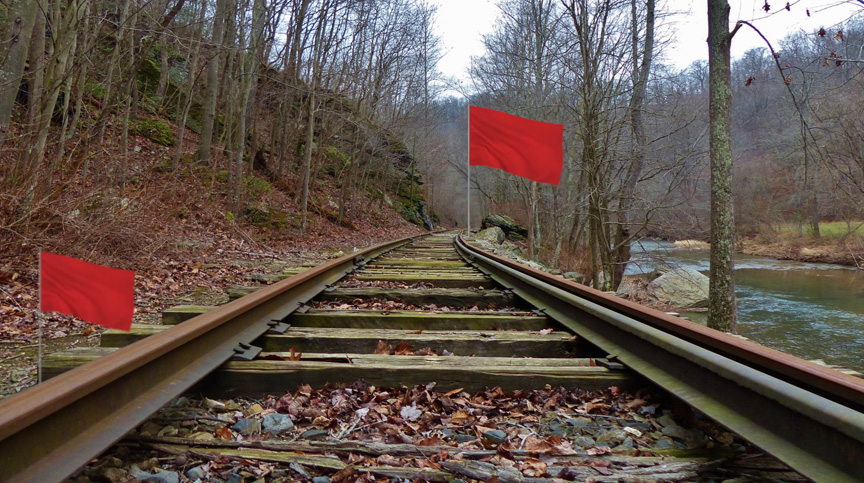 Essentially, this is what is happening with the Form Box representation described above. Our perception is shaped by past experience. We react to certain configurations of light on our retina with the reflexive responses that have evolved yield behavioral success. As observational representationalists, it is important to understand that when we perceive certain patterns, lines, shapes, curvatures and angles in one context that experience has linked to another–our perception reflexively pulls from past experience to elicit the most appropriate response (in this specific case, the meeting of different drawing/painting and viewing proximities transform a specific combination of curvatures, angles, and lines into a perception of forms that are structurally distorted or even tipping/falling forward.) In other words—the only way, as dictated by past experience, that we would see those configurations describing those forms at a viewing distance that is significantly GREATER than the proximity at which the representation was created would be due to structural deformation, or in the case of the cone—something tipping or falling forward.
Does this mean that I shouldn’t get closer than the distance I might expect the piece to be viewed at? What if I want a good amount of detail?
Working to include a great deal of detail is absolutely fine, but there are some important considerations that should be reviewed at the onset of a high-definition effort.
First, you should understand that “more” visual information does not always mean greater advantage in one’s observational representationalist efforts. The “ideal” amount of visual information is that amount which best serves your needs at a particular point in your process. As you might already suspect, this may mean different things at different times throughout one’s strategy for an effective representation. I have spent a good part of my career trying to find the ideal “Goldilocks Zone” between high-definition representation containing geometries that will communicate effectively over greater distances as well as details and textures that will hold together at intimate viewing proximities (and I continue to refine this balance to this day.)
So how is this done?
I do this by directing attention to different TYPES of visual information at different stages during my process. Another one of our early Lod/LoP exercises challenges students to achieve this exact type of information synthesis. In an exercise aptly titled, “The Ellipse Chart,” students draft an evolution of ellipses from a provided schematic which they then must populate with a value/color structure that it elicited from natural observation. Here, the students can garner as much close-proximity information as they like without the worry that the lines, shapes, angles, and curvatures at those proximities will lead to a general miscommunication of the form.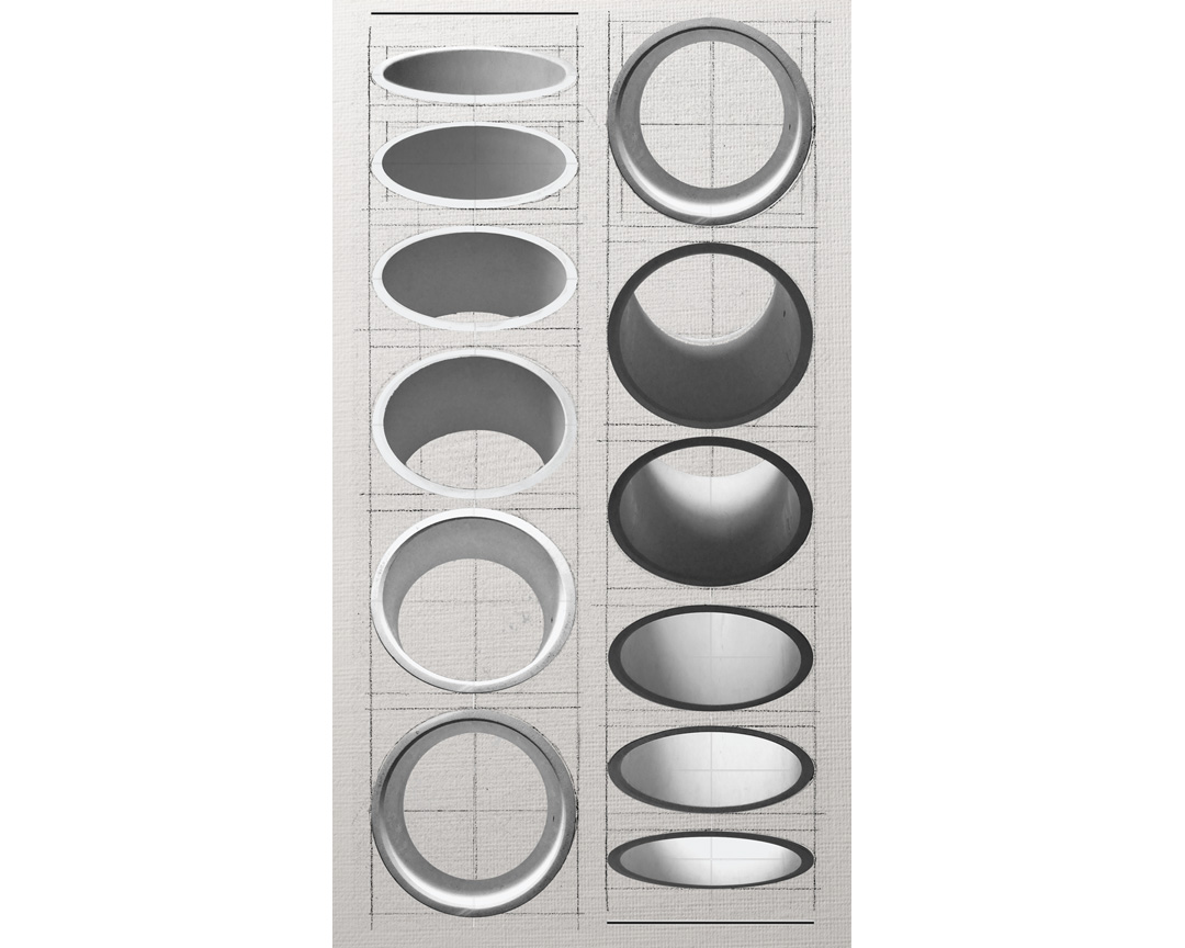 This, in a nutshell, is how I overcome unwanted proximity distortions. Just like the LoD/LoP Ellipse Chart, I take whatever close-proximity visual information that I think may be relevant for the effective communication of a particular subject and feed it into a geometry, schematic, survey, or cartoon that is designed to elicit a specific perceptual response over a particular range of viewing proximities successfully. For my own work, this strategy allows my efforts to “hold together” at greater distances (within reason) as well as more intimate proximities. I should also mention that these same type of distortions may indeed take place when looking closely at work that was created from more distant proximities–but practical considerations and additional aspects of visual perception not discussed here make this variation on the issue far less problematic.
As I have stated before, representational painting and drawing, for me, is not a matter of deciding whether it is better to paint what you see or to paint what you know as what you see IS what you know. Rather, my efforts are built on a strategy of effectively weaving together visual stimuli that are chosen based on what I want a viewer to know. This may sound strange to many that have been mired in the popular dichotomy–but this strategy has afforded me some very effective results.
In any case, I hope that this consideration of proximity offers you an additional advantage in your observational representationalist efforts.
Happy Painting!


this blog is gold
Anthony,
Another visual idea that contributes to the problem is optical tilt. Our experience of the world tells us that things at the edge of the picture plane are closest to us. And because our feet connect us to the ground, the top of the picture plane is assigned a greater distance effectively tilting the plane in space. Chinese landscape painters used this to create illusions of space where the distant mountains appear large and close humans feel small by working with a very vertical picture plane.
Cezanne and Morandi both hinged objects to various depths in the picture plane through the strategic use of broken form in conjunction with optical tilt. Frank Lloyd Wright used it exstensively in his architectural rendering creating multiple internal picture planes to enhance his depth illusions. This skill contributed significantly to his ability to convince his clients to build the radically different designs he was proposing.
Another great exercise is to place a tea cup in a saucer and attempt to draw or paint the forms. If you don’t use strategic broken form, the tea cup will appear to both tilt and float above the saucer.
A great addition for consideration Abbott. Thank you!