I came across a very good article last night exploring the benefits of working with a limited palette. The article was written by Courtney Jordan and is available on the artist daily blog here: http://www.artistdaily.com/blogs/artist-daily/sharpen-your-ability-to-judge-color-tone-and-value/
Within this article, one very knowledgeable artist shared his strategies for extending his palette’s color gamut as far as possible with a limited salvo of pigments. He stated: “When you place orange next to the gray, the gray looks blue in comparison because orange is its complement… …The muted purple looks more saturated next to yellow; the muted green looks greener next to red. That’s how the palette works–you must be aware of complementary colors to get the most out of the few colors you are using.”
While there is definitely truth in the above statements—the fact that something may look blue because “orange is its complement” is actually confusing pigment dynamics with our perceptual system’s color opponency mechanisms. The mixing dynamics of pigments (in general, historical primaries and their secondary complements) are not the same thing as the dynamics of our visual system’s color opponency.
For example, specific cells in the visual cortex, known as “double opponency cells”, play an important role in both simultaneous color contrast as well as color constancy. These cells are at work in the visual phenomenon referenced in the article above in which a more color-neutral object can appear to exhibit the color of a neighbor’s antagonist. However, these opponents are not the same as the historical complements referenced above (Red-Green, Blue-Orange, and Yellow-Purple). Our physiological opponent pairs are Red-green and Blue-Yellow. As such, a yellow color will psychophysically push a neighboring color towards blue as a red surround may push a neighboring neutral toward green. Orange may push a color towards a more greenish blue while the average bright yellow may push towards a very deep, royal blue. This can all still fit with the general statements in the article referenced above—however you can get a bit more effective with the strategy by understanding that there is a difference between the dynamics of pigment complements and our physiological color opponency.

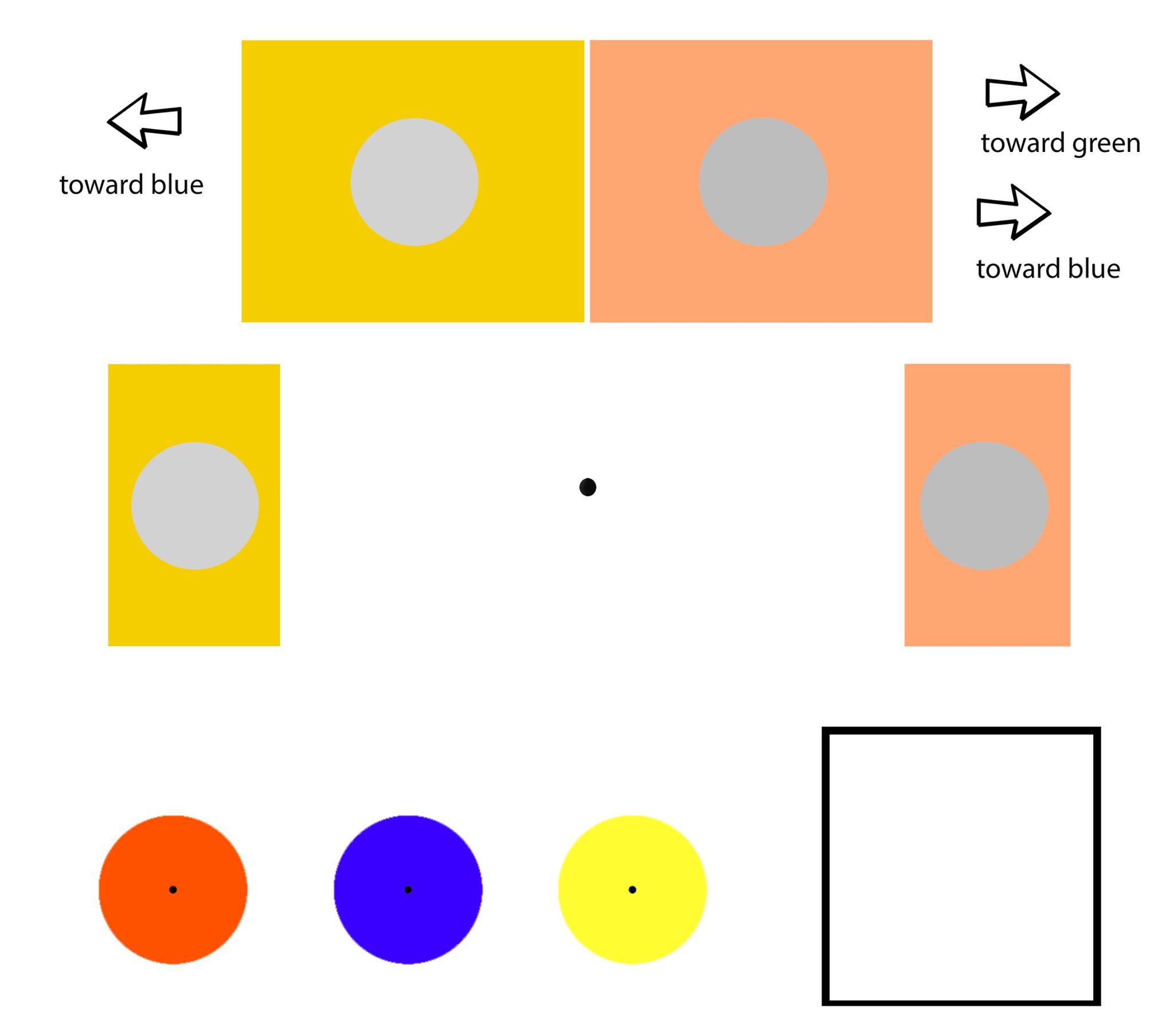
In the illustration provided you can examine neutral gray disks in front of equiluminant backgrounds of both yellow and orange. The effects are extremely, extremely subtle, but if you look long enough you may begin to see a specific color cast emerging from the neutral disk.
To help with this experiment I have placed a dot in the center of the two middle examples so that you may be easier for the viewer to see two varied casts of blue emerge from the neutral. By focusing your gaze on the center dot and observing the neutral disks and surround swatches with your peripheral vision—blue casts may be become more apparent (it’s dependent on a few variables). It is interesting to note here that rods (the dominating photoreceptor cells in your periphery—away from the fovea) have a much higher response curve to the short wavelength end of the visible spectrum (in the area of blue—hence the periphery bias configuration as an effort to augment the potential perception of blue)
In addition, you can see the opponent system in action by staring at the dot at the center of one of the colored circles at the bottom of the illustration for about 30 seconds and then look into the white box you will see an opponent afterimage appear.


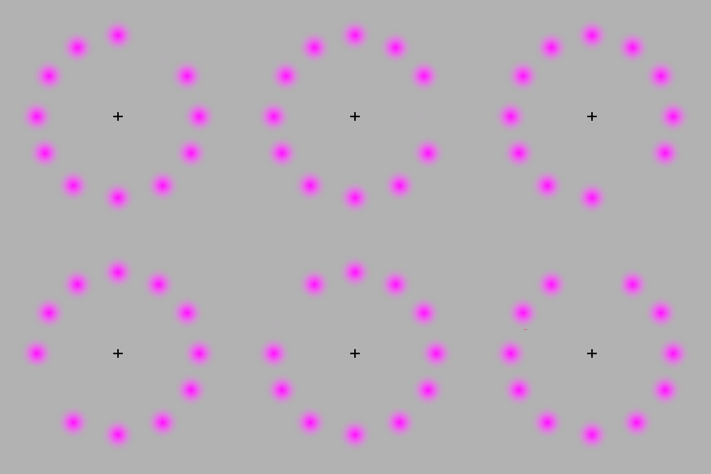
Another fun demonstration for experiencing afterimage opponent “complements” is an animation known as the “Lilac chaser” (sometimes referred to as the Pac-Man Illusion.) While the demonstration can often be found in numerous colors, the original consists of 12 lilac (or pink, rose or magenta), blurred discs arranged in a circle (like the numbers on a clock), around a small black, central cross on a grey background. One of the discs disappears briefly (for about 0.1 seconds), then the next (about 0.125 seconds later), and the next, and so on, in a clockwise direction. When one stares at the cross for about 5 seconds or so, one sees three different things:
A gap running around the circle of lilac discs;
A green disc running around the circle of lilac discs in place of the gap;
The green disc running around on the grey background, with the lilac discs having disappeared in sequence.
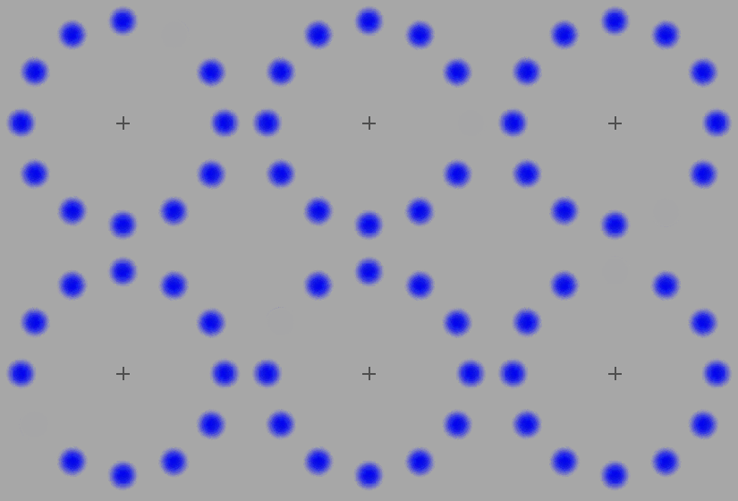
For readers that may be interested, the chaser effect results from the phi phenomenon illusion, combined with an afterimage effect in which an opposite, complementary, color—green—appears when each lilac spot disappears (if the discs were blue, one would see yellow), and Troxler’s fading of the lilac discs. The illusion was created by Jeremy Hinton some time before 2005. He stumbled across the configuration while devising stimuli for visual motion experiments. In one version of a program to move a disc around a central point, he mistakenly neglected to erase the preceding disc, which created the appearance of a moving gap. On noticing the moving green-disc afterimage, he adjusted foreground and background colors, number of discs, and timing to optimize the effect.
Hope those of you navigating some of these ideas out there find these explanations helpful!

