

Thoughts on evaluating the many art “rules” and traditions that continue to thrive in the studio and classroom.
“Art ‘rules’ are often personal opinions shouted loudly with a big stick.” -Kara Castro McGee.
American Author Hilary Hinton “Zig” Ziglar is often credited with the popularizing of a clever story about blindly following tradition and dogma. The tale now exists in many versions, with numerous details changed, but the story’s core remains the same. Here’s how it appeared in Ziglar’s 1977 book, “See you at the Top.”: “In this respect, they are as bad as “this old boy down home.” His wife sent him to the store for a ham. After he bought it, she asked him why he didn’t have the butcher cut off the end of the ham. “This old boy,” asked his wife why she wanted the end cut off. She replied that her mother had always done it that way, and that was reason enough for her. Since the wife’s mother was visiting, they asked her why she always cut off the end of the ham. Mother replied that this was the way her mother did it; Mother, daughter, and “this old boy” then decided to call grandmother and solve this three-generation mystery. Grandmother promptly replied that she cut the end of the ham off because her roaster was too small to cook it in one piece.“
A story that I would guess fewer people are aware of is the one that immediately precedes the ham story. This one involves Processionary Caterpillars and is a little bit darker. It reads: “A man or a woman without a goal is like a ship without a rudder. Each will drift and not drive. Each will end up on the beaches of despair, defeat, and despondency. John Henry Fabre, the great French naturalist, conducted a most unusual experiment with some Processionary Caterpillars. These· caterpillars blindly follow the one in front of them. Hence, the name. Fabre carefully arranged them in a circle around the rim of a flower pot so that the lead caterpillar actually touched the last one, making a complete circle. In the center of the flower pot, he put pine needles, which is food for the Processionary Caterpillar. The caterpillars started around this circular flower pot. Around and around they went, hour after hour, day after day, night after night. For seven full days and seven full nights, they went around the flower pot. Finally, they dropped dead of starvation and exhaustion. With an abundance of food less than six inches away, they literally starved to death because they confused activity with accomplishment. Many people make the same mistake and as a result reap only a small fraction of the harvest life has to offer. Despite the fact that untold wealth lies within reach, they acquire very little of it because they blindly, without question, follow the crowd in a circle to nowhere. They follow methods and procedures for no other reason than, “It’s always been done that way.“
While these tales, and others like them, are often used to illustrate the folly found with a blind adherence to tradition, it should be understood that such traditions only survive because they have resulted in, or by the very least have been associated with, some form of success. For example, the behavior of the Pine processionary caterpillars forms those long head-to-tail procession lines to better navigate their environment—utilizing a “trail-marking” mechanism which enables the caterpillars to aggregate at feeding sites and allows them to find their way back to nest after feeding (not to mention the invaluable increase in the number of collective exterior urticating hairs which can meet unwanted contact with a significant sting.) So it should go without saying that if such behavior provided no evolutionary advantage to the species—there would be no processionary caterpillars to observe circling the aforementioned flower-pot (which, by the way, was an actual experiment carried out by the French entomologist Jean-Henri Fabre, and described in his 1916 book ‘The Life of the Caterpillar”.)
I would also wager that the grandmother’s ham recipe provided some reasonably good results as well. Whether or not it truly had anything to do with the ends of the ham being removed, the product seems to have been good enough so that each generation engaged in strict adherence to the instruction.
Today, we find a good deal of such adherence to tradition and dogma in art schools, art academies, university art departments, and other educational resources. Laden with golden-age fallacies, traditional art “rules” thrive as aspiring creatives are eager to snatch up any bit of instruction that is made available without any sort of practical evaluation. Fortunately, as the age of information expands and educational resources become increasingly accessible, previously unchallenged dogma and tradition are now finding increased scrutiny–a change that has the potential to improve contemporary art education drastically.
So how can one evaluate the many instructions and traditions that are celebrated, promoted, and passed along as unquestionable dogma in the classroom, studio, or other learning environment?
Fortunately, there are effective tools available to us for such evaluation. The most demonstrably reliable tools are those found within the arena of critical thinking. While the definition of critical thinking can vary, simply speaking, the term describes a structured, reasoned analysis of factual evidence to form a rational conclusion or judgment. The subject can be highly complex, but I could recommend no better toolbox for the effective evaluation of the validity of available information.
Unfortunately, most of us do not invest a great deal of time learning or developing a large arsenal of critical thinking skills and instead rely on cognitive shortcuts called heuristics. A heuristic is a sort of mental shortcut or cognitive “rule-of-thumb” for use with problem-solving, learning, or discovery that employs a practical method with seemingly efficient rules not guaranteed to be optimal or perfect but are relatively sufficient for immediate goals. These shortcuts, which often involve focusing on a single aspect of an issue, object, or concept and ignoring all others, can work well in many circumstances–but can also lead to systematic deviations from logic, probability, or rational thinking.
Two cognitive heuristics that I often write about are the availability heuristic and the representativeness heuristic. The availability heuristic is a process in which we use or adapt more readily available, specific information to form beliefs about distant or more general concepts that we deem comparable. For example, it is far more likely that a lottery ticket purchaser’s mind is filled with images of celebrating a colossal win instead of any actual statistics regarding the likelihood of winning.
The representativeness heuristic is a process in which we apply the perceived properties of a group, class, or category prototype to each assigned member. (The term prototype here is used to describe an example or standard that exhibits the essential features or greatest representativeness of a particular category.) While availability involves specific instances, representativeness has much more to do with the prototypes, stereotypes, or averages. Psychologists have argued that many judgments relating to likelihood, or to cause and effect, are based on how representative one thing is of another or of a category. We tend to feel far more confident about this process when a target in question appears similar to our prototype. While this shortcut can be useful when evaluating a relatively novel target, it can also lead to a significant amount of irrational stereotyping.
However, it is important to realize that there are indeed many cases of heuristic use resulting in positive outcomes. In fact, when an optimal solution to a problem is impossible or impractical, heuristic methods can be used to speed up the process or ease the cognitive workload for finding a satisfactory solution. As an educator, I use heuristics often to lay the groundwork for a useful cognitive association, to increase processing fluency to ease cognitive workload amid increasingly complex activity, and to establish strategic increases in cognitive processing speed. Examples of such heuristic use in my teaching career include the treatment of circles in perspective as ellipses, the treatment of specific colors as inherently primary (secondary, tertiary, etc.), as well as countless references to the combining of pigments or paints as “mixing colors.” Each of these treatments or statements is technically problematic in one way or another—but each has proven time and again to be very useful or advantageous in a specific context. The trick is not to confuse the usefulness of a heuristic with the actual facts of the matter, as such conflation can create a fertile ground for problematic traditions and practices to flourish.

A good first preparatory step for the individual who is navigating new information is the acknowledgment that truth and usefulness are indeed very different concepts that are often confused and conflated. A statement that is true is in accordance with the actual state of affairs. It communicates what is the case. Information that is deemed useful is serviceable toward a specific end or purpose. Usefulness is not an inherent property of the world–but is instead a subjective assignment relative to a goal or task. On the other hand, something that is true is objective, confirmed by proof, and is, or at least ideally should be, universally accepted. Unfortunately, something that is true is not always useful, and that which is useful may not always be true. The latter is often referred to as convenient fiction.
I can offer examples of both true and untrue statements, but technically, I cannot provide any examples of a “useless” statement as by using it here, it instantly becomes useful. But, if we engage in a bit of temporarily useful cognitive dissonance—we can set aside the paradox and pursue the gist here.
Consider the following tautology: “It will rain today, or it will not rain today.” This statement is true, but if presented to an individual seeking to prepare for a weather-dependent activity that day, he or she may consider the statement useless as it is not serviceable relative to the task at hand. Conversely, information can be untrue but still useful. Take the idea that “humans see the world objectively.” This idea is untrue, as human perception has been demonstrated to be in disagreement with the physical properties of the environment. Nevertheless, our species continues to find great utility in the idea that our visual system provides a veridical window on the world. The instruction “Do not touch the stove as it is quite hot” can be shown to be both true and useful if it is indeed the case that the stove is hot and that your current activity may lead you to burn yourself if you were not made aware of that fact. Lastly, a statement can be shown to be both untrue and unuseful such as can be seen with the statement “Egypt consumes more Coca-Cola per capita than any other nation,” if it were offered up in response to an inquiry about the current time in New York.
In addition to the successful parsing of truth and usefulness, effective evaluation requires clarity. Term usage can vary significantly from one context to another, and unfortunately, the art world–regardless of any claims to the contrary–has no standard lexicon. As such, we need to make sure that we fully comprehend the instruction, rule, or claim being presented. One way to do this is to ask questions! (a.k.a PRACTICE THE ASK!) Inquire as to how the instructor or presenter is using any terms that you might seem even remotely unclear to you. We will always perceive new, incoming information through the lens of our own assumptions, experiences, and associations. The more novel the incoming information, the more steps we should take to verify that we understand what is being put forward before we begin to analyze and evaluate it. One practice that I often recommend here is a form of “steelmanning.” This technique involves the act of taking a view, opinion, or argument, reconstructing it in the terms that you DO understand, and representing it to the presenter to verify successful communication.

With basic concepts of truth, usefulness, and clarity in tow, we are now prepared to take additional steps for effective evaluation. And the very next step is the deployment of a deceptively simple question, “Why?” With this one word, we can transport ourselves from the land of rote learning into the realm of meaningful learning with dense forests of cause, reason, and purpose. The fruits of this realm include an increased likelihood for more useful and adaptive cognitive associations, more effective/efficient information synthesis, including but not limited to contextual and causal relationships, a potential decrease in overall confusion or misunderstanding, as well as an increase in generally productive experiences navigating the aforementioned concepts of truth, usefulness, clarity, heuristics, and tradition.
It is also important to acknowledge that the term why is inextricably linked to the concept of cause. As such, I will focus my application of “why” in this context through the lens of cause in terms of necessary, sufficient, and contributory conditions. For those that may not be familiar with these concepts, the following is a general overview:
Causation is the relationship that exists between cause and effect. A cause is any event that both precedes and is responsible for the event(s) that follow(s). A causal effect is understood to occur if variation in the independent variable is followed by variation in the dependent variable, when all other things are equal (ceteris paribus).
As I mentioned earlier, the concept of causation can be navigated in terms of certain conditions—and for our purposes here, we will limit these conditions to necessary, sufficient, and contributory. Condition A is said to be necessary for condition B if (and only if) the falsity (/nonexistence /non-occurrence) of A guarantees (or brings about) the falsity (/nonexistence /non-occurrence) of B. In other words, a necessary cause is an event without which the consequence cannot occur. A typical example of necessary causation is influenza. In order to come down with a case of the flu, you must first be exposed to the flu virus. Thus, the necessary cause of getting the flu is being exposed to the virus. But notice that just because you are exposed to the virus does not mean you will get the flu (your immune system might be strong enough to fight it off). Therefore, while exposure to the flu is a necessary condition (you cannot get the flu without it), it is not a sufficient condition (just because you’re exposed does not mean you will get sick).
Sufficient causation is arguably “stronger” than necessary causation in that if a sufficient cause exists, the connected consequence must follow. Necessary conditions aren’t a guarantee of any kind of result. However, a sufficient cause is not exclusive of other possible causes of the same event. For example, the chemical reaction fire can be caused by striking a match, flicking a lighter, or focusing a beam of sunlight through a magnifying glass. Each one is sufficient to bring about the effect. In other words, a sufficient cause is any event that is always followed by the consequence.
Contributory causation describes a causal factor that is just one among several co-occurrent causes. Generally speaking, there is no implication that a contributory cause is necessary, though it may be so. Nor is such a factor sufficient, as a sufficient cause would require no co-occurrent causal factors to yield a change in the dependent variable. However, a factor that is on some occasions a contributory might on other occasions be sufficient. In the latter cases, the factor would not be merely contributory.
There are other types of cause or “causal concepts,” including material cause (the stuff out of which something is made), formal cause (the defining characteristics of (e.g., shape) the thing), and final cause (the purpose of the thing)–but again I am limiting my scope to necessary, sufficient and contributory causal conditions. You can always research these additional concepts later to see how they might apply to this topic.
When we find our deployment of why met with an appropriate reason or rationale, we can continue an evaluation with the following inquiries:
Is it (the reason or rationale) clear?
Is it useful?
Is it true?
Does it utilize any logical fallacies?
Does it put forth a causal relationship that I can verify? (in necessary, sufficient, contributory terms)
Let’s apply some of these concepts and considerations to evaluate some common instructions, or “rules,” that the average art student may encounter in a teaching studio or classroom. I will follow each “rule” or “instruction” with a chosen (cited) rationale put forward. This is not to say that the rationales shared here are the only or strongest ones available. Rather I chose the ones that I believed would be most productive with this exercise. I’ve also added a simplified version of each rationale in an attempt to increase clarity.
Omit black paint from your palette.
WHY: “Monet’s paintings evoke a sense of energy and life, they leap off the canvas with color and contrast, but Monet somehow managed to avoid using the color black for nearly his entire painting career. By avoiding black in your own designs, you can replicate some of this dynamism.” –David Kadavy, Design for Hackers

SIMPLIFIED: The absence of black causes some of [Monet’s] dynamism (including a sense of energy and life as well as a leaping-off-the-canvas effect.)
In the interest of fair analysis, I would recommend reading the entire article that is cited and linked as there are additional reasons given for avoiding black, including one claims that states that ” The impressionists avoided black not only because it nearly doesn’t exist in nature, but because the effects caused by changes in hue are so much richer than those caused by changes in shade.“
Ummmm…

However, as stated above, for our purposes here, we will limit our focus to the rationale that was extracted and simplified.
First, regarding clarity, there is a significant amount of flowery, nebulous language here. I have no way to usefully validate or gauge claims about energy, life, and “leaping-off-of-the-canvas” effects in this context. It sounds nice, but is it clearly communicating anything? Are the statements made in the rationale factually correct? There is indeed evidence to support the claim that Monet did avoid black for many of his works. Additionally, I would concede that some probably have described Monet’s works as “evoking a sense of energy and life” and as having an ability to “leap off the canvas with color and contrast.” Let’s say for the sake of argument that this is also true. Does that mean that what follows is also likely to be true? (“By avoiding black in your own designs, you can replicate some of this dynamism.”)
Let’s look at the structure of the basic gist of the author’s rationale:
Monet avoided black.
Monet created work described as having a sense of energy and life.
Avoiding black can cause your work to be described as having a sense of energy and life.
Even if the first two statements are true, what follows is ultimately problematic due to a number of logical fallacies committed in the structure of the rationale. The author never establishes, but only assumes, a causal relationship between the absence of black and Monet’s dynamism. He simply barrels forward with some “flashy” language and an unapologetic appeal to accomplishment (the success of Monet’s efforts)–utilizing the fallacies of cum hoc ergo propter hoc (which means with this, therefore because of this) and a hasty generalization work to quickly produce a problematic conclusion built from inductive reasoning.
It is always wise to tread carefully with inductive reasoning. Such logic makes broad generalizations from specific observations. Here’s an example of the pitfalls one can face with inductive logic: “John has a bag of marbles that he has not looked inside yet. However, the first two marbles he pulled from the bag were red. Therefore, John can conclude that all of the marbles in the bag are red.” As we can see with this example, even if all of the premises are true in an argument, inductive reasoning allows for the conclusion to be false. We see this form of reasoning here in the form of Monet avoided X, Monet was Y, everyone who avoids X will be Y.
With all of that said, if we look back through the lens of causal relationships, we can quickly determine that there exist significant issues with both necessity and sufficiency regarding the author’s causal assumptions. For example, a blank canvas does not contain black and would likely not be described as having [Monet’s] dynamism (a sense of energy and life or Monet’s leaping-off-the-canvas effect). Additionally, no evidence (or argument) is presented to support the claim that an absence of black is indeed a necessary requirement for a work being described as full of energy, life, and leaping off the canvas (to any degree). Beyond this, there is nothing here to support the idea that the absence of black will bring about a similar result outside of the context of a Monet-esque Impressionistic effort. And while I think it would be reasonable to assume that anyone attempting to create a Monet-like impressionistic painting would do well to follow his color palette, his work has a good number of notable characteristics that may overshadow the mere absence of black.
There are many valid reasons that one might consider avoiding or omitting a particular paint from their palette. Perhaps the color is not relevant to the subject. Perhaps it dries at a rate or has an opacity that is not conducive to the painter’s process and goals, or maybe the absence will provide an advantageous scenario for productive practice, etc. All of these are valid reasons to omit a particular paint. But as a general “rule,” absent some adequate justification, such an instruction seems to be more of an opinion wrapped in a gilded blanket of tradition.
All in all, this painting “rule,” as presented here, is a textbook example of how a bit of truth, a flowery appeal to a celebrated painter, and a truckload of fallacious reasoning can provide the seeds for what could quickly become unquestioned “tradition.” You would be wise to keep an eye out for this pattern.
Paint “Fat over Lean.”
WHY: “The ‘fat over lean’ rule allows you to build a painting that is flexible, so over time, there will be less cracking to your painting. The under layers of a painting should be leaner than the upper layers.” –Gamblin Colors.
SIMPLIFIED: Adherence to the “fat over lean” rule can cause increased paint film flexibility, which results in less cracking.
In stark contrast to the last “rule” we examined, this is a fairly straightforward piece of instruction that utilizes reasonably clear terms. It is important to note that Gamblin states that the action will not eliminate cracking altogether, but will produce “less cracking.” Also, the information comes from a source with ample expertise* in material behavior. (*This should not be confused with a fallacious appeal to authority, as to qualify for the fallacy, the target of the appeal would need to be lacking in relevant expertise.)
As to the factual nature of the instruction, there is good evidence to support that a more flexible paint film may decrease the potential for surface cracking. When oil paint is spread on a surface and exposed to air, it begins a lifelong sequence of chemical processes collectively referred to as “curing.” This sequence is generally understood to include an initial autoxidation of fatty acid-derived chains followed by the unending crosslinking of those chains. This ever-developing crosslinked network can be considered relatively strong; however, it becomes increasingly brittle over time.
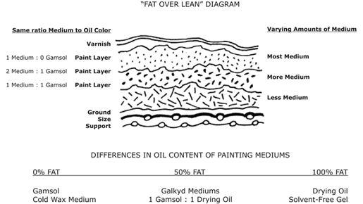
During these processes, increases or decreases in the weight of the paint film will have a measurable impact on its dimensions. These changes can accumulate with the compression and expansion forces caused by cycles of relative humidity and temperature, yielding significant stresses that often relieve themselves by cracking the increasingly brittle surface. Therefore, if the surface layers can be made more flexible relative to the lower (earlier) layers of the work, the described stresses may be less likely to manifest such harsh surface effects. One way to do this is to organize paint layers in a certain way (see Gamblin diagram above) so that each successive layer contains more medium or oil (or lower the pigment volume concentration).
Scottish chemist and author A. P. Laurie explained the bones of the strategy in his 1926 text The Painter’s Methods and Materials (Chapter 10) He writes, “During this process, the oil film is not only absorbing oxygen and therefore increasing in weight, but is also losing certain volatile products of the oxidation, thus losing weight. If a thin film of the oil is painted out on glass and weighed from time to time, it will be found to increase in weight in passing from liquid to sticky and then from sticky to surface dry. It now begins to lose in weight, the rate of loss slowly diminishing. An increase or decrease in the weight of the paint film represents an equivalent change in the dimension of the paint film. If the changes in dimension of the under layer are considerably greater than the top layer, it is inevitable that the top layer will become disfigured as a result.“
Concerning cause, I believe that ample evidence is available to conclude that the employ of “fat over lean” or “flexible over inflexible,” as described here, is sufficient to decrease the potential for surface cracking. In addition, the practice can be described as “contributory,” as there are additional factors that can increase or decrease the likelihood that a paint film will crack. However, necessity is debatable here, as other factors, such as a problematic amount of zinc oxide in the paint film, can be eliminated or reduced, which may also reduce the potential for cracking. It should also be mentioned that while the goal here is a strategic increase in paint film flexibility through a specific construction (“fat over lean” or “flexible over inflexible”), this approach is entirely sound; some have recently cautioned artists to look more carefully at the “spirit” of the rule. Sarah Sands from Golden Artist Colors writes: “Oil painters concerned with fat over lean will often turn to information about the oil absorption values for particular pigments as a way to compare how oily or lean certain colors might be. However, this has led to many misconceptions and outrightly wrong conclusions, which seem to persist in various forums and articles. In what follows, we try to correct this and show how using the actual ratio of the volume of pigment to oil, rather than the weight, gives a far more accurate picture and is usually what people have in mind when wondering about the amount of oil in any one particular color.” Natural Pigment’s founder, George O’Hanlon, writes, “…[fat over lean] is typically difficult to achieve in practice. Most artists don’t understand what constitutes fat or what is lean. It is impractical to measure the ratio of pigment and binder while painting. What I will tell you next may sound heresy, but you do not need to follow this rule if you use paint at its CPVC, which is applying paint straight from the tube, and paint thinly. On the other hand, working in thick paint layers and/or with lots of medium or oil added to paint requires one to observe the fat-over-lean rule.“
In summary, I would argue that this particular bit of instruction, or “rule,” is quite sound***. Unlike the Monet-inspired reasoning for the omission of black, it is NOT a case of fallacious reasoning. It is a recommendation based on reliable lines of verifiable evidence, employs factual representation, and is communicated (especially here) using reasonably clear terms to minimize confusion or other potential misunderstandings.
***I recommend seeking out multiple sources to investigate the factual nature of any claim or instruction. Even though I have represented the factors of “fat over lean” to the best of my ability, I would recommend independent verification of the many statements here throughout with appropriate resources or relevant experts in the field. Some online resources to consider would be: The Materials Information and Technical Resources for Artists (MITRA) online resource, The Natural Pigments Forum, Smithsonian Museum Conservation Institute, and Golden Artist’s Just Paint.
Follow the Rule-of-Thirds to find an ideal focal point placement.
WHY: “The rule of thirds dictates that if you divide any composition into thirds, vertically and horizontally, and then place the key elements of your image along these lines or at the junctions of them, the arrangement achieved will be more interesting, pleasing, and dynamic.” –Chris Legaspi, Creativebloq.com
An illustration depicting a compositional arrangement using the ‘rule of thirds’
The rule-of-thirds can be found in just about every contemporary resource involving pictorial composition. As we can see in the chosen “why” above, this “rule” proposes that an image should be imagined as divided into nine equal parts by two equally spaced horizontal lines and two equally-spaced vertical lines, and that important compositional elements should be placed along these lines or their intersections for aesthetic advantage.
SIMPLIFIED: Adherence to the rule-of-thirds (ROT) will cause a pictorial spatial arrangement to be more interesting, pleasing, and dynamic (i.e., a “positive” aesthetic response)
Regarding clarity, the majority of this rationale is presented in reasonably clear terms, with the exception of the reference to “interesting, pleasing, and dynamic.” Just like with Monet’s dynamism, the language here can become problematic. However, for this paper, I simplified the latter trifecta into a clearer but slightly broader term by substituting “positive aesthetic response.”
Concerning fact and fallacy here, let’s take a glance at the origin of this concept. The earliest known articulation of the “rule of thirds” appears in the 1797 publication Remarks on Rural Scenery by British painter, engraver, and writer John Thomas Smith. In a chapter titled Of Light and Shade, Smith outlines a principle of visual harmony based on unequal distribution, arguing that two equal areas of light (or form) create visual tension, while unequal parts naturally guide the viewer’s attention. He writes, “Two distinct, equal lights, should never appear in the same picture: One should be principal, and the rest subordinate, both in dimension and degree: Unequal parts and gradations lead the attention easily from part to part, while parts of equal appearance hold it awkwardly suspended…”
Smith then introduces a proportional framework, stating: “Analogous to this ‘Rule of thirds’ (if I may be allowed so to call it)… I have presumed to think that… in a design of landscape, to determine the sky at about two-thirds; or else at about one-third, so that the material objects might occupy the other two.” He extends the idea beyond landscape, applying it to form, color, line, and shadow, and concludes that the two-thirds-to-one-third ratio is more visually harmonious than equal or extreme divisions.
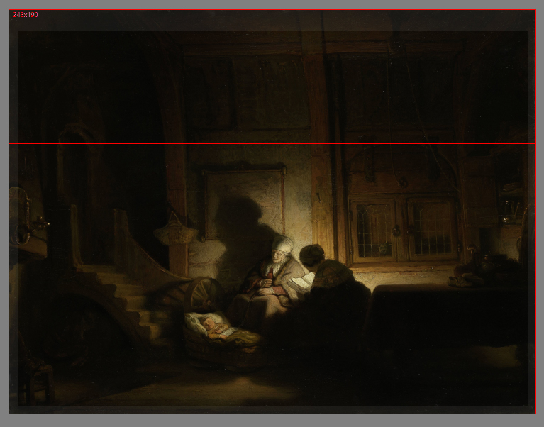
While Smith makes no reference to specific artists or works, including Rembrandt, some modern scholars have speculated that paintings such as Rembrandt’s The Holy Family at Night (c. 1642), with its asymmetric light distribution and compositional balance, embody the principles Smith was attempting to codify. Such associations, however, are interpretive and not based on any direct documentation.
To be clear, what happened here is exactly what we saw with the reasoning put forward to avoid black. John Thomas Smith likely observed what he believed were “strong” works, noting particular light and dark ratios. From this observation, he concluded that this ratio was indeed a “harmonizing proportion.” And just as with the clarity issues regarding Monet’s dynamism and sense of life, I am not entirely sure what “harmonizing proportion” is supposed to communicate.
I must confess that I could not locate the origin of the later augmentation (after Smith’s 1797 publication) regarding “placing the key elements of your image along these lines or at the junctions of them,” but I am not too worried about that mystery moving forward. As we will soon see, the modern augment, which I would argue currently overshadows Smith’s initial focus on proportion, is fatally undermined by modern research.
Fortunately for contemporary artists, some brilliant minds are using scientific methodologies and current technologies to test many of the long-standing traditions in the realm of Artmaking. In 2014, Psychologists Stephen Palmer and William Griscom, and research assistant Yurika Hara presented “Why the “Rule of Thirds” is Wrong” at the Vision Sciences Society Annual Meeting. Here is the abstract from that effort: “Perhaps the best-known prescriptive rule of pictorial composition is the “rule of thirds” (ROT), which posits that: (a) the best positions for the focal object within a rectangular frame lie along the vertical and horizontal lines that divide the frame into thirds, with maxima at the four intersections of these third-lines, and (b) the worst positions lie along the vertical and horizontal axes of symmetry, with the minimum being at the frame’s center. We tested these predictions by measuring people’s preferences for placement of a single object at the nine points defined by the 3×3 grid of intersections among the horizontal and vertical third-lines and symmetry-axes. We measured forced-choices between two pictures of the same object (fish/dog/eagle) facing in the same direction (forward/leftward/rightward) at all possible pairs of positions in the 3×3 grid. The results strongly contradicted both of the ROT’s main claims.“
In 2012, researchers Stephen E. Palmer and Stefano Guidi studied what they called “goodness-of-fit ratings” with circles at different positions in rectangular frames. Their experiments demonstrated that the “best-fitting” position was reported at the center, followed by positions along the global symmetry axes. The next “best” was along local symmetry axes located at the corners of the frame. The poorest fit was at asymmetric positions, like those that are deemed “ideal” with the contemporary application of the ROT.
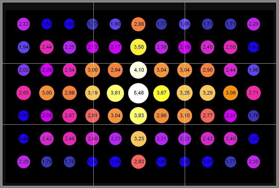
Can it be shown that adherence to this ubiquitous rule can cause a pictorial spatial arrangement that will be more likely to elicit a positive aesthetic response? Simply speaking, no. The ROT pictorial armature, independent of contextual factors, cannot be shown to be necessary or sufficient to provide an aesthetic advantage. Application of the ROT is not sufficient in that it does not guarantee in any way an aesthetically pleasing spatial arrangement independent of contextual factors (factors that we will discuss momentarily). Nor can it be shown to be necessary independent of contextual factors, as countless works of art with spatial arrangements described as “interesting, pleasing, and dynamic” can be shown to have no adherence to the ROT whatsoever.
With that said, adherence to the rule can be a contributing factor if it happens to align with certain pre-existing biases coincidentally. So yes, that’s right–the ROT can be considered a useful heuristic even though it seemingly is at odds with all modern research. Let’s look at two relevant biases that can lead to the ROT appearing quite successful:
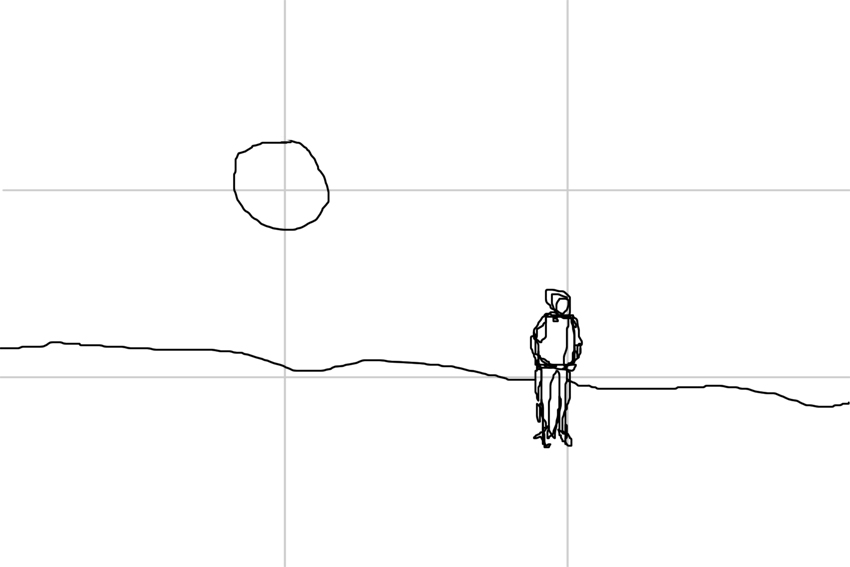
Inward Bias: Studies have demonstrated that when an object with a salient “front” is placed nearer the border of a frame than a center, observers tend to describe an image as more aesthetically pleasing [attractive/comfortable] if the object faces inward (toward the center) than if it faces outward (away from the center) [tense] (Chen et al., 2014). I believe that this may have much to do with the idea of understanding our brain as a “prediction machine.” Again, “A still photograph of an object in motion may convey dynamic information about the position of the object immediately before and after the photograph was taken (implied motion)” -(Kourtzi and Kanwisher, 2000). If we can see more of where an object may be “headed,” we can make a better prediction about a future state of the objects being observed. This bias can sometimes seem to reconcile with the rule of thirds, just as it appears to in the above picture of a figure in a snowy field.
Center Bias: In studies regarding front-facing subjects, an aesthetic [attractive] preference was greatest for pictures whose subject was located at or near the center of the frame and decreased monotonically and symmetrically with distance from the center (Palmer, Gardner & Wickens, 2008). The reason that people prefer the object’s salient front region to be as close to the center as possible may result from a number of factors. The greatest influence MAY come from how we usually engage with what we see as a front-facing subject (i.e., ecological fluency). This center bias may reflect an advantageous viewing position for extracting information from such scenarios. I would like to note here that center bias is not the same as central fixation bias. They may be related in some way, but not in a way that I can show support for at this time. Central fixation bias is a tendency for observers to begin an exploration of a visual scene at the center. Numerous visual perception experiments have borne this out (e.g., Buswell, 1935, Mannan et al., 1995, Mannan et al., 1996, Mannan et al., 1997, Parkhurst et al., 2002 and Parkhurst and Niebur, 2003). The prevalence of central fixation bias suggests that it is a key feature of scene viewing, but the basis of this effect remains poorly understood. In any case, the center bias contradicts the effect claims attached to the ROT.
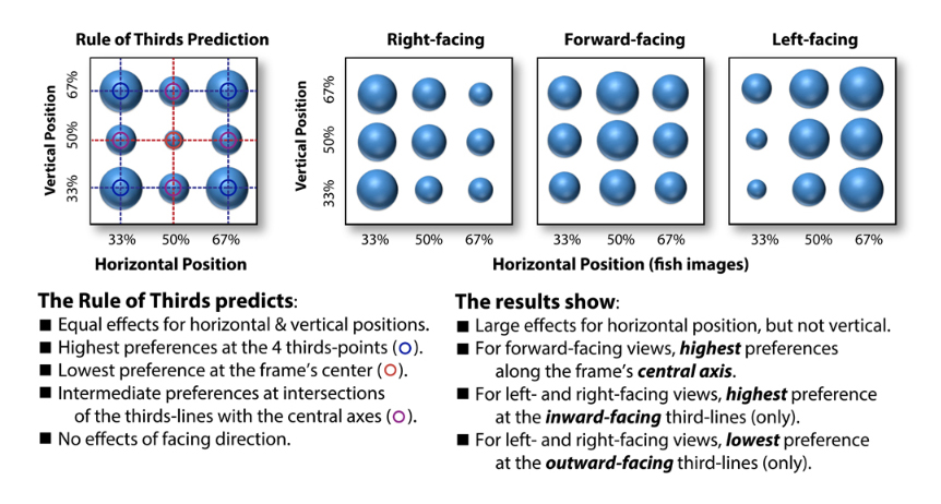
I should also note that research has shown both center and inward biases to influence preferences in the vertical dimension as well (Sammartino and Palmer, in press). Additionally, vertical preferences have been shown to be consistent with an ecological bias toward its viewer-relative position in the environment (Sammartino & Palmer, 2011).
For those interested in the research referenced here, I would recommend these additional studies related to the Rule-of-Thirds (ROT):
Sammartino, J., Palmer, S.E. (2012). Aesthetic issues in spatial composition: Effects of vertical position and perspective on framing single objects. Journal of Experimental Psychology: Human Perception and Performance, 38(4), 865-879.
Palmer, S. E., & Gardner, J. S. (2008). Aesthetic issues in spatial composition: Effects of position and direction on framing single objects. Spatial Vision, 21, 421-449.
Palmer, S. E., & Guidi, S. (2011). Mapping the perceptual structure of rectangles through goodness-of-fit ratings. Perception, 40(12) 1428-1446.
Artists should not “Paint from Photos.”
Why: “The camera cannot see like the eye can when it comes to color accuracy, depth of field, and the warms and cools of highlights and shadows. There’s a lot of distortion that comes along with photographs.” -Mark Haworth, artistsnetwork.com.

SIMPLIFIED: Avoiding photography will result in more accurate reference (in terms of color, depth-of-field, warm/cool highlights/shadows) and less distorted reference material.
Unfortunately, while the language here is crystal clear, the author of the rationale is clearly communicating some significant misrepresentations regarding concepts of accuracy, color, distortion, and visual perception.
It is a fact that the eye (vision, perception) is often compared with a camera (or any comparable imaging technology). This comparison or association is very understandable, as we (humans) tend to build understanding through the cultivation of cognitive associations. We compare, contrast, associate, and apply metaphor in a concentrated effort to process the unknown (into something useful) in terms of the known. The basic idea behind photography is to record a projected light pattern with an electronic sensor or light-sensitive plate that can be used to generate an image. Doesn’t that sound similar to what we think an eye does?
In reality, aside from some low-level similarities in optics and photosensitive materials, the kinship is almost non-existent. With regard to digital photography, each pixel in a camera sensor’s array absorbs photons and generates electrons. These electrons are stored as an electrical charge proportional to the light intensity at a location on the sensor called a potential well. The electric charge is then converted to an analog voltage that is then amplified and digitized (turned into numbers). The composite pattern of data from this process (stored as binary) represents the light pattern that the sensor was exposed to and may be used to create an image of the light pattern recorded during the exposure event. Additionally, a Bayer mask or Bayer filter (a color filter array) is placed over the sensor to collect wavelength information at each pixel in addition to information regarding light intensity.
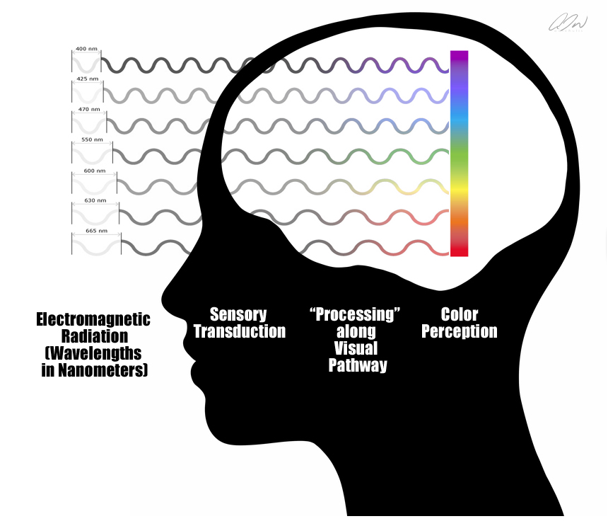
Visual perception, on the other hand, is not an objective recording or sampling process of any kind. Yes, we do have photosensitive tissues that absorb photons, but the cascade of neural activity that follows that absorption is nothing like the photon collection-electron generation-voltage chain that we find with today’s cameras, even though some may argue an additional similarity between camera voltages and the characteristics of a neuron’s action potentials. Modern research informs us that the percepts that we experience may not reflect the objective features of our environment at all. In a 1709 publication titled An Essay Towards a New Theory of Vision, Anglo-Irish philosopher George Berkley pointed out that sources underlying visual stimuli are unknowable in any direct sense. And while this observation did not stop many brilliant minds from arguing or assuming that our vision system evolved for veridical function (Marr, Pizlo, Gibson, etc.), far fewer champion the idea today as growing evidence across multiple fields of scientific inquiry continues to point to the fact that Bishop Berkley had it right all along. (For those interested in an overview of the visual system, please visit my paper here: https://anthonywaichulis.com/regarding-perception-photography-and-painting/
Another problematic intuitive implication embedded in our selected rationale here is the idea that color is a property of the environment, and as such, can be experienced more or less “accurately.” The fact of the matter is that color is no more of an environmental property than is the experience of pain or sound. Color is a term that we use to describe a set of particular visual experiences that arise upon visual exposure to various wavelengths of visible light. For example, the standard human observer has a specific type of photoreceptor cell in the retina that is “tuned” for short wavelengths. That means that when this particular cell type encounters this type of wavelength, it responds by initiating a complex cascade of electrochemical events that could eventually result in an experience that we might describe as the color “blue. The experience of blue is no more an accurate representation of the encountered visible wavelength than is the resulting knee-jerk an accurate representation of the reflex hammer that is tapping on a patellar tendon. With this in mind, I am not entirely sure how to address the idea that colors will be “more accurate” if experienced with a live percept instead of a photograph. The term accuracy refers to the closeness of a measured value to a standard or known value. For example, if in the lab you obtain a weight measurement of 3.2 kg for a given substance, but the actual or known weight is 10 kg, then your measurement is not accurate. In this case, your measurement is not close to the known value. But since color is a biological response occurring within a non-veridical perception system (not using any form of objective measurement), I do not think that “accuracy” is an applicable term here. It is true that the experiences of color with a live percept can differ significantly from what may be found with a corresponding surrogate—but neither would be considered a more or less “accurate” measure of nature itself in this context. (I believe that we can fold the claims about warm and cool highlights and shadows in with this as well.)
I am not sure how Mr. Haworth is using the idea of depth-of-field here. As I understand it, depth-of-field is the distance between the nearest and the farthest objects in “acceptably sharp focus” within a percept or image. What may be intended here is a reference to our ability to shift our focus when observing a live percept in a way that is not possible with a two-dimensional surrogate. With this ability in play, we can have access to certain experiences that may inform our decisions about the strategic application of defocus blur. However, the utilization of photographic references may also provide information (like a representation with a very narrow depth of field) that cannot be easily experienced with a live percept. Either way, the bottom line is that the usefulness or magnitude of such advantages would still be relative to the artist’s goals.
Unfortunately, our selected rationale here boils down to a number of problematic representations in regard to visual perception, accuracy, color, and distortion. As I argued in a 2015 article titled The “Pitfalls” of reading about Photography “Pitfalls,” there are some genuinely GREAT reasons to conclude that photography should be avoided within certain painting and drawing practices. However, these reasons are always context-dependent, taking into account the artist’s intentions and goals.
So let’s put aside some of the misrepresentations here, bust out the lens of causality once more, and see how the “why” here holds up in terms of necessity and sufficiency.
Is avoiding photography within an observational painting or drawing context necessary to achieve “accuracy”? The simple answer is no. Again, the nature of the visual system makes the idea of accuracy here highly problematic. If, though, we perform some cognitive gymnastics and interpret the term “accuracy” in this context to describe the similarity or “closeness” of an experience to itself (e.g., the experience of a live percept is a more accurate experience of that percept than a surrogate of that percept), then I would agree that incorporating an unnecessary surrogate could be problematic. However, even with an interpretation this absurd, the same argument can then be flipped in favor of the “accuracy” of a percept surrogate like a photograph. (e.g., the experience of a surrogate is a more accurate experience of a surrogate than is the experience of the live percept that the surrogate represents.)
Additionally, considerations of “access” should be taken into account in the context of this rule. Certain factors, like motion, time, adaptation, etc., may prohibit an observer from perceiving all that the artist may deem necessary for what he or she understands as accuracy. The consideration of such factors can indeed lead an individual to conclude that surrogacy, in certain scenarios, is necessary to achieve a form of accuracy when compared with what information is available with a corresponding live percept.
And what of sufficiency? Again, if we look to the nature of visual perception, the short answer is still no. Even if we grant the uber-generous interpretation of accuracy found with our consideration of necessity here, there can be many more factors that may prohibit what we might deem an accurate experience. We may find successful arguments to earn the rationale here, a contextually dependent contributory badge, but even that would require the aforementioned uber-generous interpretation.
The bottom line here is that there can be many advantages found with avoiding photography within observational, representational drawing or painting. But as we so often see in cases like this, those advantages are context-dependent and should not require any misrepresentation for justification. To be clear, certain types of misrepresentation are absolutely “forgivable” in the service of a heuristic. However, such misrepresentation should never serve as the basis for a supporting rationale. Keep that in mind when you are considering “Is it true?”
Remember–when you are presented with that new piece of information or that new set of instructions—take a moment and practice the ask. Ask the provider of that information, “Why?” Ask them why any given rule or practice should be followed. Ask them what evidence or rationale they can provide to show that adherence will yield an advantage.
And when we find our deployment of why met with an appropriate reason or rationale, we can begin to consider:
Is it (the reason or rationale) clear?
Is it useful?
Is it true?
Does it utilize any logical fallacies?
Does it put forth a causal relationship that I can verify? (in necessary, sufficient, contributory terms)
Happy Learning and Artmaking All!