Note: It is highly recommended that you read So What’s With Jane already? A Primer on Pictorial Composition. (Part I) , “To the makers of music – all worlds, all times.” A Primer on Pictorial Composition. (Part II) and Henri Breuil and Alfred Yarbus Walk into a Bar…A Primer on Pictorial Composition. (Part III) before embarking on this installment.
“Too often we hold fast to the clichés of our forebears. We subject all facts to a prefabricated set of interpretations. We enjoy the comfort of opinion without the discomfort of thought.” ― John F. Kennedy [Commencement Address at Yale University, June 11 1962]
In the first installment of this series, we examined an excerpt from a contemporary resource on pictorial composition. While the text was indeed well written and offered a seemingly clear algorithmic approach to picture building, closer examination revealed that the content was based on the all-too-common cliché compositional heuristics that typically treat coincidence and correlation as causation. With this installment, I would like to begin a journey into the heart of many popular heuristics of pictorial composition and evaluate their functionality through the lens of our developing biological framework.
Before embarking on this journey I would like to revisit our definition of pictorial composition once more:
Pictorial composition can be defined as the specific content of an image as well as the spatial relationship of its elements with respect to aesthetic quality and communication efficacy.
Thus far I have offered a cursory overview of aesthetic quality, communication efficacy, and pictorial content, but I have not yet addressed what is meant by “elements” in this definition. Allow me to rectify that issue before moving forward. “Elements” in this regard can refer to either the subject matter (content) of a pictorial composition or to the visual building blocks of pictorial content. While the former can be just about anything that we can imagine, the latter offers a more manageable list for examination. Wikipedia defines “visual elements” as:
“The various visual elements, known as elements of design, formal elements, or elements of art, are the vocabulary with which the visual artist composes. These elements in the overall design usually relate to each other and to the whole artwork. The elements of design are:
Line — the visual path that enables the eye to move within the piece
Shape — areas defined by edges within the piece, whether geometric or organic
Colour — hues with their various values and intensities
Texture — surface qualities which translate into tactile illusions
Tone — Shading used to emphasize form
Form — 3-D length, width, or depth
Space — the space taken up by (positive) or in between (negative) objects
Depth — perceived distance from the observer, separated in foreground, background, and optionally middle ground.”
While this list of visual elements is fairly standard, there are some subtle issues that we should address to avoid potential confusion moving forward.
For example, line can be effectively defined in a number of ways here. However, the defining of a line as a “facilitator of eye movement” is, unfortunately, misleading. While discontinuity indeed attract our gaze, and saccades most often occur in straight lines, eye movements do not “follow” line direction in the manner that one might infer from the above definition.
In his 1967 publication Eye Movement and Vision, Russian psychologist Alfred Yarbus (introduced in the last installment) wrote: “…outlines themselves have no effect on the character of the eye movements. In the movements of the eye we have no analogy with the movements of the hand of a blind person, tracing the outlines and contours. Outlines and contours are important for the appearance of the visual image, but when the image has appeared and is seen continuously, the observer has no need to concern himself specially with borders and contours. Borders and contours are only elements from which, together with other no less important elements, our perception is composed and the object recognized. Clearly the outlines of an object will attract an observer’s attention if the actual shape of the outline includes important and essential information.”

Fig. 53. Record of eye movements during examination of geometrical figures. a) Geometrical figures presented to the subject for examination; b) record of eye movements during which the subject tried to trace the lines of the figures with his eye smoothly and without saccades; c) record of eye movements during free (without instruction) examination of the figures for 20 sec: d) record of eye movements during examination of the figures for 20 sec after the instruction “look at the figures and count the number of straight lines.”
Unfortunately, the fact that there exists no strong evidence for the claim that our eyes follow individual lines in a pictorial composition does not stop countless drawing, painting, and photography resources from perpetuating the idea.
From expertphotography.com:
“Leading lines are one of the most effective and under-utilised [sic] compositional tools available to photographers. They’re used to draw a viewers [sic] attention to a specific part of the frame, whether it’s a person, or a vanishing point in the background of the frame.
Our eyes are naturally drawn along lines and paths in photos, as they tend to make us feel as if we’re standing within the photo itself. It’s important to understand how to use leading lines effectively, because if they’re used incorrectly, they will be more detrimental than anything.”
From Drawing Secrets Revealed – Basics: How to Draw Anything:
“Lines such as a river, fence or walkway can be very effective visual aids because they guide your viewer’s eye through the different elements of your drawing and around the whole work. These types of lines are called “leading lines”. These lines can take your eye right to the focal point of a drawing of just guide your eye through the whole composition.”

Remember this image from our second installment “To the makers of music – all worlds, all times” A Primer on Pictorial Composition. (Part II)”? We discussed how the placement of the figure was telling in regards to a recent past as well as a pending future. Due to the figure’s configuration, location, and surrounding context, we may infer that the individual pictured had moved from the right side of the image in the recent past and will continue to walk into the space pictured on the far left.
Now a good argument can be made that particular configurations of lines may influence our gaze in certain contexts. For example, linear configurations that may be used to imply optic flow may steer our fixation towards whatever may occupy the convergence of the flow in an effort to elicit valuable information. We will see this concept again and again in our exploration of pictorial composition. Massive amounts of neuronal resources in the human brain are devoted to predicting what will happen from moment to moment. This fact has led many to regard the brain as a dynamic prediction machine. Jeff Hawkins writes in his book On Intelligence: “Your brain receives patterns from the outside world, stores them as memories, and makes predictions by combining what it has seen before and what is happening now… Prediction is not just one of the things your brain does. It is the primary function of the neo-cortex [sic], and the foundation of intelligence.” More to our point, David Rock, author of Your Brain at Work, writes: You don’t just hear; you hear and predict what should come next. You don’t just see; you predict what you should be seeing moment to moment.” With this in mind, you can see how an individual may prefer those compositions that provide enough information so as to facilitate predictions about what will happen in the moments following the one captured in the frozen percept surrogate. Some studies of the brain go further to explore spatial preferences in this regard (Battaglia et al, 2011). Such research explores how observers of a still image of an action may extract dynamic information by extrapolating future position from the motion implied by the image “A still photograph of an object in motion may convey dynamic information about the position of the object immediately before and after the photograph was taken (implied motion)” -(Kourtzi and Kanwisher, 2000).
Returning to our examination of visual elements, the definitions for shape, color and texture above seem adequate. The definition of tone, on the other hand, may be a tad problematic for those pulling information from multiple texts. I would guess that what the author of the Wikipedia entry meant to insert here was the term value instead of tone. Value can be defined simply as relative lightness or darkness. Tone, a term often used synonymously with value, actually describes a color mixed with both black and white. Many dictionaries will define value and tone as synonyms–however, different texts may use the terms to mean different things. If we look to the origin of these words, the difference becomes more apparent (from Online Etymology Dictionary).
value (n.) late 14c., “degree to which something is useful or estimable,” from Old French value “worth, price, moral worth; standing, reputation” (13c.), noun use of fem. past participle of valoir “be worth,” from Latin valere “be strong, be well; be of value, be worth”.
tone (v.): 1811, from tone (n.). Related: Toned; toning. To tone (something) down originally was in painting (1831); general sense of “reduce, moderate” is by 1847.
Considering the origin of these terms, one can see how value may more accurately describe a judgment of relative lightness or darkness while tone may better describe a reduction of color purity with a neutral gray.
I am not exactly sure what is meant by the above definition of form: 3-D length, width, or depth. Form can be better defined as perceived volume (quantity of three-dimensional space) through the specific configuration of line and/or value.
The above definition of space seems fine, but I would augment depth as the perceived distance from the observer as defined by particular depth cues. The degree of perceived depth can be generalized into three regions; foreground, middleground, and background.
So now that we have all of the variables from our definition of pictorial composition adequately defined—let’s proceed with our review of existing compositional devices. We’ll start with one of the most common: The Rule of Thirds.
The rule of thirds is a heuristic which applies to the process of composing visual images. The “rule” proposes that an image should be imagined as divided into nine equal parts by two equally spaced horizontal lines and two equally spaced vertical lines, and that important compositional elements should be placed along these lines or their intersections.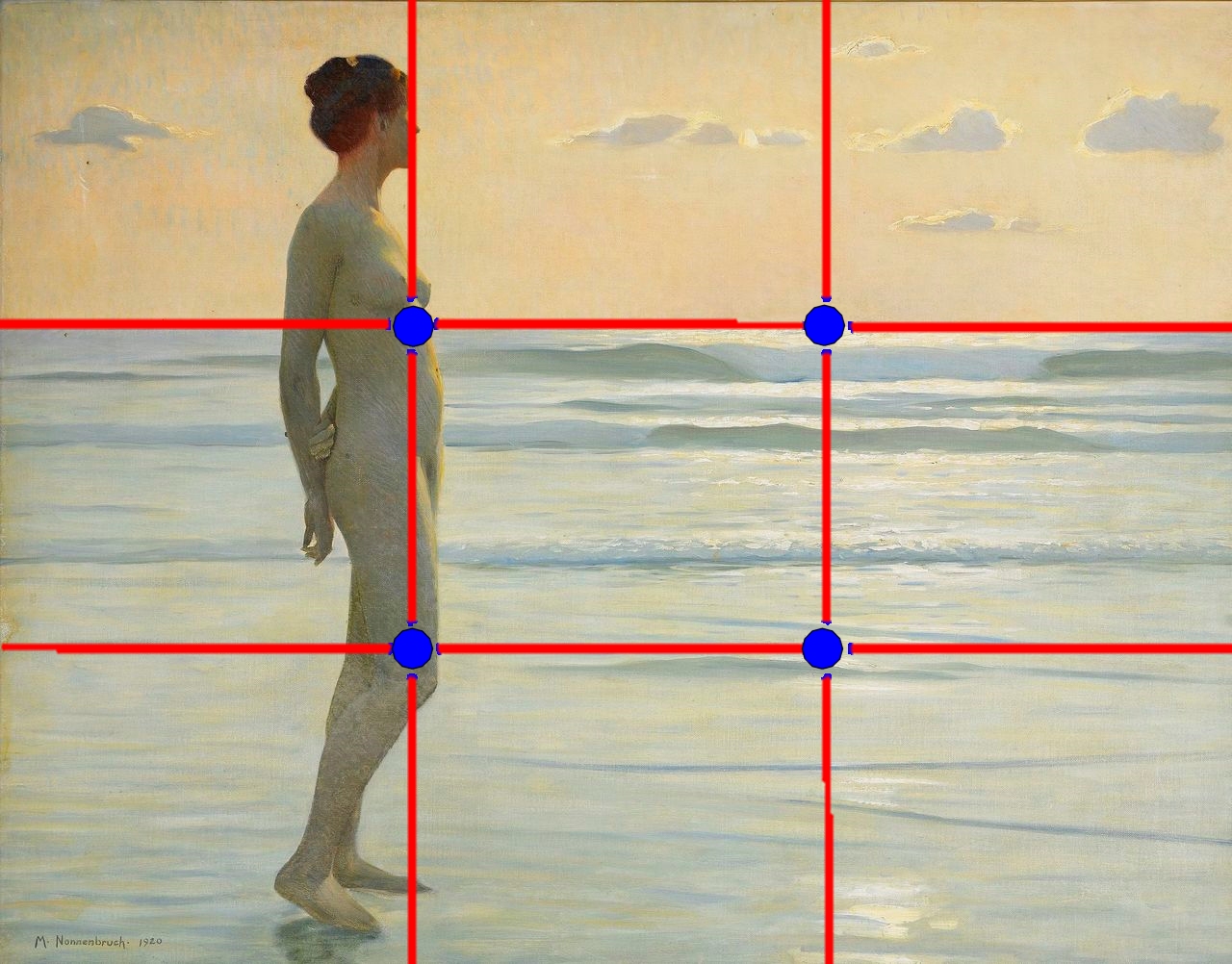 The earliest documentation of the rule of thirds was from 18th-Century painter, engraver, and writer John Thomas Smith with his 1797 book, Remarks on Rural Scenery. In a chapter titled Of Light and Shade, Smith discusses a work by Rembrandt in which “two-thirds of the picture are in shadow.” He writes, “Two distinct, equal lights, should never appear in the same picture: One should be principal, and the rest subordinate, both in dimension and degree: Unequal parts and gradations lead the attention easily from part to part, while parts of equal appearance hold it awkwardly suspended, as if unable to determine which of those parts is to be considered as the subordinate.” Smith goes on to state, “Analogous to this “Rule of thirds”, (if I may be allowed so to call it) I have presumed to think that, in connecting or in breaking the various lines of a picture, it would likewise be a good rule to do it, in general, by a similar scheme of proportion; for example, in a design of landscape, to determine the sky at about two-thirds ; or else at about one-third, so that the material objects might occupy the other two : Again, two-thirds of one element, (as of water) to one third of another element (as of land); and then both together to make but one third of the picture, of which the two other thirds should go for the sky and aerial perspectives. This rule would likewise apply in breaking a length of wall, or any other too great continuation of line that it may be found necessary to break by crossing or hiding it with some other object : In short, in applying this invention, generally speaking, or to any other case, whether of light, shade, form, or color, I have found the ratio of about two thirds to one third, or of one to two, a much better and more harmonizing proportion, than the precise formal half, the too-far-extending four-fifths—and, in short, than any other proportion whatever.”
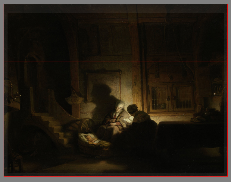
“De Heilige Familie bij Avond” (The Holy Family at Night)-formerly titled “The Cradle” by Rembrandt Harmenszoon van Rijn. You will see that John Thomas Smith does nothing to call attention to the actual intersections of these divisions (as opposed to the emphasis on the armature intersections found with heuristic today) but that a general proportion motif of 2:1 should be favored. Unfortunately, there is no good evidence for either. In any case, the genesis of this particular heuristic unfolds as most do: an observed correlation between arbitrary variables within a celebrated work is treated as causation.
So is there any communicative or aesthetic merit to this heuristic?
Fortunately for contemporary artists, there are some brilliant minds using scientific methodologies as well as current technologies to test these long-standing heuristics. In 2014, Psychologists Stephen Palmer and William Griscom, and research assistant Yurika Hara presented “Why the “Rule of Thirds” is Wrong” at the at the Vision Sciences Society Annual Meeting. Here is the abstract from that effort:
“Perhaps the best-known prescriptive rule of pictorial composition is the “rule of thirds” (ROT), which posits that: (a) the best positions for the focal object within a rectangular frame lie along the vertical and horizontal lines that divide the frame into thirds, with maxima at the four intersections of these third-lines, and (b) the worst positions lie along the vertical and horizontal axes of symmetry, with the minimum being at the frame’s center. We tested these predictions by measuring people’s preferences for placement of a single object at the nine points defined by the 3×3 grid of intersections among the horizontal and vertical third-lines and symmetry-axes. We measured forced-choices between two pictures of the same object (fish/dog/eagle) facing in the same direction (forward/leftward/rightward) at all possible pairs of positions in the 3×3 grid. The results strongly contradicted both of the ROT’s main claims.”
Additional studies related to the Rule-of-Thirds (ROT):
Sammartino, J., Palmer, S.E. (2012). Aesthetic issues in spatial composition: Effects of vertical position and perspective on framing single objects. Journal of Experimental Psychology: Human Perception and Performance, 38(4), 865-879.
Palmer, S. E., & Gardner, J. S. (2008) Aesthetic issues in spatial composition: Effects of position and direction on framing single objects. Spatial Vision, 21, 421-449.
Palmer, S. E., & Guidi, S. (2011). Mapping the perceptual structure of rectangles through goodness-of-fit ratings. Perception, 40(12) 1428-1446.
I would like to take a moment to mention that the many spin-offs of the rule-of-thirds—like the rule-of-fifths, sevenths, elevenths, or whatever, are just as misguided as the original. Aside from possibly being useful in encouraging artists to consider off-center focal-object locations when those placements “work” in the context of the entire image, they hold no independent communicative or aesthetic advantage.
So why do so many believe that the rule-of-thirds (ROT) heuristic is effective? They do so for the same reason that people believed that rats could spontaneously generate from garbage. For centuries, people based their beliefs on their interpretations of what they saw going on in the world around them without testing their ideas to determine the validity of those beliefs — in other words, they didn’t use the scientific method to arrive at answers to their questions. Rather, their conclusions were based on intuition and untested observations. Now it should be stated that much of scientific evidence is based upon a correlation of variables, however, scientists are careful to point out that correlation does not necessarily mean causation. The assumption that A causes B simply because A correlates with B is often not accepted as a legitimate form of argument. There are many instances where we find effective communication and pleasing aesthetic qualities within an image that seems to adhere to the ROT heuristic. But again, coincidence and correlation are not necessarily evidence for causation.
Here are a few pictorial biases supported by empirical research which shows how the ROT may seem to “work” in some instances, but not others:
Inward Bias: Studies have demonstrated that when an object with a salient “front” is placed nearer the border of a frame than a center, observers tend to find the image more aesthetically pleasing if the object faces inward (toward the center) than if it faces outward (away from the center) (Chen et al., 2014) . I believe that this may have much to do with the idea of understanding our brain as a “prediction machine”. Again, “A still photograph of an object in motion may convey dynamic information about the position of the object immediately before and after the photograph was taken (implied motion)” -(Kourtzi and Kanwisher, 2000). If we can see more of where an object may be “headed”, we can make a better prediction about a future state of the objects being observed. This bias can sometimes seem to reconcile with rule of thirds just as it appears to in the above picture of a figure in a snowy field.
Center Bias: In studies regarding front-facing subjects, preference was greatest for pictures whose subject was located at or near the center of the frame and decreased monotonically and symmetrically with distance from the center (Palmer, Gardner & Wickens, 2008). The reason that people prefer the object’s salient front region to be as close to the center as possible may result from a number of factors. The greatest influence MAY come from the way in which we usually engage with what we see as a front-facing subject. This center bias may reflect an advantageous viewing position for extracting information from such scenarios. I would like to note here that center bias is not the same that as central fixation bias. They may be related in some way, but not in a way that I can show support for at this time. Central fixation bias is a tendency for observers to begin an exploration of a visual scene at the center. Numerous visual perception experiments have borne this out (e.g., Buswell, 1935, Mannan et al., 1995, Mannan et al., 1996, Mannan et al., 1997, Parkhurst et al., 2002 and Parkhurst and Niebur, 2003). The prevalence of central fixation bias suggests that it is a key feature of scene viewing, but the basis of this effect remains poorly understood. In any case, the center bias contradicts the ROT’s main claims.
It should be noted here that current research has shown both center and inward biases to influence preferences in the vertical dimension as well (Sammartino and Palmer, in press). Additionally, vertical preferences have been shown to be consistent with an ecological bias toward its viewer-relative position in the environment (Sammartino & Palmer, 2011).
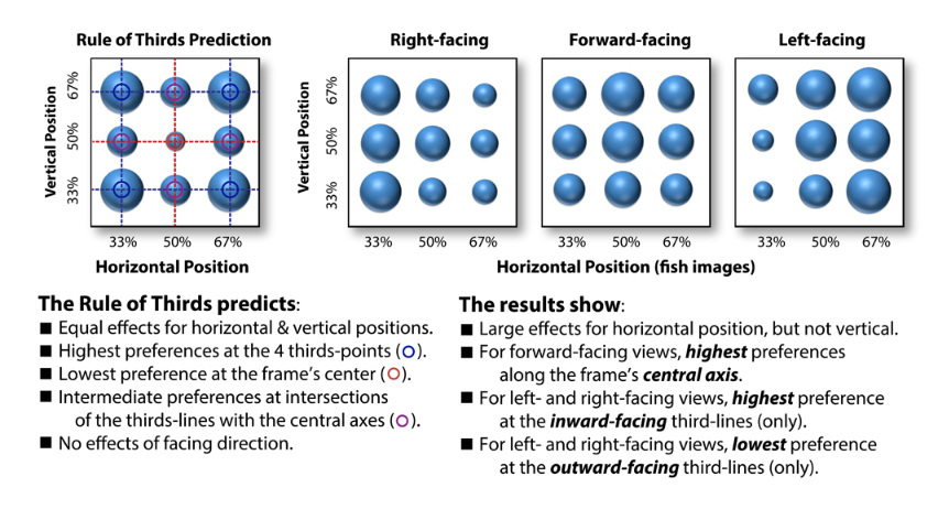
Adapted from the 2014 VSS Poster (How the “Rule of Thirds” is Wrong: Let us Count the ways) by Stephen E. Palmer, Yurika S. Hara, & William S. Griscom.
Goodness-of-Fit: Psychologist Rudolph Arnheim, author of the Power of the Center: A Study of Composition in the Visual Arts, claimed that the center was the most “balanced and stable” point in the framed space. Personally, I am not one to reference the seemingly nebulous principles of the Gestaltists (principles defined by subjective terms like “good”, “simple” or “stable”), but Arnheim’s work inspired subsequent research that may be insightful.
Numerous studies have shown that balance around the center of a rectangular frame plays a crucial role in spatial composition, as measured in a variety of different tasks,including participant-controlled adjustments of pictorial elements (Locher et al., 1998; Puffer 1903), explicit judgments of balance (McManus et al., 1985; Locher et al., 2005), and explicit judgments of aesthetic preference (Bertamini et al., 2011; Palmer et al., 2008)
In 2012, researchers Stephen E. Palmer and Stefano Guidi studied what they called “goodness-of-fit ratings” with circles at different positions in rectangular frames. Their experiments demonstrated that the “best-fitting” position was reported at the center, followed by positions along the global symmetry axes. The next “best” was along local symmetry axes located at the corners of the frame. The poorest fit was at asymmetric positions, like those that are deemed “ideal” with the contemporary application of the ROT.
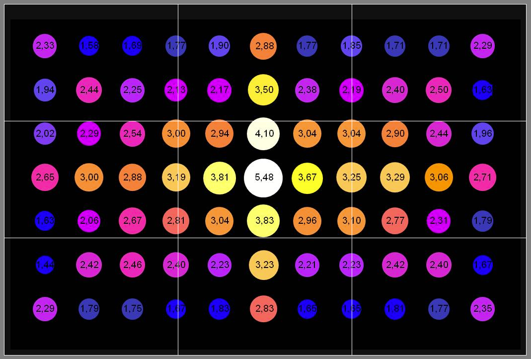
Adapted from the 2014 VSS Poster (How the “Rule of Thirds” is Wrong: Let us Count the Ways) by Stephen E. Palmer, Yurika S. Hara, & William S. Griscom. Experimental results by Palmer and Guidi (2008) using a “goodness of fit” rating task show that the structural skeleton of a rectangular frame are the preferred location with the center being the most potent location (the point of intersection of its vertical and horizontal axis of symmetry). The rule-of-thirds armature is shown in white.
So as we can see, there is no real evidence to support the idea that element placement along the axes or intersections of the ROT (or related armatures) is communicatively or aesthetically advantageous. In fact, current evidence seems to support the exact opposite. What we do find is that general placement preferences are sensitive to an object’s function or ” facing” direction. This may sometimes coincide with the armature of the ROT–but the ROT is as responsible for the resulting preferences as garbage was for the spontaneous generation of rats (or maybe even a tad less.) Furthermore, it seems that many compositional preferences seem driven by affordance spaces (functional regions around objects) that can facilitate better prediction tasks. This is something to keep in mind as our journey continues.
Up next: Jay Hambidge’s Dynamic Symmetry and The Golden Ratio.
RESOURCES:
Bertamini, Marco, Kate M. Bennett, and Carole Bode. “The anterior bias in visual art: The case of images of animals.” Laterality: Asymmetries of Body, Brain and Cognition 16.6 (2011): 673-689.
Buswell, Guy Thomas. “How people look at pictures: a study of the psychology and perception in art.” (1935).
Chen, Yi-Chia, and Brian J. Scholl. “Seeing and liking: Biased perception of ambiguous figures consistent with the “inward bias” in aesthetic preferences.” Psychonomic bulletin & review 21.6 (2014): 1444-1451.
Hawkins, Jeff, and Sandra Blakeslee. On intelligence. Macmillan, 2007.
Kourtzi, Zoe, and Nancy Kanwisher. “Activation in human MT/MST by static images with implied motion.” Journal of cognitive neuroscience 12.1 (2000): 48-55.
Locher, Paul, Kees Overbeeke, and Pieter Jan Stappers. “Spatial balance of color triads in the abstract art of Piet Mondrian.” Perception 34.2 (2005): 169-189.
Locher, Paul J., Pieter Jan Stappers, and Kees Overbeeke. “The role of balance as an organizing design principle underlying adults’ compositional strategies for creating visual displays.” Acta Psychologica 99.2 (1998): 141-161.
Linsen, S., Leyssen, M. H., Sammartino, J., & Palmer, S. E. (2011). Aesthetic preferences in the size of images of real-world objects. Perception, 40(3), 291-298.
Mannan, S., K. H. Ruddock, and D. S. Wooding. “Automatic control of saccadic eye movements made in visual inspection of briefly presented 2-D images.” Spatial vision 9.3 (1995): 363-386.
Mannan, Sabira K., Keith H. Ruddock, and David S. Wooding. “The relationship between the locations of spatial features and those of fixations made during visual examination of briefly presented images.” Spatial vision 10.3 (1996): 165-188.
Mannan, Sabira K., Keith H. Ruddock, and David S. Wooding. “Fixation patterns made during brief examination of two-dimensional images.” Perception 26.8 (1997): 1059-1072.
McManus, I. C., D. Edmondson, and J. Rodger. “Balance in pictures.” British Journal of Psychology 76.3 (1985): 311-324.
Palmer, Stephen E., Jonathan S. Gardner, and Thomas D. Wickens. “Aesthetic issues in spatial composition: Effects of position and direction on framing single objects.” Spatial vision 21.3 (2008): 421-449.
Palmer, Stephen, Yurika Hara, and William Griscom. “Why the Rule of Thirds is Wrong.” Journal of Vision 14.10 (2014): 367-367.
Palmer, Stephen E., and Stefano Guidi. “Mapping the perceptual structure of rectangles through goodness-of-fit ratings.” Perception 40.12 (2011): 1428-1446.
Parkhurst, Derrick, Klinton Law, and Ernst Niebur. “Modeling the role of salience in the allocation of overt visual attention.” Vision research 42.1 (2002): 107-123.
Puffer, Ethel D. “Studies in symmetry.” The Psychological Review: Monograph Supplements (1903).
Rock, David. Your brain at work. New York: Harper Business, 2009.
Sammartino, J., Palmer, S.E. (2012). Aesthetic issues in spatial composition: Effects of vertical position and perspective on framing single objects. Journal of Experimental Psychology: Human Perception and Performance, 38(4), 865-879.
Smith, John Thomas. Remarks on Rural Scenery. Nathaniel Smith, 1797.
Tatler, Benjamin W. “The central fixation bias in scene viewing: Selecting an optimal viewing position independently of motor biases and image feature distributions.” Journal of Vision 7.14 (2007): 4-4.
Yarbus, A. (1967). Eye movements and vision (B. Haigh & L. A. Riggs, Trans.). New York: Plenum Press
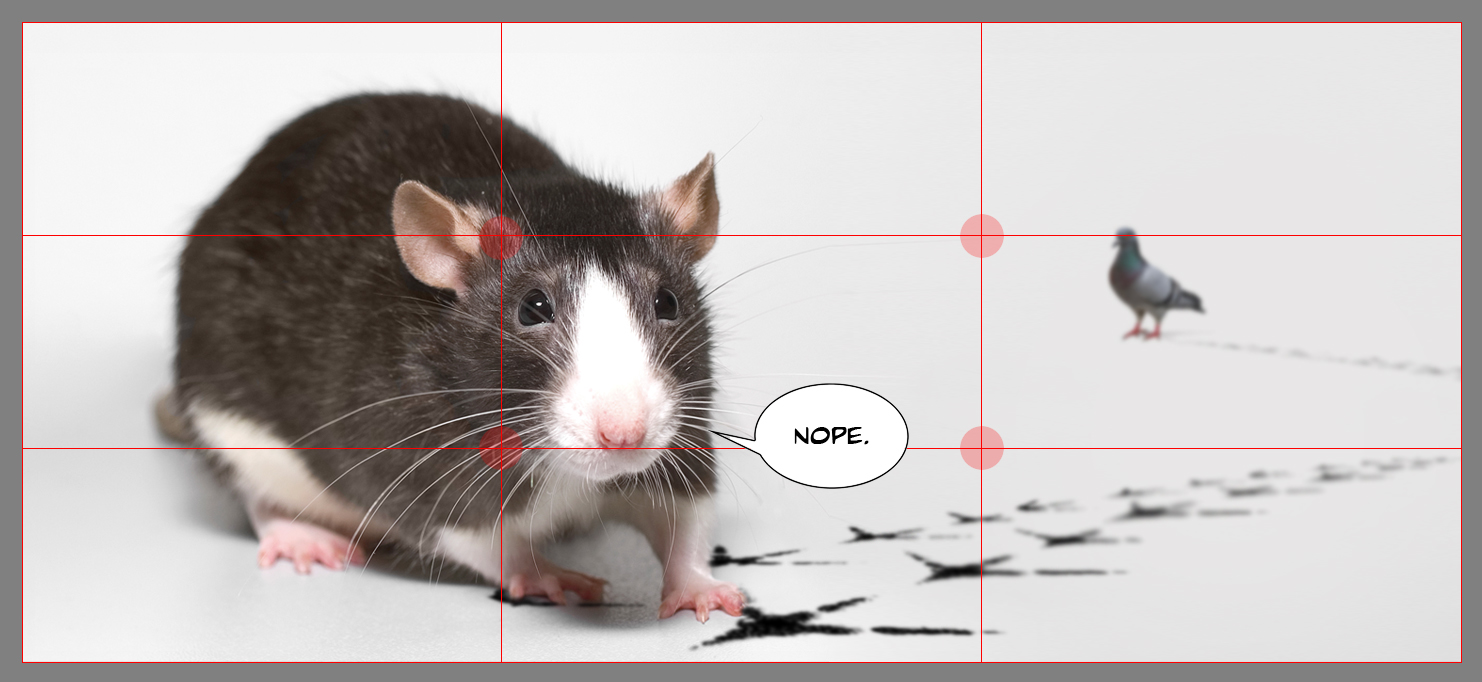
And in case you were wondering…


Excellent article! The whole series is a pleasure to read. Looking forward to the next part.
Thank you Eva! I’m very glad to know that you enjoyed the series. More on the way soon! Best wishes~~~
I’m not quite sure how to say this; you made it exltemery easy for me!
I’ve been wondering about this ratio for a while too and I think it’s explainable in some sense due to culture, not just because someone mentioned it in some treaty. You find all sorts of “magical” or mythical numbers in literature, specifically 3 and 7… I remember those days in school when we had to analyze novels and such… fun times. But I digress. Recently I’ve seen a Ted talk about music. What is music, to be more precise and what makes music likable (https://www.youtube.com/watch?v=LadUft_ly50). Much like what makes illustrations and paintings likable, the main elements (aside from storytelling to a higher extent in paintings – i.e. prediction and forecast abilities of the brain) are portrayed through the balance between order and disorder (which in case of music leads to repetition). I’m not sure how much science is used in the talk, but I can’t help but notice a lot of similarities with some of the topics discussed in the articles here. And this is where I think a connection with the “rule of thirds” is. This simple heuristics helps in defining a frame for oneself to restrain from steering too much from the central position of this spectrum between order and disorder (that the guy is talking about in his Ted talk). And why people think it works for placement in picture as well as ratios for other elements such as noise and smoothness or land, sea, sky etc. So in the end what I’m trying to say is that I definitely don’t see the rule of thirds as an explanation for why we might like the things we like, but could be used as a tool to refrain oneself from straying too much on the extremes of the spectrum especially at the beginning level. Would I ever want to see it included in curriculum? No, definitely not, I’d much rater have an education based on science. ONly place where I’d see it fit is in the “history” or “development” of art in human society.
That a brilliant thought on the matter Razvan (and thank you for the TED share as well!) And yes, I do completely agree—by all means, the ROT should be taught in an art-history context. It is a fascinating example of how we all work to make sense of the world as well as an activity as complex as the “art experience.”