

Electron microscopes have become invaluable tools in the realm of scientific exploration, offering researchers unprecedented insight into the intricate world of the “nanoscale.” Electron microscopy offers a better resolution than traditional (light) microscopes and can reveal the structure of smaller objects not usually seen by the latter. This is because the wavelength of electrons is up to 100,000 shorter than visible light photons. Electron microscopes have a high resolving power, 250 times that of light microscopes, and magnify objects by 100,000 to 300,000 times. The image above, which might appear to be an overhead view of giant rocks, is actually an SEM-produced image of very small crystals. The scale bar in the image might allow you to better appreciate just how intimately we can explore these crystals (with 100 µm being 1/10 of a millimeter.) Pretty neat, eh?
Now, some of you may be able to identify the material or substance represented in the image above from the information shared thus far. However, let me offer a few more clues for those who do not.
I’ll start by sharing that the substance represented here is a water-soluble compound that is among the simplest group of carbohydrates. Its molecular structure is composed of 12 atoms of carbon, 22 atoms of hydrogen, and 11 atoms of oxygen (C₁₂H₂₂O₁₁.)
Still unsure? Perhaps it will help if I also add that it generally appears as a crystalline solid, has a molecular weight of 342.30 g/mol., and has a density of 1.59 grams per milliliter. Can you be reasonably sure yet?
Ok then, what if I put aside all the “sciencey” physical descriptions and just told you that what we are looking at is an SEM image of a small, water-soluble crystal that’s sweet?
Ahhhhhh, there it is; it’s just plain old everyday sugar. And while the SEM image is absolutely fascinating to me, the more fascinating aspect here arises from the little identification exercise itself. It is found with the fact that the majority of people reading this might agree that the key piece of information for confident, successful identification here was not a physical property of the substance in question but rather an organoleptic one. An organoleptic property is a property that is capable of acting on or involving the use of an organism’s sense organs. In other words, sweet does not exist “in” the sugar itself; rather, sweet is a description of the experience that arises from a particular neural cascade that can result when sugar crystals come in contact with the appropriate receptors on the tongue. To be clear, regardless of how closely today’s electron microscopes (or future devices, for that matter) can allow us to peer into the “nanoverse,” we will never be able to uncover or find “sweet” in the sugar itself in the same way we can find the length, mass, temperature, or amount.
A significant factor contributing to the idea that sweet is indeed a physical property of sugar is a bias known as the “mind projection fallacy.” This bit of naive intuition occurs when individuals assume that their subjective perceptions or beliefs about the world are actually inherent properties of an external reality. In other words, they project their own mental states onto the world around them, mistaking their subjective experiences for the objective, physical properties of the environment. This bias can prove quite useful as a heuristic for us in many contexts but can also lead us to some problematic conclusions when we set out to better understand the world around us.
One specific arena of human experience that tends to be rife with projection practices is visual perception. Our visual system operates in such a way that subjective experiences often serve as the basis for seemingly reasonable conclusions about the nature of the real world. And few aspects of perception do this, as well as “color.”
Color and its relationship to “mind projection” came up recently for me due to a discussion connected to a social media post regarding color. Specifically, it was the assertion that black or white were not technically colors. I, of course, countered the assertion in the discussion only to find a number of messages from people who supported the “not colors” position. The discussion continued for a bit and eventually led to several concluding that both positions could be correct. In this scenario, correctness was determined by how one chose to define color itself. Unfortunately, this idea is only trivially true in the sense that the truth of something like x=2 will always depend upon how we define x. And while this trivial truth can indeed help us to appreciate the nature of the disagreement a bit better, it doesn’t mean that an objectively correct answer in not in the cards.
Furthermore, there is an additional consideration connected to the usage or definition of the “x” in my example here that must be acknowledged. While a specific definition for a phenomenon may offer great utility in certain contexts, it may be demonstrably problematic in others. For example, take the simple statement, “Unicorns exist.” Many facing this statement would be quick to contradict this with the fact that all available evidence would suggest otherwise. Similar to the conversation about black, white, and color, a trivial truth is that it depends on how you define the term unicorn. If we define it as a feature of a story, the word itself, or as a general concept, we can indeed argue existence reasonably well. Unfortunately, though, these arguments do not address the concept or idea that most would have in mind when addressing the statement, “Unicorns exist.” Similarly, I will show that the arguments put forward in support of the position “black and white are not colors” utilized definitions for color that, while highly useful in various contexts, were ultimately phenomenon-adjacent. The difficulty here is further compounded in that the context-dependent, more useful definitions also hold a strong appeal to our mind projection bias, so they seem even more intuitively correct. So, let’s see if we can forge a path to reveal what we’re really talking about when we are trying to resolve whether or not black and white are colors. In other words, let’s productively hunt down our own unicorn.

Color is defined in various ways across many different contexts and disciplines. As one might expect, preferred usages of the term are governed by contextual utility—one that often includes an appeal to our penchant for projection. As such, many useful definitions tend to regard color as a property of our environment. To be fair, such usages do allow us to navigate otherwise overly complex interactions in a far simpler way. But, as is common with practices that favor utility over what is the case, carrying a convenient fiction into different contexts can quickly get you into an inconvenient bind.
In an effort to save some time, I am going to forgo a good number of possible definitions for color. I will instead focus on a select few common categorical definitions/usages that seem most relevant. Thankfully, artist and psychologist Bruce MacEvoy spells out four such categorical definitions/usages that are applicable to the topics of visual arts on his amazing all-things-color resource, Handprint.com. His list includes material color, radiant color, visual color, and conceptual color, and are basically as follows:
- Material Color: the physical pigment, dye, filter, pigmented or dyed material, or light source that originates the experience of color. Artists very often speak of “mixing different colors” or of “choosing colors for a painting,” and what they are talking about is material color (pigments).
- Radiant color: the mixture of light wavelengths emitted by a light source, or transmitted by a filter or other semitransparent medium, or reflected from an opaque material such as paint, ink, dye, or photographic emulsion. This defines color very narrowly, as a physical stimulus independent of any other lights or surfaces around it. …Radiant color is not equivalent to the material color of a pigment, dye, or filter: we never experience material color directly, but only through the radiant color it creates.
- Visual color: the perception of radiant color in a specific viewing context — usually as a physical surface in a specific place under a specific intensity and color of illumination.
- Conceptual color: an abstract concept, a sensory memory, a color label that calls to mind a visual or material color that is not present as a physical exemplar or as a visual perception. It is color defined primarily through language, memory, custom, and habit.
You might immediately notice that all of these definitions regard color as something very different: a physical material, a form of energy, something we can perceive, and a concept or memory. But with all of this utility, does any usage here actually describe the phenomenon itself? Do any of these address what someone means by “red” when they point to a Liberty apple and say, “That is red.”?

The material and radiant energy categories here define color as the organoleptic properties of various materials and as an energy, respectively. Again, the properties may, in their own way, be responsible for eliciting a color experience, but neither IS the actual phenomenon of color any more than the phenomenon of “sweet” IS the sugar discussed above. Even though the use of color to describe a material or energy can be super useful in our day-to-day lives, defining color itself as something that can exist independently of appropriate biology is something we have known to be a convenient fiction for some time. In his 1623 publication, The Assayer, Italian polymath and grandfather of modern science Galileo Galilei wrote:
“I think that tastes, odors, colors, and so on are no more than mere names so far as the object in which we locate them are concerned and that they reside in consciousness. Hence, if the living creature were removed, all these qualities would be wiped away and annihilated.“
Galileo Galilei 1623
The definition of color as “visual color” is another common one that almost, in my opinion, gets it right. It seems to be roughly headed towards the idea that color is an experiential phenomenon, but unfortunately, it intertwines the concept with detection tasks or abilities (again suggesting that color is “out there” in the world (e.g., radiant) somewhere waiting for us to see it.) As I have mentioned earlier, all available evidence suggests that the claims of color materialism remain wholly unsupported.
The last categorical usage here is color as simply a concept, sense memory, or label. And even though each usage again carries contextual advantage, none offer great insight beyond our ability to conceive of, recall, and communicate aspects of the phenomenon. It should go without saying that the concept, memories, and labels of a thing are not necessarily the thing itself. Furthermore, the phenomenon of color experience must necessarily precede any sense memory or concept. Both of these statements, while potentially trivial truths, seem necessary to put forward here as the phenomenon under investigation and the concepts, memories, and associated labels of that phenomenon do share domain.
So, what do I feel most successfully defines the phenomenon? What do we really mean when we point to that Liberty apple and describe it as “red?”
It is this: Color is a particular set of visual experiences that can be described by assigned attributes of hue, value (lightness/brightness), and chroma (saturation.) Most often, the experience of color is associated with the first-person view of the neural activity that arises when our visual system encounters a specific range of electromagnetic radiation in the environment. However, such experiences are not limited to light exposure alone, as color may accompany dreams, visualizations, hallucinations, anomalies (e.g., synesthesia), etc. In a 2018 paper titled Human V4 Activity Patterns Predict Behavioral Performance in Imagery of Object Color by Bannert and Bartels, the researchers write,
“Many humans experience color not only when visually exploring the outside world, but also in the absence of visual input, for example when remembering, dreaming, and during imagery.”
Bannert and Bartels
I feel that with all the available evidence, my chosen definition of color above is the most successful in terms of specificity and in describing what is actually the case regarding what many experience and project. It does not define color as stimuli that may elicit the experience or the organoleptic properties of such stimuli. It identifies color as what it is—a perceptual experience.
With all of that said, here’s my argument presented in a simple syllogistic structure for black and white as colors:
- All visual experiences that can be described in terms of the assigned attributes of hue, value, and chroma are colors.
- Black and white are visual experiences that can be described in terms of the assigned attributes of hue, value, and chroma.
- Therefore, black and white are colors.
The structure of this argument is valid. The information included in this writing up to this point was presented so that the reader can confirm soundness (i.e., the premises are demonstrably true.) As such, we must accept the conclusion that, yes, both black and white are indeed colors.
Some might be quick to interject here that black and white fall short, though, in terms of possible description via the assigned attribute of hue (and, thus, potentially chroma.) However, while it is true that difficulty in discerning hue or chroma in some contexts might see the observer describe an attribute as “contextually indiscernible”, or assigning it of a metaphorical value of “zero,” such an assignment in this context would still qualify as a description. Here’s a metaphor that might help one to better understand why:
Borrowing from Donald Hoffman’s interface model of perception, let’s imagine that our perceptual experience of the world is essentially equivalent to icons on a computer desktop.
Now, let’s say that each icon on this simplistic hypothesized desktop is composed of smaller units that we will call colors. Each color unit is built from three distinct subunits capable of a unique range of activity that we can measure from 0 to 100%. The configuration of activity levels among the three subunits is what gives rise to a singular color output for each unit. (For our “math people,” this would mean that each subunit has 101 activity level possibilities (0 to 100%), so the total subunit activity combinations = 101 * 101 * 101, or 1,030,301 possible unit outputs, or for purposes of this metaphor, colors.) What we need to acknowledge is that for an operational, functioning system as described here, outputs generated from subunit activities that can be described as 0,0,0 and well as 100,100,100 are still valid, potentially contributory outputs and, thus, still qualify as colors.
Ok, moving on… Additional arguments did come in supporting my position, offering support due to the fact that the colorants exist that carry labels of black and white. While this strategy can get you to the same conclusion that my argument arrives at—it generates the conclusion for not-so-right reasons. Yes, colorants exist that carry the labels of black and white, but again, they are not the colors themselves but rather materials that have organoleptic properties that may contribute to the occurrence of the phenomenon. Still, I want to point out that the existence of such colorants is not completely inconsequential here. The existence and usage of colorants specifically designed to elicit visual experiences that can be described in terms of hue, value, and chroma attributes, which we label as black and white, reinforces my general argument above for both colors.
The vast majority that argued against black and white as colors, citing webpage after webpage strewn across dem good ‘ol internets, put forward the argument that instead of being colors, black and white were, in actuality, the absence of color and the sum of all colors, respectively. This argument is what happens when you pull a contextually advantageous usage from its home context into another. Yes, we often have visual experiences that we describe as black and white, which may result from our engagement with certain environmental energies or lack thereof. But again, these energies are not the colors themselves, even though contexts do exist in which we can refer to them as such. These energies have organoleptic properties that can lead to experiences we describe as color, but once again, they themselves are not color. White, like black, like all other colors, is a visual experience that can be described in terms of hue, value, and chroma attributes. Again, as I have acknowledged earlier, it is true that contexts do exist where an assigned attribute of hue and chroma may seem less discernable. However, such special case experiences can still be described relative to all three assigned attributes. It’s important to acknowledge that a visual experience that can be described using assigned attributes of hue, value, and chroma, even if those descriptions reflect a theoretical basement or ceiling, is still a color in the same way that absolute zero is still a temperature.
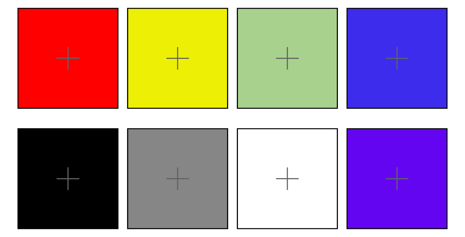
One simple way to demonstrate to yourself that your responses of black, white, and the many colloquial shades of grey in between are categorically equivalent to responses to other colors is to look at the phenomenon of afterimages. An afterimage is a visual effect that persists after the stimulation has ceased. The effect is produced by exposing the eye to a primary stimulus — i.e., adapting it to a specific exposure of known duration, intensity, and spectral composition — and, upon stimulus offset, directing the gaze at an appropriate surface for viewing. The afterimage generally appears as the color complementary to that of the primary stimulus — a subjective experience for which the color-coded units discovered in the retina and LGN appear to provide the basis. To experience this, simply select a target square below and stare at the cross at its center for 30 seconds. Then, turn away, looking to a light, homogenous area of your environment, and you’ll see the complimentary afterimage for a short duration of time. Each target below can indeed generate an afterimage. (Clicking the image below will open it larger in a new tab. Depending on the image size for your viewing, you may see several or all of the target afterimages represented.)
Indeed, many more valid arguments could be made FOR defining black and white as colors aside from the material existence of colorants holding such labels, research into the history of basic color terms (See Berlin and Kay), the existence of “structural color,” and more. However, I feel that the argument that I chose to present here is the most successful in resolving the question in a valid and sound manner (and it does so by directly addressing the core nature of color as well as attempting to separate it from the influence of projection, organoleptic properties, and other proxies.) In any case, I hope that you find this paper helpful in your navigation of this issue (and I sincerely hope that this knowledge will make you more popular at the next party you attend. LOL!)
Happy Painting!
To read much more about the many aspects of color, including the science and philosophy that have given us the insights we have today, I recommend visiting:
Stanford Encyclopedia of Philosophy (Color): https://plato.stanford.edu/entries/color/
Handprint: https://www.handprint.com/HP/WCL/wcolor.html
Dimensions of Color: https://www.huevaluechroma.com/index.php