Note: It is highly recommended that you read So What’s With Jane already? A Primer on Pictorial Composition. (Part I) , “To the makers of music – all worlds, all times.” A Primer on Pictorial Composition. (Part II) , Henri Breuil and Alfred Yarbus Walk into a Bar…A Primer on Pictorial Composition. (Part III), A Spurious Affair. A Primer on Pictorial Composition. (Part IV), and Fool’s Gold. A Primer on Pictorial Composition. (Part V), before embarking on this installment.
“The trouble with organizing a thing is that pretty soon folks get to paying more attention to the organization than to what they’re organized for.” -Laura Ingalls Wilder
Of the many issues that call into question the validity or functionality of a compositional “device”, the absence of a biological or psychological basis for the device’s aesthetic, communicative or perceptual attributes is by far the most significant. While some may argue that this absence of evidence is not evidence of absence, or that our current understanding of the issue is merely a provisional truth—the same arguments can be used as support for the existence of leprechauns or Bigfoot.
One area of psychology that many HAVE attempted to use as a basis for a salvo of nebulous compositional heuristics is the Gestalt principles of perceptual organization. I’ll share my thoughts on why this area of study seems to be a “go-to” for many fans of the famously-unsubstantiated, but first, let me explain a bit about the Gestalt principles or “laws” of perceptual organization.
The Gestalt school of psychology was founded in the 20th century and has provided the foundation for the modern study of perception. Gestalt theory emphasizes the ideas that that the whole of anything is greater than its component parts and that the attributes of the whole are not deducible from analysis of the parts in isolation. Gestalt is a German word that roughly translates to “shape, form, whole, figure, configuration, or appearance.”
The earliest Gestalt work focused on the perceptual organization of visual elements and seemed to revolve around a fundamental principle dubbed prägnanz (German for pithiness or succinctness), which states that we tend to order our experience in a manner that is regular, orderly, symmetrical, and simple. In other words, the neural and perceptual organization of any set of stimuli will form as good a “Gestalt”, or whole, as the prevailing conditions will allow.
In his book Vision Science, psychologist and researcher Stephen E. Palmer writes, “Max Wertheimer, one of the founding fathers of Gestalt psychology first posed the problem of perceptual organization. He asked how people are able to perceive a coherent visual world that is organized into meaningful objects rather than the chaotic juxtaposition of different colors that stimulate the individual retinal receptors.” Palmer goes on to state that “Wertheimer’s initial assault on the problem of perceptual organization was to study the stimulus factors that affect perceptual grouping: how the various elements in a complex display are perceived as “going together” in one’s perceptual experience.” The first organization principle, or “law”, to emerge from this line of investigation was proximity. This principle states that elements tend to be perceived as aggregated into groups if they are near each other. It was an easily demonstrable effect and would soon lead to several others including:
Similarity—elements tend to be integrated into groups if they hold similar attributes.
Closure—elements tend to be grouped together if they are perceived as parts of a closed figure.
Symmetry—when two symmetrical elements are unconnected the mind perceptually connects them to form a coherent shape.
Common Fate—elements tend to be perceived as grouped together if they move together.
Continuity—elements of objects tend to be grouped together, and therefore integrated into perceptual wholes if they are aligned within an object.
Good Gestalt—elements of objects tend to be perceptually grouped together if they form a pattern that is regular, simple, and orderly.
Past Experience—implies that under some circumstances visual stimuli are categorized according to past experience.
Figure–ground—the perceptual process of assigning regions of the visual field or specific contours to a foreground object or a surrounding background. Though this principle was embraced by the Gestaltists, it originated with Danish psychologist Edgar John Rubin.
While these principles are extremely useful in many contexts and continue to evolve in modern vision science, some current areas of study consider them to be redundant or uninformative. Modern developments in cognitive psychology and computational neuroscience have led many to conclude that Gestalt theories of perception are descriptive rather than explanatory in nature.
“The physiological theory of the Gestaltists has fallen by the wayside, leaving us with a set of descriptive principles, but without a model of perceptual processing. Indeed, some of their “laws” of perceptual organization today sound vague and inadequate. What is meant by a “good” or “simple” shape, for example?”-Bruce, Vicki, Patrick R. Green, and Mark A. Georgeson. Visual Perception: Physiology, Psychology, & Ecology. Psychology Press, 2003.
Much like how Fechner could not provide a psychological basis for the Golden Ratio preference, Gestaltists seemed unable to provide a substantiated neural basis for their principles of perceptual organization. This was not for lack of trying though. Gestalt psychologist Kurt Lewin developed the idea of “field-forces” that became part of Gestalt theory. This idea proposed that many aspects of perception and behavior can be explained by field-like forces of attraction and repulsion in the “behavioral environment”, or the internal perceptual copy of the external world. Unfortunately, the idea did not stand up to experimentation.
“A major determinant of perceptual organization for them was couched in terms of certain “field forces” that they thought operated in the brain. The Gestaltists maintained a Doctrine of Isomorphism, according to which there is, underlying every sensory experience, a brain event that is structured similar to that experience. Thus when one perceives a circle, a “circular trace” is established, and so on. Field forces were held to operate to make the outcome as stable as possible, just as the forces operating on a soap bubble are such that its most stable state is a sphere. Unfortunately, no evidence has been provided for such field forces…”-Bruce, Vicki, Patrick R. Green, and Mark A. Georgeson. Visual Perception: Physiology, Psychology, & Ecology. Psychology Press, 2003.
Another problematic aspect of the Gestalt principles of organization is their ‘ceteris paribus‘ (all other things being equal) clause. That is, each principle is supposed to apply given that the other principles do not apply or are being held constant. If two (or more) principles apply for the same input, and they favor the same grouping, it will tend to become strengthened; however, if they disagree, usually one wins or the organization of the percept is unclear. Palmer writes “The difficulty with ceteris paribus rules is that they provide no general purpose scheme for integrating several potential conflicting factors into an overall outcome–that is, for predicting the strength of their combined influences.”
In my experience, it seems more likely that the Gestalt principles of perceptual organization are simply a series of ad-hoc descriptors for what is better explained by the empirical ranking theory of vision presented earlier in this series. For example, we will indeed see a percept that contains the fruits of grouping by proximity, closure, or similarity if such a percept has served us well in the past. Again, the conceptual basis of this empirical ranking theory is that the percept elicited by any particular stimulus parameter corresponds not to a statistically determined value of the relevant qualities in the physical world, but rather to the relative frequency of occurrence of that particular stimulus parameter in relation to all other instances of that parameter experienced in the past. It’s true that gestalt theories include a past-experience principle, but it has historically remained one of the more “ignored” players on the bench.
So why do proponents of the “devices” like the Golden Ratio(GR), Dynamic Symmetry(DS) or the Rule-of-Thirds(ROT) seem to gravitate to Gestalt principles as their psychological basis for these devices?
Believe it or not, it is NOT something called the “phi phenomenon”. That’s right, in 1912 psychologist and Gestalt founder Max Wertheimer named the tendency to perceive a series of still images, when viewed in rapid succession, as continuous motion, the phi phenomenon. However, it seems that this naming was completely arbitrary and has nothing to do whatsoever with Phi or the Golden Ratio.
Rather, I believe that it is the ambiguity of Gestalt concepts like prägnanz and “good figure” that makes some pursue gestalt theory an attractive “psychological basis” for the GR/DS/ROT. Remember that prägnanz states that we tend to order our experience in a manner that is regular, orderly, symmetrical, and simple while the attributes of a good figure or form include stability, simplicity, ease of recognition, memorability, regularity, familiarity, unity, symmetry, balance, and proportion. It can be argued that the GR/DS/ROT inherently contains many of the attributes of “good form”–so does it follow that Gestalt theory supports that the GR/DS/ROT leads to good form? Not quite.
Whereas it may be relatively simple to point out the presence of Gestalt principles (proximity, continuity, closure, symmetry, etc.), or attach the subjective assignments of “good form”, we are ultimately left with vague descriptors and an absence of a means of practical measurement. Furthermore, while many can indeed attempt to hide the GR/DS/ROT in the nebulous forest of gestalt theory–modern vision science and empirical aesthetics quickly dispel the fog to reveal the concepts are still without adequate substantiation.
Much like the Gestaltists, designers have also come to recognize a set of organizing principles. These “design principles” are not to be confused with the visual elements presented in A Spurious Affair. A Primer on Pictorial Composition. (Part IV), (Line, Shape, Color, Texture, Value, Form, Space, Depth), but rather, the design principles are higher-order configurations of such visual elements. These principles include Balance, Movement, Repetition, Pattern, Rhythm, Variety/Contrast, Emphasis/Dominance-Subordination, Perspective, Harmony, and Unity. This list will indeed vary from one text to the next, but these principles seem to be among the most common.
Let’s take a closer look at each principle so that we may better understand how they may function in our compositional efforts.
Balance:
According to art theory, pictorial balance is a sense of equilibrium achieved through implied weight, attention, or attraction, created by manipulating the visual elements in an artwork. The balancing of elements is thought to be similar to balancing mechanical weights in a framework of symmetry axes. There are several different “types” of pictorial balance including symmetrical (even distribution of elements relative to a central axis), asymmetrical (irregular or uneven element arrangement), radial (elements arranged radially around a central point), ambiguous/neutral (equilibrium in spite of characteristically unclear element relationships or seeming randomness).
Many properties can contribute to the “visual weight” of an object. These attributes can include, “size (Berlyne 1966, 1971, 1974; Pierce 1894; Puffer 1903), color (Arnheim 1974; Bullough 1907; Pinkerton and Humphrey 1974), and perhaps coarse texture, contrast, and interest.”-Gershoni, Sharon, and Shaul Hochstein, “Measuring pictorial balance perception at first glance using Japanese calligraphy.” i-Perception 2.6 (2011): 508-527.
As with most other aspects of pictorial composition, our sense of balance is born from our own biology. Particular preferences can be traced back to specific biological mechanisms. For example, “Paintings and drawings are perceived differently when viewed in mirror image; left and right have different roles in expressing action, motion, or power (Chatterjee 2002), and the left half of visual space may attract more attention, due to right parietal lobe specialization in attention and emotion (McManus 2002). Similarly, using the ecological view that in natural scenes visual field bottom is generally more crowded, it was suggested that weight at the top should be perceived as “heavier” than at the bottom (Arnheim 1974, 1981).”-Gershoni, Sharon, and Shaul Hochstein. “Measuring pictorial balance perception at first glance using Japanese calligraphy.” i-Perception 2.6 (2011): 508-527.
Here are some of the findings from the Gershoni study above. They offers a wonderful insight into understanding “balance”:
“...We review here the most salient elements that seem to drive balance perception, leaving detailed study of these trends to further systematic study:
Horizontal and vertical elements. The most-balanced sets are composed mainly of horizontal and vertical elements. In the less-balanced stimulus sets the main feature is a lack of straight lines. This is consistent with the aesthetics oblique effect; for example, observers show aesthetic preference for Mondrian paintings oriented with vertical and horizontal elements over rotated versions with oblique elements (Latto and Russel-Duff 2002; Latto et al 2000; Plumhoff and Schirillo 2009).
Vertical mirror symmetry. In the more balanced images vertical symmetry is either maintained or, with grouping of a number of non-vertical elements, even enhanced. With 90° rotation there is a switch from vertical symmetry to horizontal symmetry. As a result, vertical symmetry may be violated and the image is perceived as less balanced. This effect is exacerbated for ±45° rotations, when the symmetry is around the diagonals. These results are consistent with previous studies that found vertical mirror symmetry salience compared with horizontal or centric mirror symmetry in a variety of object perception tasks and suggested that vertical mirror symmetry is used as a cue for figure–ground segregation and element grouping in a display of Gabor elements (Machilsen et al 2009; Wenderoth 1994, 1995). We now suggest that vertical symmetry is also a critical cue for perceived balance.
Imprecision of verticality and horizontality. According to Japanese calligraphy tradition, all seemingly horizontal lines are in fact either slanted or slightly arched. Yet they are satisfactorily perceived as horizontal. For example, in the very top set of Figure 10 the horizontal lines are curved mostly above or below the horizontal axis, yet are perceived as resting on the horizontal axis. This is in line with Arnheim’s (1974) observation that visual experience cannot be described in terms of precise property measurement units. For example, when people see a 93° angle they perceive “an inadequate right angle”. Likewise, almost perfectly parallel lines are as likely to be perceived as parallel or as not parallel (Kukkonen et al. 1996). Quasi-invariant properties such as near parallelism are influential in object recognition over novel viewpoints and rotations.”
While a sense of equilibrium may appeal to our preference for stability, an “unbalanced” composition may elicit a sense of tension and unease. Keep this in mind when you are considering how to incorporate “balance” into your compositions.
Movement:
While the idea of movement in a static image may initially seem counter-intuitive, there is much to garner from considering this principle. It should be pointed out though, that this principle is often misrepresented by some that are under the impression that our eye movements are governed by a natural tendency to follow lines. This is completely false. (See Yarbus, A. (1967). Eye movements and vision (B. Haigh & L. A. Riggs, Trans.). New York: Plenum Press.)
Here is one example of how Movement in static pictorial composition is often problematically discussed by starting with erroneous claims about vision: “Because the eye tends to move along lines, different types of lines create different feelings of movement. This effect is sometimes referred to as “vectors” and “kinetics.” Verticals go up and down to cooperate with or defy gravity; horizontals shift from side to side; diagonals cut across the scene with force and unresolved tension; curved lines, which continually change direction, present graceful flow or quick acceleration depending on their degree of bend; s-lines and zig-zags oscillate back and forth in either predictable or unpredictable fashions.” -John Suler’s Photographic Psychology: Image and Psyche.
Again, as seen in the work of Yarbus and others, while the contrast inherent to a line, or an implied line, may be attractive to one’s gaze, there is absolutely no evidence that eye movements “follow” the lines that are experienced within a visual field.
Eye movements CAN give rise to some sensations of movement as we explore certain configurations of visual elements—but again, it is not the visual elements themselves that strictly govern the eye’s path of investigation. One such demonstration of illusory movement via visual element configuration can be seen with the Ouchi illusion, named after Japanese artist Hajime Ouchi. In this illusion, a central region containing an array of vertical bars seems to “quiver” independently of the background (an array of horizontal bars) when moving the eyes around the figure. The more appropriate definition for movement (or implied movement) in regards to pictorial composition is the implication of motion, or potential motion, through the configuration of visual art elements and design principles. Unbalanced or seemingly unstable configurations can elicit a sense of impending motion.

Left: ‘Ouchi Illusion” (Ouchi 1977, Spillmann et al 1986). Middle: Akiyoshi Kitaoka’s version titled “Out of Focus”. Right: Recreation by Michael Bach of a related illusion titled “Floating Motion” from Pinna & Spillmann (2002).
A paper from the Morris Museum of Art titled The Language of Art lists some of the following techniques for achieving a sense of motion in a static image.
”Repetition: Figures are repeated in such a manner to suggest sequential moments in time (such as in a comic strip). Often the repeated figure, rather than being shown in a sequence of small pictures, merely reappears in one unified composition.
Fuzzy outlines: The outlines of a figure or element are blurred in an attempt to capture a moment in time. This technique is similar to what happens when a slow shutter speed is used to photograph movement.
Multiple images: When one figure in an overlapping sequence of poses is slightly changed in each successive position.
Lines of force: Lines added to show the pathways of movement (again, this technique is often used in comic strips).”
The implication of motion, potential motion, or movement in static imagery is believed to be one of the contributing factors to certain spatial biases within pictorial space. This was addressed in A Spurious Affair. A Primer on Pictorial Composition. (Part IV) regarding inward bias:
Inward Bias: Studies have demonstrated that when an object with a salient “front” is placed nearer the border of a frame than a center, observers tend to find the image more aesthetically pleasing if the object faces inward (toward the center) than if it faces outward (away from the center) (Chen et al., 2014) . I believe that this may have much to do with the idea of understanding our brain as a “prediction machine”. Again, “A still photograph of an object in motion may convey dynamic information about the position of the object immediately before and after the photograph was taken (implied motion)” -(Kourtzi and Kanwisher, 2000). If we can see more of where an object may be “headed”, we can make a better prediction about a future state of the objects being observed.
Another means of generating the sensation of movement, specifically vibration, may be through the use of equiluminant colors. One of the most famous uses of this technique can be seen in Claude Monet’s Impression Sunrise. In the piece, many reported that the sun within the image appeared to “vibrate.” This may be due to the two different visual processing pathways that we have in the brain.
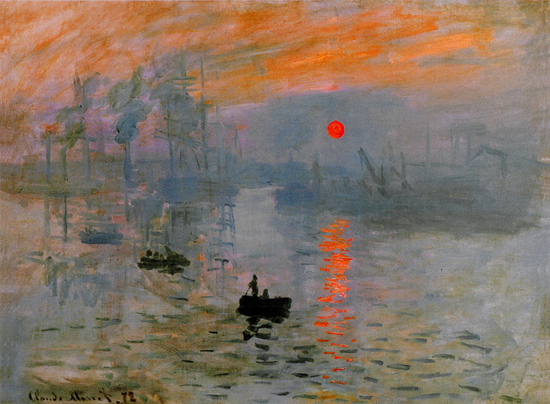
Impression, Sunrise by Claude Monet 48 cm × 63 cm (18.9 in × 24.8 in), Oil on canvas, 1872
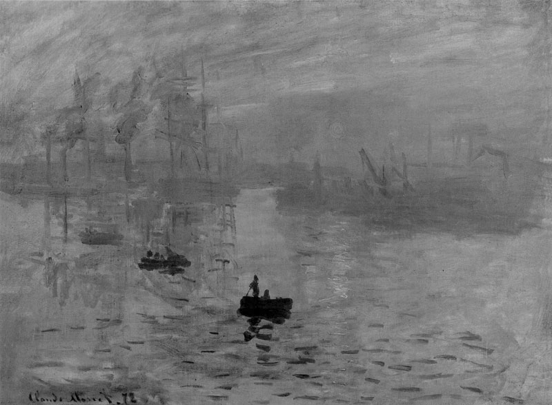
Grayscale version of Impression, Sunrise by Claude Monet. Notice how the sun is nearly invisible due to its equiluminance with the surrounding clouds.
Neurobiologist Margaret Livingstone explains the peculiarity of Monet’s equiluminant sun in her book Vision and Art: The Biology of Seeing, “The sun in this painting seems both hot and cold, light and dark. It appears so brilliant that it seems to pulsate. But the sun is actually no lighter than the background clouds, as we can see in the grayscale version. It is precisely equiluminant with–that is, it has the same lightness as–the gray of the background clouds. This lack of luminance contrast may explain the sun’s eerie quality: to the more primitive subdivision of the visual system (which is concerned with movement and position) the painting appears as it does in the grayscale version; the sun almost invisible. But the primate-specific part of the visual system sees it clearly. The inconsistency in perception of the sun in the different part of the visual system gives it this weird quality. The fact that the sun is invisible to the part of the visual system that carries information about position and movement means that its position and motionlessness are poorly defined, so it may seem to vibrate or pulsate. Monet’s sun really is both light and dark, hot and cold.”
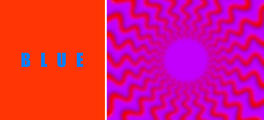
Equiluminance (left) can indeed be a powerful device for achieving a sensation of vibration or pulsation–however, specific variations in contrast, color and element orientation can give rise to even more powerful perceptions of motion such as those created by psychologist Akiyoshi Kitaoka to demonstrate the effect of “Perceptual Drift” (right).
Since we are on the topic of implied movement and eye movement, I would like to take a few minutes to address the concept of “resting areas”.
Resting areas are often defined as regions of a pictorial composition where a fatigued eye can find respite from the demands of a complex image. In fact, there are quite a few books, magazines, and websites that still frame the concept of a visual “resting place” in this manner:
“…background shapes are known as the “negative” space, and is that area the artist would not intend to draw attention to. So long as the positive elements are much less in total space in the picture plane, the negative space will act as a resting area or “neutral” zone which demands nothing of the eyes, and makes it easier for the eyes to follow along in scrutinizing the positive elements.” –Composition: Understanding it – Using it! by Larry Seiler
“Another element that impacts rhythm and tempo is what we may called visual “rests.” Quiet spaces for the eye add importance to busy areas because they change the rhythm and provide contrast.” –A Painter’s Guide to Design and Composition by Margot Schulzke”
“Sometimes blank space is just as important as space filled with lines, shapes, and colors. If the focal point is very busy, the eye needs a resting place in the picture. Leave some blank areas (in an interesting shape of course) for a resting place.” Acrylic Painting For Dummies by Colette Pitcher
“Negative space is sometimes thought of as a resting place for the viewer’s eyes.” –The Design Elements of Composing a Drawing (For Dummies).
Unfortunately, these descriptions of a “resting place” demonstrate a significant misunderstanding of how we visually interact with a complex stimulus. The idea of a “resting place” can be found in resources for numerous pursuits such as drawing, painting, graphic design, advertising, interior design and gardening. While some resources present the above-mentioned concept in regards to a visual “resting place,” there are many that present it in a much different way. Let’s start by looking at a book that was written during the 1920’s:
“Emphasis can be obtained in many different ways; by isolation, by the elimination of everything else that might compete with the principal object, by the position of the principal object in the picture-space, by the radiation of lines leading the eye directly to the principal object, by contrast of tone, and so on. The little child in Plum Island (Fig. 13) is obviously the chief object of interest in the picture. He is the only human being in sight, he is placed in a strong position in the picture-space, the line of the surf leads the eye directly to him and he is strongly emphasized by contrast in tone. Thus we have, in this picture, a definite object to provide a resting place for the eye and to prevent it from wandering outside the picture margins, and a feeling of unity is established.” –Pictorial Composition in Photography by Arthur Hammond 1920. (I should point out here that Hammond’s comment, “radiation of lines leading the eye directly to the principal object” may have more to do with a response to a simulation of optic flow and not the erroneous claim that the eye instinctively follows any specific line.)
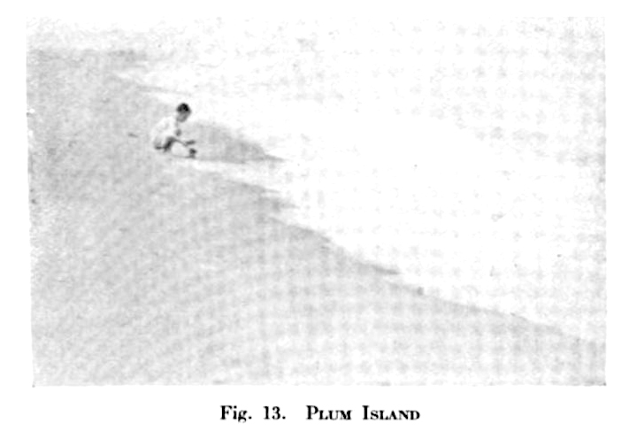
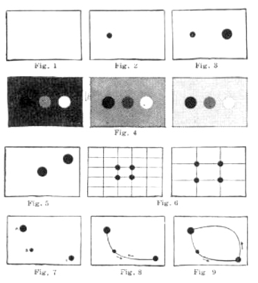
Now that sounds like something completely different than the earlier definition. That makes a “resting place” sound more like what many would understand as a focal point. Let’s take another look at a fun resource I found that may be one of the best walk-through presentations for a “resting place”:
“Suppose we represent our picture space by a blank rectangle the size and shape of the finished picture; (Fig.1) The eye roams over the entire space, resting nowhere. But if we place a single spot in this rectangle, the eye finds a resting place; that is a center of interest; (Fig 2.) Now if we place a second, larger, spot in the rectangle, the eye sees both, but rests longer on the larger one, and propositions II and III(a) are proved.” Boys’ Life May 1935. (Image Left)
In addition to these older resources, we can find this latter explanation of a visual “resting place” in many contemporary resources. But… which one truly makes more sense? Which interpretation of the concept is actually correct? To best answer that we should briefly revisit the eye-tracking work of work of Alfred Yarbus. For a more thorough look at Yarbus’ experiments, I would recommend reviewing Henri Breuil and Alfred Yarbus Walk into a Bar…A Primer on Pictorial Composition. (Part III).
Yarbus states: “Human eyes voluntarily and involuntarily fixate on those elements of a visual scene that carry essential and useful information. The more information is contained in an element, the longer the eyes stay on it. The distribution of fixations on the elements of a scene changes depends on the purpose of the observer, i.e., it is determined by information to be obtained and the thought process accompanying the analysis of this information. Hence people who think differently also, to some extent, see differently”. – A. L. Yarbus (1067) Eye Movements and Vision. New York: Plenum Press (Translated from the 1965 Russian edition by Basil Haigh.)
Yarbus’ experiments showed the task given to a subject has a very large influence on the subject’s eye movement: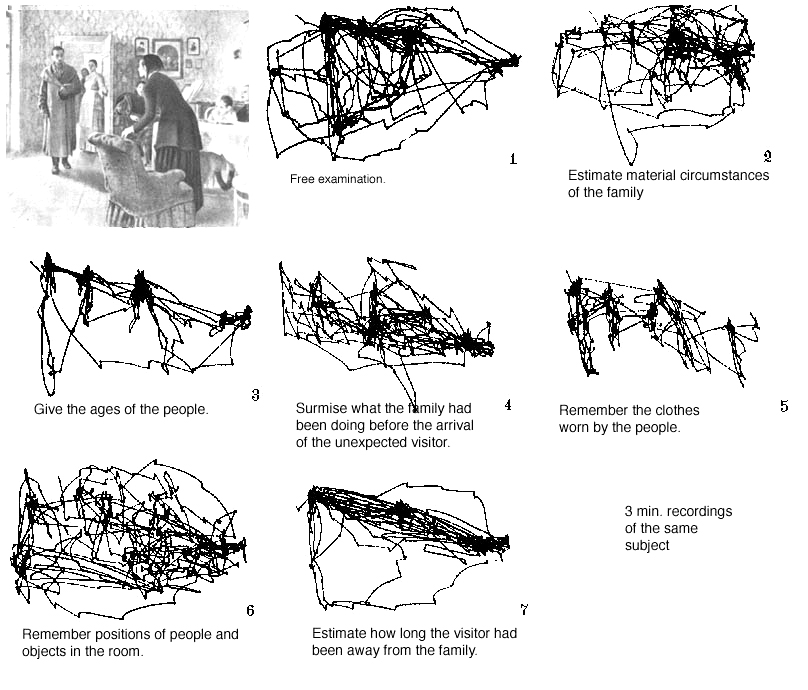 Here you can see that eye movements (saccades and fixations) are guided from information gathering saccadic sweeps and fixated investigations—all working to elicit information from a visual field. It is important to notice that there is not much fixation or “resting” in areas that have little information to offer. Areas bearing little information (or the former concept of a “resting place” in this article) sees very little activity in comparison to areas of more robust content.
“Yarbus suggested an alternative logic to the distribution of attention, speculating that the eye instinctively gravitates toward details that promise to “explain” an image…. our patterns of looking relate to the task of solving a picture, by which he meant discerning its narrative logic. Presented with an image, the eye begins a rapid fact-gathering mission, filtering out extraneous visual information and honing in on bits of explanatory detail. Given opportunity for extended looking, we do not turn our attention to an unexplored corner, but compulsively reinvestigate those elements that “allow the meaning of the picture to be obtained.”-2 Ways of Seeing by Sasha Archibald – – Issue 30, The Underground Summer 2008
Another famous example of Yarbus’ eye tracking work: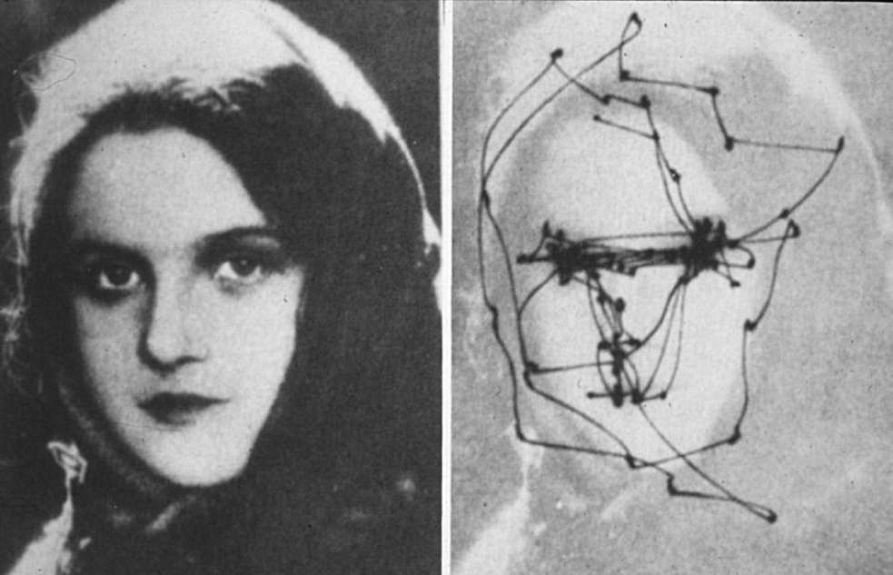
It is very important to remember that the visual system seems to be not all that interested (relatively) in gradual changes in the visual field, rather–our eyes tend to glide over subtle changes towards areas of increasing contrast or complexity in an effort to elicit information. So if we are taking the work of Yarbus into account, it seems that a “resting place” is more akin to a focal point than a piece of negative space. Saccadic movement stops at a fixation point, gathers information, and then continues the search for information. While it is true that certain cells involved in vision can become fatigued (leading to commonly experienced phenomena like “after-images” ), I am unaware of any specific “image exploration fatigue” that would force the eye into some negative space for recovery.
Rhythm/Repetition/Pattern
I am grouping these three design principles together as they are very closely related and may have a good degree of overlap in their meaning/application.
Repetition: Repeated use of a visual element, motif, or principle. Repetition can be distinguished from pattern as it need not occur with discernible regularity. In other words, while apattern is a form of repetition–a repetition may not necessarily result in a pattern.
Pattern: A pattern is a form of repetition that occurs with discernible regularity. As such, the elements of a pattern repeat in a predictable manner. A geometric pattern is a kind of pattern formed of geometric shapes and typically repeating with an underlying mathematical structure. Natural patterns include spirals, meanders, waves, foams, tilings, cracks, and those created by symmetries of rotation and reflection.
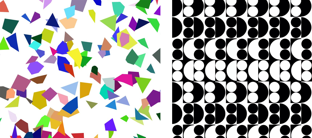
The images seen here both contain repetition–but the one on the right contains repetition that occurs with discernible regularity (a pattern.) While this may seem a clear way to separate these two concepts–know that there may be some visual contexts in which the line between the two is less clear.
Rhythm: (from Greek ῥυθμός, rhythmos, “any regular recurring motion, symmetry” (A Greek-English Lexicon,Liddell and Scott 1996)) generally means a “movement marked by the regulated succession of strong and weak elements, or of opposite or different conditions” (The Compact Edition of the Oxford English Dictionary II, 1971, 2537). While most often used in the performance arts to indicate the timing of events on a human scale; of musical sounds and silences, the steps of a dance, or the meter of spoken language and poetry, visual artists often apply this term to static work to indicate a implied motion or development over time achieved via a repetition of elements that change or “evolve” at discernible intervals.
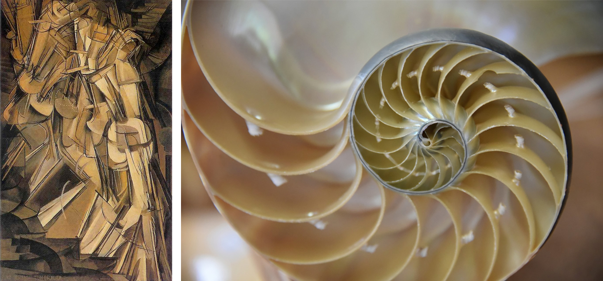
Two examples of what may be described as rhythm in imagery. (Left) Nude Descending a Staircase (No. 2) Marcel Duchamp, American (born France), 1887 – 1968 and (right) the logarithmic spiral/growth spiral (self-similar spiral curve) of a nautilus shell (sorry, still not a golden spiral—but that would work here as well!).
Variety/Contrast
I am addressing variety and contrast together. Just as with movement, pattern, and rhythm, variety and contrast are closely related and have a good degree of overlap in their meaning/application.
Variety
Variety can be defined as diversity among visual elements, motifs, representations or design principles in a pictorial composition. While variety is often said to increase interest in a work, I am not aware of any context-independent link between increased variety and interest. In fact, one may argue that excess variety may lead to problems with effective communication.
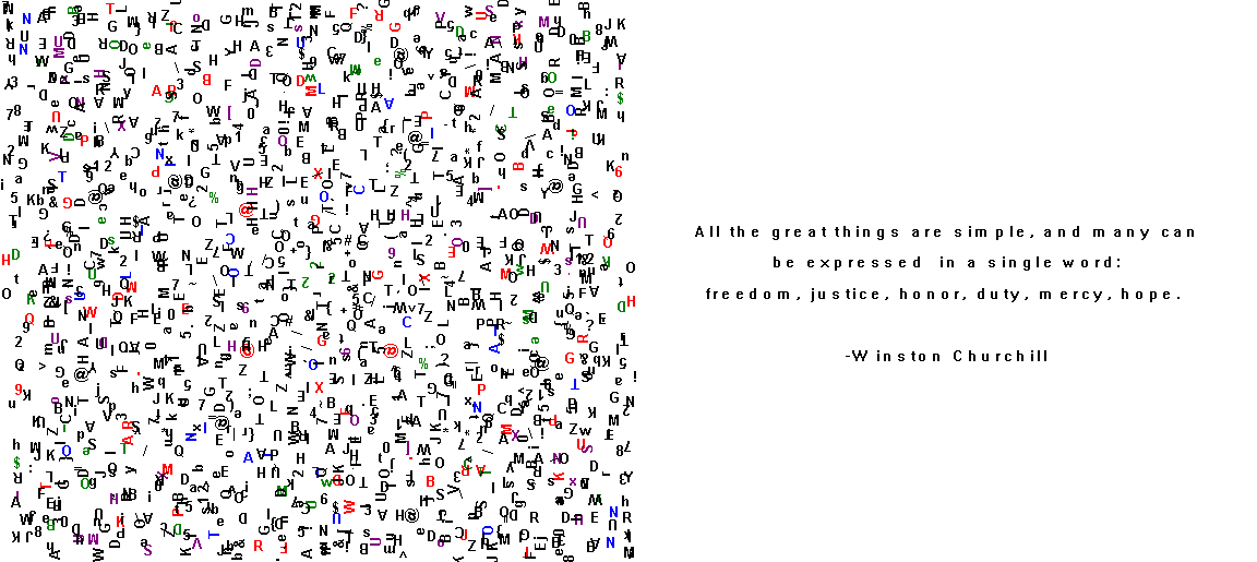
One may find greater variety in the characters on the left which may elicit a greater interest in investigation—however it may come at the cost of a clear message as can be seen with the statement on the right containing a less diverse arrangement of characters.
Contrast
In the context of pictorial composition, contrast can be defined somewhat broadly as a juxtaposition of pictorial components, or more narrowly, in terms of specific disparities perceived between element characteristics like lightness or color. For example, regarding perceived luminance, contrast may be defined as the relative difference of one perceived lightness/brightness value and another within a field of view (contrast ratios.) Both contrast and variety involve differences among visual elements or their attributes. However, variety tends to describe a general diversity among pictorial elements/attributes, as opposed to contrast which involves specifically “opposing” pictorial attributes/elements, the results of such pictorial element/attribute juxtaposition(s), or the relative differences between comparable pictorial elements/attributes.
Neuroscientist and neuroaesthetics pioneer VS Ramachandran brings the broad and narrow concepts of contrast together quite well. He writes, “Extracting contrast involves eliminating redundant information and focusing attention. Cells in the retina, the lateral geniculate body or relay station in the brain, and in the visual cortex respond predominantly to step changes in luminance rather than homogeneous surface colors. Smooth gradients are much harder for the visual system to detect rather than segmented divisions of shades resulting in easily detectable edges. Contrasts due to the formation of edges may be pleasing to the eye. The importance of the visual neuron’s varying responses to the orientation and presence of edges has previously been proven by David H. Hubel and Torsten Wiesel. This may hold evolutionary significance since regions of contrast are information rich requiring reinforcement and the allocation of attention. In contrast to the principle of grouping, contrasting features are typically in close proximity eliminating the need to link distant, but similar features.”
You may remember that we addressed the idea of contrast in my first installment, So what’s with Jane already? A Primer on Pictorial Composition. (Part I),
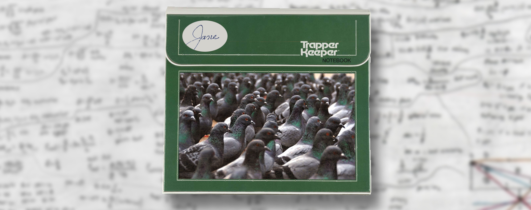
Try and read this sentence: Now try to read this one:
![]() Now this:
Now this:
Jane walked down the street.
All three sentences are constructed with the same content and grammar. How they differ is in the visual elements that manifest that content and grammar. The characters of the first sentence are so thin and spatially condensed that parsing out the individual letters to successfully read the sentence is nearly impossible. The second sentence offers no contrast between the background and the foreground characters. This lack of contrast also produces a stimulus that is incapable of conveying the intended information. These first two examples demonstrate one way in which our biology may define successful communication. Light outside the visible spectrum, contrast lower than our minimum contrast sensitivity, or a stimulus that is on a scale beyond the limits of our angular resolution is not going to be of much use in regards to visual communication.
The third sentence above is constructed with a configuration of visual elements that allows for a reader, fluent in the conventions of the English language, to successfully elicit the intended meaning. The reader can quickly garner that at some point in the past, an individual named Jane had walked down a street. The sentence is a visually viable, self-contained unit of meaning that effectively conveys information according to the logic of the language’s grammar.
The importance of contrast in regards to vision, and therefore visual art, cannot be overstated. As Margaret Livingstone states in her book Vision and Art, “Many visual perceptions, such as luminance, color, motion, and depth, exhibit greater sensitivity to abrupt rather than gradual change, and in each modality this selectivity is due to an underlying center/surround organization. The image above illustrates this point for luminance with the Cornsweet Illusion. The center/surround organization of the cells in our visual system makes us more sensitive to the light-to-dark transitions at the middle then to the gradual changes of exactly the same magnitude on either side of the discontinuity.”
Again, we are not light meters or spectrophotometers. We utilize contrasts instead of absolute luminance measurements to elicit information from the visual world. We are drawn to regions of discontinuity while generally ignoring homogeneous areas within our the visual field. Always keep this in mind when composing imagery. While we have addressed a number of problematic claims about how the eyes will move throughout a picture—they will indeed be drawn to contrast.
Emphasis/Dominance-Subordination
Dominance, subordination, and emphasis are all aspects of what many would understand as a pictorial “hierarchy”.
Emphasis – The application or configuration of visual elements or design principles in a manner that increases visual prominence or communicates importance.
Dominance – a condition in which one or more regions, visual elements, motifs, representations, or organizational principles is emphasized to appear visually prominent or important relative to other regions, visual elements, motifs, representations, or organizational principles.
Subordination – a condition in which one or more regions, visual elements, motifs, representations, or organizational principles is deemphasized to appear less visually prominent or important relative to other regions, visual elements, motifs, representations, or organizational principles.
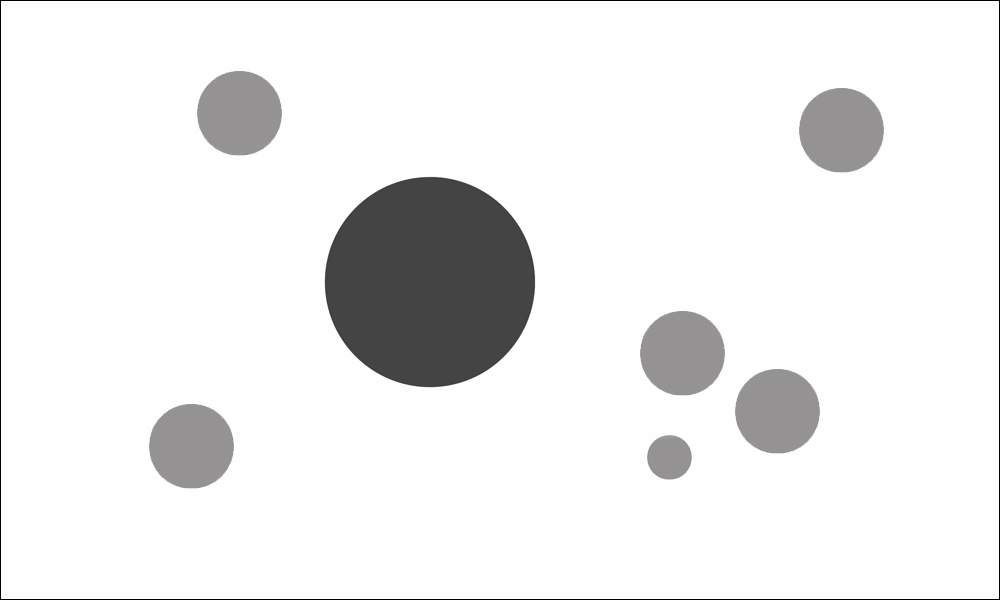
Here we see an element made dominant with a larger size, higher contrast (against surround), and preferred orientation (near center). It should be understood that a clear hierarchy of elements is sometimes difficult to discern (esp. with very complex images). Much like the Gestalt principles of perceptual organization, means by which to promote dominance or subordination can seem to be limited via a set of ceteris paribus rules.
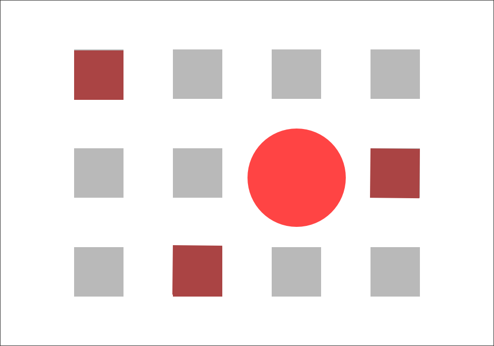
“The circle and the three reddish squares are all focal points because they stand out from the majority of other elements in the graphic. They contrast with the mass of gray squares. The large bright red circle stands out the most. It’s the dominant focal point, or the dominant element in this image.” –Smashing Magazine, Design Principles: Dominance, Focal Points And Hierarchy by Steven Bradley.
Just as we may emphasize certain words in a sentence to communicate importance–specific regions, visual elements, motifs, representations, or organizational principles may need to be emphasized in order to establish their importance. The most emphasized or dominant components of a visual artwork are often referred to as “focal points.” In the context of pictorial composition, a focal point (or principal focus) is one or more regions, visual elements, motifs, representations, or organizational principles intended to elicit the greatest level of interest, or attention. Focal points can be created via contextual emphasis by way of size, color, contrast, texture, shape, position, etc. Alternatively, subordinate areas can be created by contextual deemphasis via the same attributes. While some resources are quick to state that one visual attribute may be universally dominant relative to another, it should be understood that–as with all aspects of visual perception—context will define which attributes will promote dominance and which will promote subordination.
Perspective/Viewpoint/Depth
Perspective – (from Latin: perspicere to see through) in the visual arts is an approximate representation, on a flat surface, of an image as it is seen by the eye.
Viewpoint (or Station Point) – While often used colloquially as a synonym for perspective, the viewpoint is the point from which an environmental science is observed.

Notice how the image on the left and the one on the right place the viewer at two significantly different heights relative to the depicted subjects.
Depth – is the radial distance from an observer to a surface or an object in a three-dimensional environment. Depth perception arises from a variety of depth cues. These are typically classified into binocular cues that are based on the receipt of sensory information in three dimensions from both eyes and monocular cues that can be represented in just two dimensions and observed with just one eye.
As these design principles all relate to the perception of a three-dimensional environment via depth cues, let’s take a quick look at the cues themselves to better understand how they might be deployed in a compositional effort. Note that all of the following cues are not applicable to two-dimensional art.
Monocular cues (depth information that can be elicited from one eye) ((M) indicates that motion is required).
Motion parallax (M) – When an observer moves, the apparent relative motion of several stationary objects against a background gives hints about their relative distance.
Depth from motion (M) – When an object moves toward the observer, the retinal projection of an object expands over a period of time, which leads to the perception of movement in a line toward the observer. Another name for this phenomenon is depth from optical expansion.
Linear Perspective – The property of parallel lines converging in the distance, at infinity, allows us to reconstruct the relative distance of two parts of an object, or of landscape features.
Relative Size – If two objects are known to be the same size (e.g., two trees) but their absolute size is unknown, relative size cues can provide information about the relative depth of the two objects. If one subtends a larger visual angle on the retina than the other, the object which subtends the larger visual angle appears closer.
Familiar size – Since the visual angle of an object projected onto the retina decreases with distance, this information can be combined with previous knowledge of the object’s size to determine the absolute depth of the object.
Absolute size – Even if the actual size of the object is unknown and there is only one object visible, a smaller object seems further away than a large object that is presented at the same location
Aerial perspective – (also known as atmospheric perspective) Due to light scattering by the atmosphere, objects that are a great distance away have lower luminance contrast and lower color saturation. (cues often associated with atmospheric perspective – size reduction, value lightness, texture (grain) reduction, color neutralization, contrast reduction)
Accommodation – This is an oculomotor cue for depth perception. When we try to focus on far away objects, the ciliary muscles stretch the eye lens, making it thinner, and hence changing the focal length. The kinesthetic sensations of the contracting and relaxing ciliary muscles (intraocular muscles) is sent to the visual cortex where it is used for interpreting distance/depth. Accommodation is only effective for distances less than 2 meters.
Occlusion – (also referred to as interposition) happens when near surfaces overlap far surfaces. If one object partially blocks the view of another object, humans perceive it as closer. However, this information only allows the observer to create a “ranking” of relative nearness.
Curvilinear Perspective – At the outer extremes of the visual field, parallel lines become curved, as in a photo taken through a fisheye lens. This effect, although it is usually eliminated from both art and photos by the cropping or framing of a picture, may significantly enhance the viewer’s sense of being positioned within a real, three-dimensional space.
Texture gradient(s) – Fine details on nearby objects can be seen clearly, whereas such details are not visible on faraway objects. Texture gradients are grains of an item. For example, on a long gravel road, the gravel near the observer can be clearly seen of shape, size, and color. In the distance, the road’s texture cannot be clearly differentiated.
“Shape from Shading” – The way that light falls on an object and reflects off its surfaces, and the shadows that are cast by objects provide an effective cue for the brain to determine the shape of objects and their position in space.
Defocus blur – Selective image blurring is very commonly used in photographic and video for establishing the impression of depth. This can act as a monocular cue even when all other cues are removed. It may contribute to the depth perception in natural retinal images, because the depth of focus of the human eye is limited
Elevation – When an object is visible relative to the horizon, we tend to perceive objects which are closer to the horizon as being farther away from us, and objects which are farther from the horizon as being closer to us
Binocular cues provide depth information when viewing a scene with both eyes.
Stereopsis, or retinal (binocular) disparity, or binocular parallax (NA) – Each eye views a slightly different angle of an object seen by the left and right eyes. This happens because of the horizontal separation parallax of the eyes. If an object is far away, the disparity of that image falling on both retinas will be small. If the object is close or near, the disparity will be large.
Convergence – This is a binocular oculomotor cue for distance/depth perception. Because of stereopsis the two eyeballs focus on the same object. In doing so they converge. The convergence will stretch the extraocular muscles. As happens with the monocular accommodation cue, kinesthetic sensations from these extraocular muscles also help in depth/distance perception. The angle of convergence is smaller when the eye is fixating on far away objects. Convergence is effective for distances less than 10 meters.
Shadow Stereopsis – Retinal images with no parallax disparity but with different shadows are fused stereoscopically, imparting depth perception to the imaged scene.
Of these various cues, only convergence, accommodation and familiar size provide absolute distance information. All other cues are relative (i.e., they can only be used to tell which objects are closer relative to others). Stereopsis is merely relative because a greater or lesser disparity for nearby objects could either mean that those objects differ more or less substantially in relative depth or that the foveated object is nearer or further away (the further away a scene is, the smaller is the retinal disparity indicating the same depth difference.)
See how many of the depth cues you can identify in these two images:
 Harmony and Unity
Harmony and Unity are design principles that are often quite subjective. Harmony can be defined as a state of visual order or as aesthetically pleasing relationships among the component parts of a whole. Unity, on the other hand, can be defined as the state of being in full agreement, or sometimes, as a condition of harmony. As you probably suspect, it is somewhat nebulous ideas like “being in full agreement” or “a state of visual order” that opens the door to a wealth of subjectivity. In any case—it is important to note that harmony is an aesthetic quality of component relationships while unity is the manner of relationship between components or between a component and the whole. For example, I think that we can safely state that all pictures have an inherent “unity”, if only for the spatial proximity of the component parts of the image. All of the component parts of a picture are “unified” by the shared quality that they all exist within a fixed perimeter. However, this fact does NOT mean that the parts themselves have an aesthetic “harmony.”
To better understand that we will need to consider what was presented in the first installment of this series regarding “aesthetic quality.”
“…our behavior is constantly influenced by the aesthetic qualities of external stimuli. These qualities are the characteristics of a stimulus that elicit adaptive responses that have evolved to reinforce or discourage specific behaviors. We may prefer one type of sensory experience over another—describing one as repulsive and the other beautiful. However, aesthetic qualities should not be confused with individual tastes. Many refer to aesthetic properties as personal preferences and this, I believe, is a serious mistake. Like most concepts involving evolution, concepts of “aesthetics” and “beauty” seems to be most productive when considered on the level of populations and not the individual. For example, it is not important that Jane may prefer Vanilla over Chocolate—but rather that Jane, if human, would most likely have a biological predilection for sugar and fat.
Paul Bloom touches on this topic in his 2010 book How Pleasure Works: The New Science of Why We Like What We Like:
“It is true that we can imagine cultures in which pleasure is very different, where people rub food in feces to improve taste and have no interest in salt, sugar, or chili peppers; or where they spend fortunes on forgeries and throw originals into the trash; or line up to listen to static, cringing at the sound of a melody. But this is science fiction, not reality.
One way to sum this up is that humans start off with a fixed list of pleasures and we can’t add to that list. This might sound like an insanely strong claim, because of course one can introduce new pleasures into the world, as with the inventions of the television, chocolate, video games, cocaine, dildos, saunas, crossword puzzles, reality television, novels, and so on. But I would suggest that these are enjoyable because they are not that new; they connect—in a reasonably direct way—to pleasures that humans already possess. Belgian chocolate and barbecued ribs are modern inventions, but they appeal to our prior love of sugar and fat. There are novel forms of music created all the time, but a creature that is biologically unprepared for rhythm will never grow to like any of them; they will always be noise.”
Oliver Reichenstein, the founder of Information Architects, also addresses the problem with discussing individual tastes when exploring design and aesthetic concepts in his 2013 paper, Learning to See:
“Whether I like pink or not, sugar in my coffee, red or white wine, these things are a matter of personal taste. These are personal preferences, and both designers and non-designers have them. This is the taste we shouldn’t bother discussing.”
Therefore, to assess whether or not an image holds a true aesthetic harmony between its component parts, as opposed to the concept of harmony as a matter of personal preference, we would need to present the psychological or biological basis for the claim.
With these concepts in tow, I believe that we are now ready to move into the final installment in this series. Part VII will pull from neuroscience, neuroaesthetics, vision science, and cognitive psychology to share the the many approaches to pictorial composition that DO carry the support of empirical testing. I look forward to sharing this last piece of the project with you all!
RESOURCES:
Arnheim R. Art and Visual Perception: A Psychology of the Creative Eye. Berkeley, CA: University of California Press; 1974.
Berlyne D E. “Les measures de la préférence esthétique” Sciences de l’Art. 1966;3:9–22.
Berlyne D E. Aesthetics and Psychobiology. New York: McGraw-Hill; 1971.
Berlyne D E. Studies in the New Experimental Aesthetics. Washington, DC: Hemisphere; 1974.
Bloom, Paul. How Pleasure Works: The New Science of why We Like what We Like, W. W. Norton & Company, 2010.
Boys’ Life May 1935.
Bradley, Steven. Design Principles: Dominance, Focal Points And Hierarchy, Smashing Magazine.
Bruce, Vicki, Patrick R. Green, and Mark A. Georgeson. Visual Perception: Physiology, Psychology, & Ecology. Psychology Press, 2003.
Bullough E. “On the apparent heaviness of colours” British Journal of Psychology. 1907;2:111–152.
Chatterjee A. “Portrait profiles and the notion of agency” Empirical Studies of the Arts. 2002;20:33–41. doi: 10.2190/3WLF-AGTV-0AW7-R2CN
Chen, Yi-Chia, and Brian J. Scholl. “Seeing and liking: Biased perception of ambiguous figures consistent with the “inward bias” in aesthetic preferences.” Psychonomic bulletin & review 21.6 (2014): 1444-1451.
Gershoni, Sharon, and Shaul Hochstein, “Measuring pictorial balance perception at first glance using Japanese calligraphy.” i-Perception 2.6 (2011): 508-527.
Hammond, Arthur. Pictorial Composition in Photography. American photographic publishing Company, 1920.
Kourtzi, Zoe, and Nancy Kanwisher. “Activation in human MT/MST by static images with implied motion.” Journal of cognitive neuroscience 12.1 (2000): 48-55.
Kukkonen H, Foster D, Wood J, Wagemans J, Van Gool L. “Qualitative cues in the discrimination of affine-transformed minimal patterns” Perception. 1996;25:195–206. doi: 10.1068/p250195.
Latto, Richard, Douglas Brain, and Brian Kelly. “An oblique effect in aesthetics: Homage to Mondrian (1872–1944).” Perception 29.8 (2000): 981-987.
Latto, Richard, and Kirsty Russell-Duff. “An oblique effect in the selection of line orientation by twentieth century painters.” Empirical studies of the arts 20.1 (2002): 49-60.
Liddell, Henry George, Robert Scott, and Henry Drisler. A greek-english lexicon. Harper & brothers, 1894.
Livingstone, Margaret, and David H. Hubel. Vision and art: The biology of seeing. Vol. 2. New York: Harry N. Abrams, 2002.
Machilsen, Bart, Maarten Pauwels, and Johan Wagemans. “The role of vertical mirror symmetry in visual shape detection.” Journal of Vision 9.12 (2009): 11-11.
McManus I C. Right Hand, Left Hand: The Origins of Asymmetry in Brains, Bodies, Atoms and Cultures. Cambridge, MA: Harvard University Press; 2002.
Ouchi, H., Japanese Optical and Geometrical Art, Dover, New York (1977)
Oxford University Press. The Compact Edition of the Oxford English Dictionary. Oxford University Press, 1971.
Palmer, Stephen E. Vision science: Photons to phenomenology. MIT press, 1999.
Pierce R E. “Aesthetics of simple forms: Symmetry” Psychological Review. 1894;1:483–495.
Pinkerton E, Humphrey N K. “The apparent heaviness of colors” Nature. 1974;250:164–165. doi: 10.1038/250164a0
Pinna, Baingio, and Lothar Spillmann. “A new illusion of floating motion in depth.” Perception 31.12 (2002): 1501.
Pitcher, Colette. Acrylic Painting For Dummies. John Wiley & Sons, 2009.
Plumhoff, Jordan E., and James A. Schirillo. “Mondrian, eye movements, and the oblique effect.” Perception 38.5 (2009): 719-731.
Puffer E D. “Studies in symmetry” Psychological Review. 1903;4:467–539.
Schulzke, Margot. A painter’s guide to design and composition. North Light Books, 2006.
Seiler, Larry, Composition: Understanding it – Using it!
Spillmann, L., Heitger, F., & Schüller, S. (1986). Apparent displacement and phase unlocking in checkerboard patterns. Poster presented at 9th European Conference on Visual Perception.
Suler, J. “John Suler’s Photographic Psychology: Image and Psyche.” (2011).
The Design Elements of Composing a Drawing (For Dummies). (dummies.com)
Wagemans, Johan, et al. “A century of Gestalt psychology in visual perception: I. Perceptual grouping and figure–ground organization.” Psychological bulletin 138.6 (2012): 1172.
Wallschlaeger, Charles, Cynthia Busic-Snyder, and Meredith Morgan. Basic visual concepts and principles for artists, architects, and designers. Wm. C. Brown Publishers, 1992.
Wenderoth, Peter. “The salience of vertical symmetry.” Perception 23.2 (1994): 221-236.
Wenderoth, Peter. “The role of pattern outline in bilateral symmetry detection with briefly flashed dot patterns.” Spatial vision 9.1 (1995): 57-77.
Yarbus, A. (1967). Eye movements and vision (B. Haigh & L. A. Riggs, Trans.). New York: Plenum Press

Don’t have much to add here, I do have one observation though about that Claud Monet research and its conclusion. I almost forgot but was reminded by someone that the colors themselves have an intrinsic lightness (which is different than value). And you end up with different results depending on the denaturation method. In the example here the “lightness” denaturation method is used. I couldn’t find the photoshop example, but we have the gimp example which I’m sure is the same: https://docs.gimp.org/2.6/en/gimp-tool-desaturate.html. If you scroll at the bottom of the page you’ll see the “lightness” algorithm which doesn’t retain the information about color in a sense and I’ll show you what I mean with an example I made myself in krita. The luminosity algorithm would be the correct one here which I think is almost (not sure if it’s exactly the same) the same as having a black layer on top with color blend mode selected which is what I did in krita to exemplify this. If you were to recolorize (with a color blend mode) the luminosity used algorithm for desaturation you’ll find that you don’t get back the same colors you started with. But if you use the “correct” luminosity algorithm or the black color on color blend mode you can recolorize agian. So hopefully you can understand my blabber here the help of this image: https://imgur.com/a/CkLpj. That being said, I’m not sure how it would alter the findings of this research presented here or if it changes anything, it’s just an observation about the multiple methods of desaturating an image and depending on how you use the algorithms you end up with different results.