Note: It is highly recommended that you read So What’s With Jane already? A Primer on Pictorial Composition. (Part I) before embarking on this installment.
“One does not meet oneself until one catches the reflection from an eye other than human.” –Loren Eiseley
During the summer of 1977, NASA launched two robotic probes, Voyager 1 and Voyager 2, from Cape Canaveral to conduct studies of Jupiter and Saturn as well as their respective moons. The mission would have the probes fly by their targets, collect data, and slingshot out of the solar system. Knowing that these probes would eventually drift into deep space after their mission was complete, NASA decided to make an addition to the probe that would essentially transform it from a “data collector” to an “interstellar message-in-a-bottle.” With this idea in mind, NASA turned to astrophysicist Carl Sagan to assemble a message that would be appropriate for contact with “a possible extraterrestrial civilization.”
Dr. Sagan responded to this challenge by assembling a team to create what would become known as the “Golden Records.” Onto two twelve-inch, gold-plated copper phonograph records encased in a protective aluminum jacket, Dr. Sagan placed 27 pieces of music (90 mins), over 118 images encoded in analog form, spoken greetings in 55 languages, and a variety of nature and animal sounds (12 mins). Hand-etched on the records’ surface is the inscription “To the makers of music – all worlds, all times.” The record’s case contains an illustration of a pulsar map, detailing Earth’s location, and a patch of uranium 238 to infer the time elapsed since launch. The information etched on the Voyager records are expected to last at least one billion years.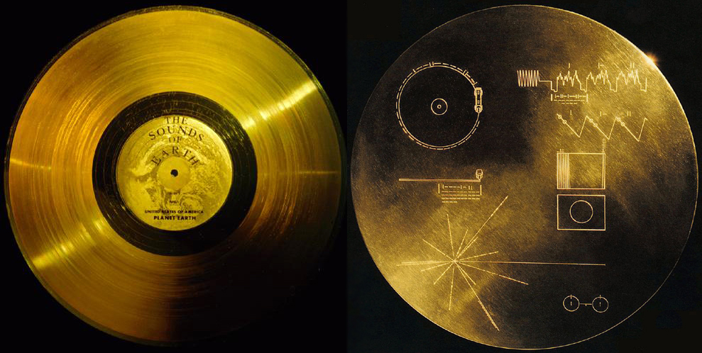 Carl Sagan noted that “the spacecraft will be encountered and the record played only if there are advanced space-faring civilizations in interstellar space. But the launching of this ‘bottle’ into the cosmic ‘ocean’ says something very hopeful about life on this planet.”
On August 25, 2012, data from Voyager 1 indicated that it had become the first human-made object to enter interstellar space, traveling “further than anyone, or anything, in history.” As of 2013, Voyager 1 was moving with a velocity of 17 kilometers per second (11 mi/s) relative to the Sun. Voyager 2 is expected to enter interstellar space by 2016.
For those that are interested you can explore the Golden Records in much more detail here: http://goldenrecord.org/ as well as pinpoint the probe’s current locations here: http://voyager.jpl.nasa.gov/where/
Dr. Sagan’s idea for the content of the Voyager records was essentially an expansion on the illustrated plaques that he had created for an earlier probe mission. Two probes, Pioneer 10 and 11, also launched from Cape Canaveral in the 1970s, each carrying 152 x 229 mm (6 x 9 inch) gold-anodized aluminum plaques that feature the nude figures of a human male and female along with several symbols that are designed to provide information about the origin of the spacecraft.
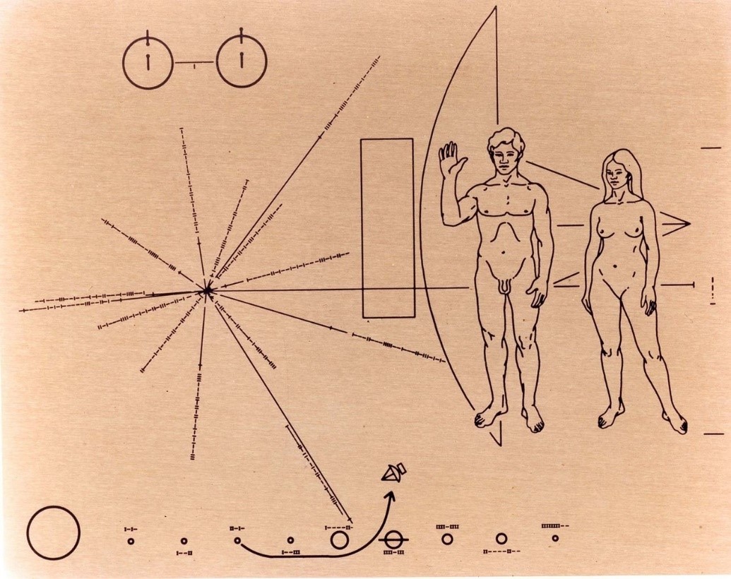
Pioneers’ pictorial message was designed to provide information identifying the spacecraft’s’ time and place of origin. The plaque was designed by Carl Sagan and Frank Drake and illustrated by Linda Sagan.
Let’s think about this for a moment. If you had to compose a message to be sent out into space to communicate with a potential extraterrestrial intelligence, how would you go about it? Can you even begin to imagine the vast myriad of problems that one would encounter in trying to convey information to an entity that does not share a similar biology to ourselves?
Put that Sisyphean task aside for a moment and consider the less problematic task of communicating a message to your fellow humans. What product can you create that would successfully convey information to as many people as possible?
Before you reply, “I would just speak or write a clear statement” consider the significant diversity of language on our planet. Here is a breakdown of some of the languages spoken by the over 7 billion people currently inhabiting our world: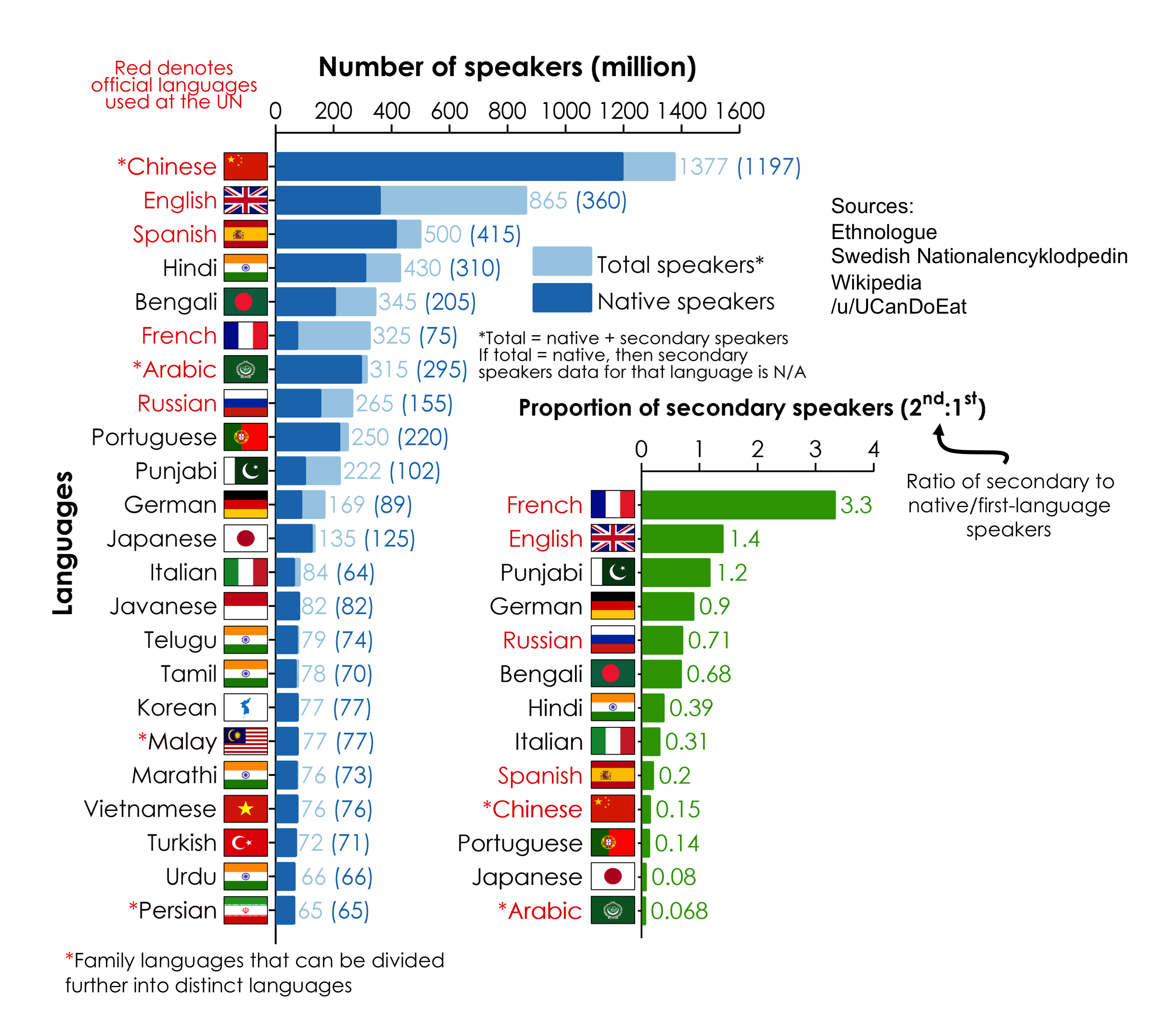 Another option, however, and the focus of this series might be the use of visual imagery.
If you have traveled internationally, then you have probably made great use of simple graphics or icons that conveyed important information when familiar terms and phrases of a conventional language were absent. Here are a few examples: Simple images like these can indicate danger, safety, sanctuary, gender, food, water as well as many other important concepts. While these images would not be recognized and understood in all cases, such abstracted icons or visual symbols can effectively communicate basic concepts by appealing directly to our object recognition systems when a conventional language barrier is present.
(If you are interested in exploring “universal” icons, you can browse further with The Noun Project, a free, public, visual dictionary of the international icons and signage that we often take for granted. https://thenounproject.com/)
Again, it should not be taken that such visual forms of communication are without significant limitations. Let’s take a look at the sentence that we kept revisiting in the first installment of this series:
Jane walked down the street.
How can we communicate this visually? (Assuming that Jane is a human female in this context.)
Here is one way that we can communicate something close without significant abstraction: While the balloons might seem a bit distracting at first, they are actually quite helpful here. Visually we can determine from this image that a human female is indeed walking along a street or other paved route (the placement of the balloons and the slight tilt of the balloon string should actually promote the idea of movement in a particular direction). The placement of the figure is telling in regards to a recent past as well as a pending future (this is a concept we will visit in depth with later installments of this series). Due to the figure’s configuration, location, and surrounding context, we may infer that the individual pictured had moved from the right side of the image in the recent past and will continue to walk into the space pictured on the far left. One major hurdle though is that we have no way to elicit (visually) that her name is indeed Jane. This aspect would remain problematic unless there is some context in which she would be recognizable (for example, if she were a well-known character or celebrity figure (e.g., Santa Claus)), or if her name was indicated in some way so as to reveal her identity. Most likely, though, the latter would require the employ of a conventional language—and for now, we are trying to avoid that.
In any case—before we go too far down this road (pardon the pun), let’s return to our space probes to see how a few very smart people tackled the problem of communicating with visual imagery.
Carl Sagan approached the opportunity for a more robust interstellar message-in-a-bottle by assembling a team of scientists and experts to contribute ideas. His team included such individuals as Philip Morrison, professor of physics at MIT, Frank Drake, Jon Lomberg and Amahl Shakhashiri of the National Astronomy and Ionosphere Center, G. W. Cameron, professor of astronomy at Harvard Leslie Orgel of the Salk Institute for Biological Research, Wendy Gradison, of the Laboratory for Planetary Studies at Cornell, M. Oliver vice-president for research and development at the Hewlett-Packard Corporation, Steven Toulmin, professor of philosophy and social thought at the University of Chicago, as well as Isaac Asimov, Arthur Clarke, Timothy Ferris and Robert Heinlein–all science fiction writers with backgrounds in the sciences.
Frank Drake, Jon Lomberg, and Amahl Shakhashiri focused on assembling the images for Voyager’s Golden Record. At the onset, the team members were facing a challenge that most visual artists contend with each day: To include as much information as possible while maintaining a simplicity that would allow for successful communication to the widest possible audience. As the team began to assemble content, the quantity of images to be included quickly grew past the original plan. Jon Lomberg stated, “the original idea was to have six pictures. It was thought that we might show Earth, the DNA molecule, and a few shots of humans and animals.”
But as one might expect, the project expanded to include over a hundred images. Here are a few examples:
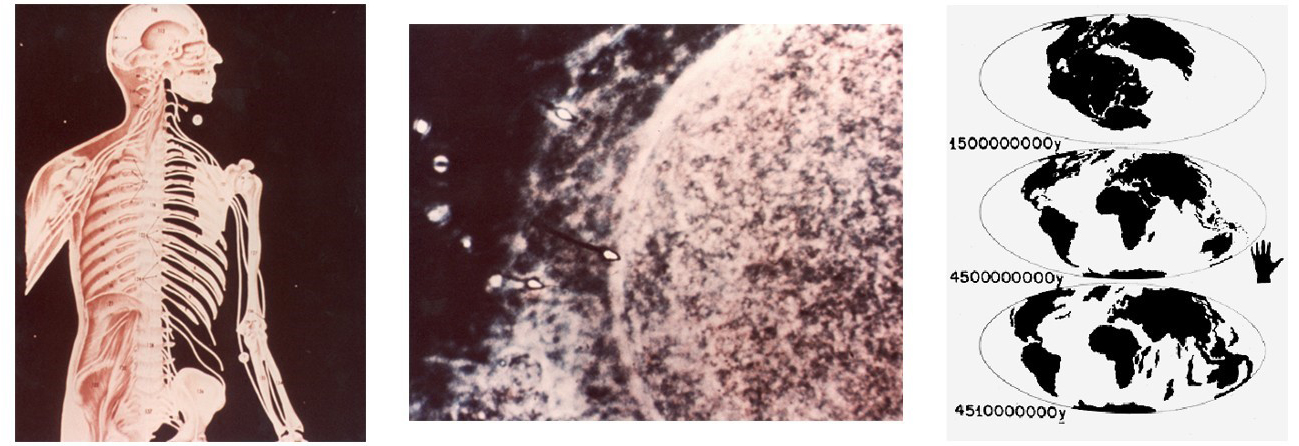
From left to right: ‘Human Anatomy 1’, ‘Conception’, and ‘Diagram of Continental Drift.’

‘House (Africa) and ‘Sunset with birds’
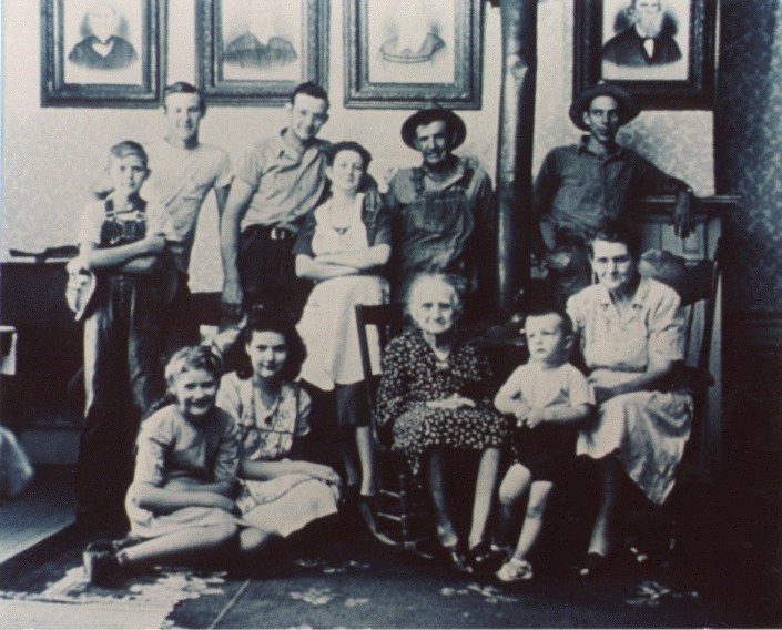
This ‘Family portrait’ included on the Golden Record, shows five generations of a Midwestern family, with the sixth generation represented by portraits on the wall.
As the collection of images came together, team members realized that they had to address a significant issue inherent to the use of imagery as communication. The concept of a ‘picture’ is by no means universal, not even on our own planet. Let us not forget the curious story from Henri Breuil, a French Catholic priest and amateur archaeologist, which describes a Turkish officer who was incapable of recognizing a drawing of a horse, “because he could not move round it.” Being a Muslim, the officer was entirely unfamiliar with depictive art. Such stories could easily lead many to argue that the eliciting of meaning from a two-dimensional representation is not an innate human ability. As such, Lomberg and his team felt that it may be necessary to teach a potential recipient how to “understand” the imagery both encoded on and etched into, the record and its casing.
Lomberg approached this problem in two ways. First, he made sure that the first two pictures included on the record are of engravings that are also featured on the Golden Records’ cover. He stated, “as engravings, they can be perceived by senses other than vision. We hope that beginning with these will give the recipients a way of comparing a photograph with an object they can touch.”
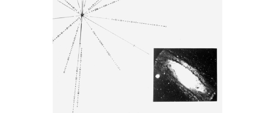
The second image encoded on the record is this ‘Solar location map’.
Second, Lomberg added silhouette abstractions of included imagery to assist in the separation of image foreground and background information. He stated, “a silhouette maximized the figure/background contrast and might show how we separate the various objects in a photograph by their outlines. It’s a way of saying ‘This is what we want you to see in this picture.’ So in a number of places I drew silhouettes of photographs and inserted them in sequence.”
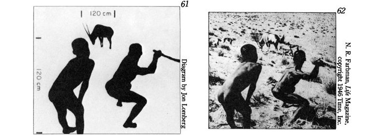
These images appeared in sequence: ‘Sketch of Bushmen’ and ‘Bushmen hunters.’ Lomberg hoped that by including silhouettes of photographs, the images would be easier to understand.
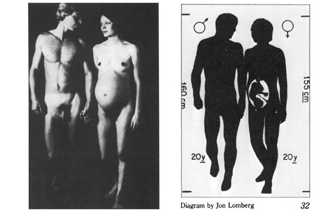
A vetoed image on the left was replaced by an abstract silhouetted image on the right, ‘Diagram of male and female’.
Throughout the image selection process, both Sagan and Lomberg addressed questions regarding why there was not more ‘Art’ in the growing image collection. While the answers primarily cited time constraints, Lomberg also added, “…we thought extraterrestrials would have enough trouble interpreting photographs of reality or simple diagrams without our including a photograph of a painting, which is itself an interpretation of reality. Even though we have some acknowledged ‘great art’ in the pictures, the criterion for the picture message was informative, not aesthetic, value.”
Dr. Lomberg’s statement here is especially poignant in the context of this series on pictorial composition. As I have introduced in the previous installment, aesthetic qualities are the characteristics of a stimulus that elicit adaptive responses that have evolved to reinforce or discourage specific behaviors. While it may seem somewhat possible that another form of intelligence would be able to decode meaning from mathematical statements or simple visual stimuli, it may be a tad egocentric to think that another intelligence may share our same aesthetic responses. Like Paul Bloom stated in his 2010 book, How Pleasure Works: The New Science of Why We Like What We Like, “there are novel forms of music created all the time, but a creature that is biologically unprepared for rhythm will never grow to like any of them; they will always be noise.”
So, now that you are thinking about communicating visually in this regard, how would you visually communicate that “Jane walked down the street” with visual imagery? Is it even possible? Again, remember that you are attempting to communicate to others that share your same biology. As we stated in the previous installment—do not think in terms of vanilla or chocolate—but it terms of our biological predilection for fats and sugars. Give this problem some serious thought as exploring the problem will steer you in the direction of building an effective framework for successfully understanding pictorial composition.
PS—Please don’t be afraid to sketch out some ideas and share them with me. I might like to use some of them for future installments in this series.
A special thank you to Leah Waichulis for her help with this installment.

Another very thought-provoking article!
I’m not sure whether I’ve understood this correctly, but my idea would be this: I don’t think it’s too difficult to represent a street, or indeed a woman — these are more or less universally recognised symbols. In fact wouldn’t it be fairly easy to distinguish in any case between a walking woman and a stationary one, because of the relative positioning of arms and legs?
Anyway, I guess to really make plain the difference between a stationary and walking woman, we need something else in the picture that would cause her to walk. So if she is in the center and supposed to be walking to the left, there need be something on the left to imply this motion.
So I guess on the left, you might put something of primeval importance e.g. of the food, sex, shelter nature.
So you could have:
a) a tree full of ripe apples that our ancestors would instinctively be attracted to;
b) a bread kiln or a barbecue;
c) a naked male offering sex!
d) a shelter of some sort (with rain all over the landscape);
e) or simply another human being making universal gestures or indeed facial expressions that basically say ‘come here’;
f) or indeed a baby on its own;
g) or I suppose the background could be inhospitable so that it would be tacitly assumed that no one would want to be there (it could be a dirty, impoverished street and Jane could be smartly dressed and look out of place)
The challenge is how would you depict JANE specifically, not ANY other woman keeping in mind that language is a barrier so we can’t just write Jane somewhere on her purse.
My initial thoughts on the problem of visually communicating that Jane walked down the street, are to move the view point to such that the viewer is in effect seeing what the person in the image sees, and has seen, using the view point referred to as 2 point perspective. The other orientation with the figure and street proceeding horizontally across the image is just a communicative to me, but if I’m trying to consider covering all the bases of perceptual struggle then I’d try to put the viewer into the position of the subject of the image.
I would also make sure there were some various points of interest that require a little looking at the street to encourage the sense of the street being the object of the subject’s (viewer’s) vision/journey.
Another consideration is to put some socially recognisable objects that are associated with walking onto or with the figure- this makes it more culturally specific, but many cultures would share some of the association: eg shoes, hat, companion, bag, binoculars (explorers in mind here – I’m visualising a woman in a pith helmet, and safari suit now, heh heh). The last point is the same really as the commenter above saying to put a purpose for walking into the image, if we imply purpose then would that help with the implied motion?
Excellent thoughts on the issue Mary!
For me the main challenge is how to portray a particular Jane and not some random woman. I think that depicting a walking woman is not really that challenging. The wording of the sentence though, if taken literally then needs considerable thought. For example, it’s “walked” not “is walking”, which implies a past time so if we’re bound to depict an accurate representation of this sentence, I would first start with the time frame, specifically choosing to place a date/calendar of in the illustration, be it on her phone or a city-building and have that date be a past date.
I would most likely pick a street (not an alley) with perhaps blooming flowers, trees and have her stroll casually in contrast to say a pier or another environment although I can also see how “somewhere in the middle of nowhere” could work. My thought is that if too many story elements would be placed in the illustration, say she’s looking at the phone (to establish the date) and the phone is ringing, she is in a hurry etc., then it would end up hurting the simple “Jane walked down the street” message. We also have to portray the downward movement, as opposed to upward, but I don’t think that’s too much of a challenge, just pick the right elevation and inclination.
On the more pressing “Jane” part, just by sheer luck, we might be able to convey the message, not to everyone, but possibly to a very large audience. First thing that comes into mind is how to connect the illustration woman with some pop symbol. What comes to mind is the (Hollywood made) famous “John Doe” and the close relative “Jane Doe” (although I think the feminine name is less famous). So, don’t want to be morbid or anything, but the first thing that comes to mind is to have a sorts of missing person’s poster or something similar and have her and an unidentified guy’s face on it with the names “John Doe” & “Jane Doe”. I cannot think of any way to convey this message other than use the English language and hope that the members of audience will understand just through the connection to pop culture.
Well, it was a fun thought experiment, perhaps I should do more of these. Thanks for the wonderful articles 🙂
Great observation regarding the consideration of time Razvan. I sincerely appreciate your strategy for considering setting prior to the introduction of one or more characters into a piece. I think that often, environment/setting–often seemingly a “secondary” consideration–is a spectacularly underused, seemingly untapped visual/communicative aspect of a developing composition. Perhaps, for some, the exercise of considering it FIRST may open it up for more potential impact. AS to the Jane—It is interesting that you mention her having a date on her phone—perhaps the inclusion of something like a smartphone alone can be a very effective cue to timeframe? In any case, great thoughts all around! Thank you~~~
A central issue for me is that visual information conveys different information than written or verbal communication.
Our vision is a way we process global relational information, specifically contrast relationships. The ideal result is to direct our saccadic focus to the most important relationships for our immediate survival. Movement for example takes primacy because it poses a possible threat. Our retinas present fields of relational information and this is modified to yield the most significant contrasts. Consequently single visuals are great at showing relationships such as size, hue, opacity, etc. But they are flawed in most cases at showing linear events such as Jane walking down the street. I can create an image that looks like a single frame of a film sequence. I can blur Jane’s figure to resemble a photograph of an object changing location within a camera’s shutter speed. I can follow the Futurists and draw her with multiple legs describing the range of movement her strides describe and use slow ins and outs to space the instances like I woukd in an animation. I can draw the figure out of balance and echo the moment of lost balance in a single step. But each of these relies on the audience having a preexisting point of reference. Even symbols require a ‘key’. If I draw a cartoon image of an igloo what does it mean? Home? A child’s snow fort? Shelter? Inuit architecture? My meaning may not match the meaning you attach to it.
The sentence here is far more effective to describe Jane’s movement. By contrast an image would be far more effective at communicating what Jane looks like than the paragraphs of data needed to describe her features in words.
Visual information is a tool. Using it to show relationships is an elegant use of the tool. Using it where words are better suited is clumsy. Just because I can use a hammer as a canoe paddle doesn’t mean that I want to or that its well suited to the task.