Give your work the illusion of spatial depth with five simple effects of perspective.
The two kinds of perspective that artists use are linear and atmospheric (or aerial). Linear perspective uses lines and vanishing points to determine how much an object’s apparent size changes with distance. Atmospheric perspective deals with how the appearance of an object is affected by the space or atmosphere between it and the viewer. Leonardo da Vinci noticed this latter phenomenon and dubbed it “the perspective of disappearance.”
Used together, linear and atmospheric perspective can create the illusion of space and dimension in your art, whether a vast landscape or an intimate still life. Here are five effects used in rendering perspective, which you easily can incorporate into your work.
1. Diminishing size
Effect: As objects recede, they reduce in size.
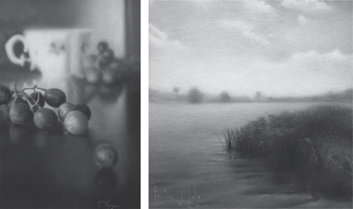
This effect is apparent in both Timothy Jahn’s Water’s Edge (below) and Terese Rogers’s La Petite Fleur (below, left). The distant trees in Water’s Edge are portrayed quite small to establish their distance from the foreground. The farthest grapes in La Petite Fleur by Rogers are noticeably smaller, even at a shallow depth. Attention to this simple effect will have a great impact on your ability to convey depth.

We can observe diminishing size, detail and contrast, and the overall lightening of values as our eyes travel from the foreground of La Petite Fleur (at left; charcoal, 9×6), by Terese Rogers, farther into the drawing. In landscapes that illustrate sizable distances, as in Timothy Jahn’s Water’s Edge (above; charcoal, 6 1/2×6 1/2), the effects of diminishing value contrast and the lightening of overall values are quite apparent as our eyes move from the water, plants and clouds closest to us, to the opposite shore line with trees and the more distant sky.
Observation:
Try to observe objects of similar size with varying distances between them. To get a good idea of how quickly size diminishes with distance, gather a small piece of acrylic glass (or other safe, clear material) and a marker. Place two identical objects at a fair distance apart. Looking through the acrylic at the objects, mark the width or length of each of them on the clear surface and note the size difference. Doing this at several varying distances will help you understand how quickly receding objects will “shrink.”
2. Diminishing detail
Effect: As objects recede, detail disappears.
No matter how complicated the surface of a subject, it won’t be noticeable for long as it recedes into the distance. Lush textures find themselves surrendering to more simplistic forms. Compare the details of foreground foliage in Jahn’s drawing Water’s Edge (page 1) to his background trees. The foreground grapes in La Petite Fleur (page 1) are rich with texture, while those in the background have a much simpler, uniform surface texture.
Observation:
Stand near any building or tree while observing a similar one in the distance. Notice how the bark, brick or other texture of the nearer subject is much more apparent than the distant one. To view this effect on a smaller scale, place an orange (or similarly textured object) at each end of a long table. Sit at one end and observe both oranges. Notice how details populate the surface of the closer orange, while the distant orange’s surface appears simplified.
3. Diminishing contrast
Effect: As objects recede, the value contrast between the object and its background diminishes.
Follow both the water and clouds as they approach the horizon in Jahn’s drawing (page 1). Notice how the lights and darks begin to merge as they recede. The background grapes in Rogers’s drawing (page 1) seem softer and, when you squint, quickly merge together as opposed to the foreground grapes. The edges of the value separations slowly begin to evaporate allowing the higher
contrast in the foreground to push forward.
Observation:
Here’s another great example of how we perceive depth and distance. Hold up your finger close enough that you can just about make out the fingerprint. While maintaining focus on your finger,
notice how everything around your finger seems very soft and blurry. Now move closer to a nearby object, still maintaining your focus on the finger, and watch how the values around your finger start to sharpen in contrast and detail.
4. Lightening of overall values
Effect: As objects recede, values begin to get lighter.
Again, both Jahn’s and Rogers’s background values are generally not as dark as values in the foreground. This change in values also contributes to the previous effect, in which contrast is reduced.
Observation:
This effect is more noticeable over greater distances (in this case, more prominent in Jahn’s landscape than in Rogers’s still life). Look at any buildings, mountains or trees that are far in the distance. You will notice an obvious upshift (lightening) in the value range. This effect is important in landscapes that illustrate vast expanses, but it can also be useful when handled subtly at more intimate ranges, as in still lifes.

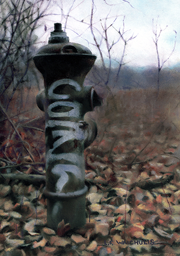
The Sentinel (oil, 7×5), by Leah Waichulis
5. Neutralization of color/possible shift to blue
Effect: As objects recede, colors begin to fade and may shift toward blue, as shown in The Sentinel (at left). The use of the neutralization of color and shift to blue tones enhance the illusion of depth and evokes a mood.
Again, at great distances this effect is extremely noticeable; however, it’s another powerful color phenomenon that can be used to enhance the depth of more shallow compositions.
Observation:
This shift toward blue is another great effect to look for when you have the opportunity to view distant buildings, trees and mountains. Note the color range in your immediate foreground and compare it with the distant objects. The effect will be apparent.

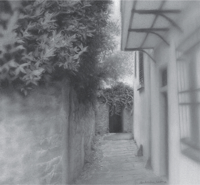
Natasha Latona manipulated atmospheric perspective’s effects of diminishing detail, contrast and overall values to draw our focus to the farthest end of the walkway in The Passage (charcoal, 6×6).
Manipulating these effects
The five effects I’ve discussed can be used to create illusions of form and distance. But these effects also can be altered or manipulated to produce a wide range of visual effects you can use to direct the movement of the viewer’s eye. Natasha Latona’s The Passage (above) is one example of several aspects of atmospheric perspective reversed to achieve an effect of drawing the viewer in toward more distant focal points. It’s fun and great practice to experiment with these effects as much as possible, as they can add convincing spatial depth, mood and interest to your work.


Thanks to both of you just those few paragraphs helped me alot. Guess i should do more reading.lol
Good article, and great new sight!
I will be sure to check back regularly.