The vast majority of my career has been spent chasing down the means by which to best create imagery that could offer viewers a perceptual experience that would be as close as possible to the experience of perceiving the actual subjects being portrayed. Aside from many years of deliberate practice, this pursuit has led to many years of studying modern vision science, cognitive psychology, neuroscience, and other related fields that would ultimately form the foundations of my strategies for picture-making. Now while there are indeed times when, on the surface, the contributions from these hard sciences can seem more esoteric than pragmatic—knowledge of these concepts holds far more “easel-level” advantages than what can be gleaned from devices that require or promote magical thinking.
One particularly fascinating perceptual/cognitive phenomenon that continues to garner careful study in my fields of interest is one that seems to target those that aspire to create what I will refer to as “high-definition realism” (HDR-not to be confused with high-dynamic range.) In fact, this phenomenon easily has the power to lead a meticulously crafted representational effort right off a cliff…
..and into a valley.
First, before jumping into this phenomenon, let me say something about intuition and good ol’ “common sense.” All of us use some amount of what we could consider common sense to navigate new activities or ideas. What we need to be aware of is that common sense, generally speaking, is a vague notion of obviousness facilitated by effective cognitive heuristics (or mental shortcuts.) Two such shortcuts are known as the availability heuristic and the representativeness heuristic. While both of these can be VERY useful for us in many cases—they can both be highly problematic when exploring new terrain. The availability heuristic can be defined as our tendency to make a decision via the ease with which a particular idea can be brought to mind. For example, people overestimate their likelihood of dying in a dramatic event such as a tornado or terrorism as such events are usually more highly publicized and therefore have higher availability. The representativeness heuristic, on the other hand, can be defined as our tendency to make decisions based on how similar an example is to something else (or how typical or representative the particular case in question is). In this way, representativeness is basically stereotyping. While availability has more to do with the memory of specific instances, representativeness has more to do with the memory of a prototype, stereotype, or average. Again, while these cognitive tools can be very helpful in many contexts–they can often lead to erroneous conclusions like the correlation-as-causation issues that I often bring up in my writings on pictorial composition.
Something that I had to come to terms with early on in my studies was that much of science is, unfortunately, counterintuitive. Neurobiology and neurophysiology were a tour through the backward, the upside-down, and the ridiculously absurd. But—that’s the way it is–and the experience of navigating that landscape truly liberated me from holding onto dogmatic ideas that were rooted in “intuitive physics.” So please bear with me if some of these ideas may seem somewhat counterintuitive at first.
Ok—back to the phenomenon.
Take a look at this image: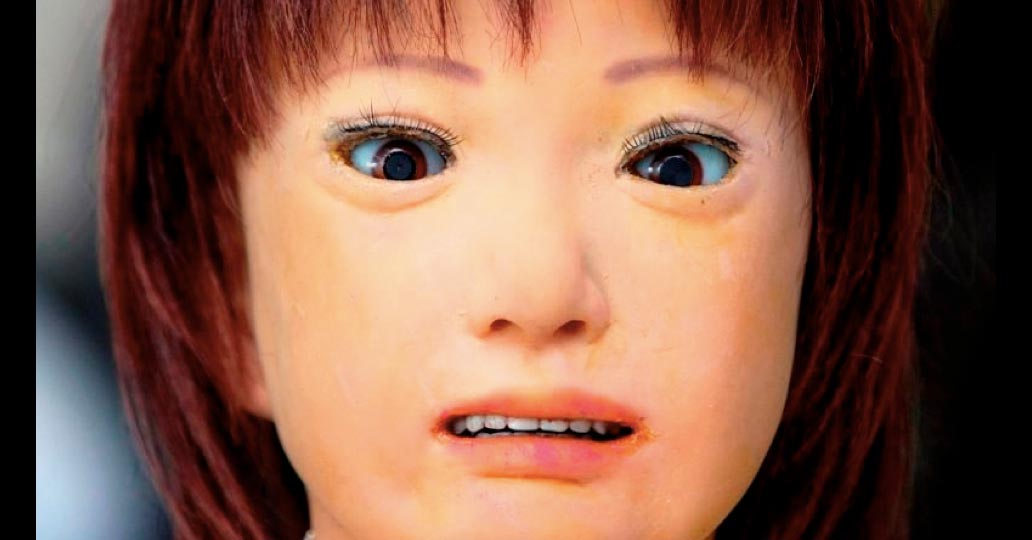 Does this creep you out at all? Do you find this somewhat unsettling? Well, hopefully, you aren’t scared off just yet as it’s about to get interesting…
A proposed reason why many may find this image unsettling (or just downright creepy) is due to the phenomenon currently known as the “Uncanny Valley.” It describes a significant decrease or “dip” (valley) in affinity for a representation (most often human) due to perceived deviations or deficits relative to the resolution of the whole. The decrease in affinity tends to be far more pronounced in the realm of higher-resolution representations or simulacra, especially when we would likely expect a growing affinity as aspects of the representation grow closer to a perceptual experience of the subject. The concept was identified by robotics professor Masahiro Mori in 1970. The term was first translated as “uncanny valley” in the 1978 book Robots: Fact, Fiction, and Prediction, written by Jasia Reichardt, thus forging an unintended link to Ernst Jentsch’s concept of the uncanny, introduced in a 1906 essay “On the Psychology of the Uncanny.”
In his essay, Jentsch explains that a person with the feeling of the uncanny is “not quite at home.” He goes on to describe a man sitting on an old tree trunk, only to find the trunk moving, and suddenly turning into a snake. The “uncanny” is that time in between the “trunk” and the “snake.”
So why should we find a near-but-not-quite human representation so potentially bothersome?
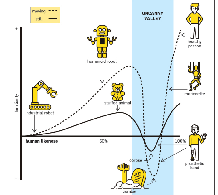
Source: ACM, 2016. The hypothesized emotional response of subjects is plotted against the anthropomorphism of a robot, following Masahiro Mori’s statements. The uncanny valley is the region of negative emotional response towards robots that seem “almost” human. Movement amplifies the emotional response.
There are a number of hypotheses with some pretty good explanatory power. Here are a few of the most common:
- Mate selection. Automatic, stimulus-driven appraisals of uncanny stimuli elicit aversion by activating an evolved cognitive mechanism for the avoidance of selecting mates with low fertility, poor hormonal health, or ineffective immune systems based on visible features of the face and body that are predictive of those traits.
- Mortality salience. Viewing an “uncanny” robot elicits an innate fear of death and culturally-supported defenses for coping with death’s inevitability.
- Pathogen avoidance. Uncanny stimuli may activate a cognitive mechanism that originally evolved to motivate the avoidance of potential sources of pathogens by eliciting a disgust response. “The more human an organism looks, the stronger the aversion to its defects because (1) defects indicate disease, (2) more human-looking organisms are more closely related to human beings genetically, and (3) the probability of contracting disease-causing bacteria, viruses, and other parasites increases with genetic similarity.”
- Sorites paradoxes. Stimuli with human and nonhuman traits undermine our sense of human identity by linking qualitatively different categories, human and nonhuman, by a quantitative metric: degree of human likeness.
- Violation of human norms. The uncanny valley may “be symptomatic of entities that elicit a model of a human other but do not measure up to it”. If an entity looks sufficiently nonhuman, its human characteristics are noticeable, generating empathy. However, if the entity looks almost human, it elicits our model of a human other and its detailed normative expectations. The nonhuman characteristics are noticeable, giving the human viewer a sense of strangeness. In other words, a robot stuck inside the uncanny valley is no longer judged by the standards of a robot doing a passable job at pretending to be human but is instead judged by the standards of a human doing a terrible job at acting like a normal person. This has been linked to perceptual uncertainty and the theory of predictive coding.
- Conflicting perceptual cues. The negative effect associated with uncanny stimuli is produced by the activation of conflicting cognitive representations. Perceptual tension occurs when an individual perceives conflicting cues to category membership, such as when a humanoid figure moves like a robot or has other visible robot features. This cognitive conflict is experienced as psychological discomfort (i.e., “eeriness”), much like the discomfort that is experienced with cognitive dissonance.
So what does this have to do with an effort to paint or draw realistically?
While a wide spectrum of representational artists may indeed contend with this phenomenon–for artists with HDR goals, this phenomenon is far more salient. Such endeavors will find the gravity from the valley formidable as they near very strong percept surrogates (images that generate perceptual experiences that would be as close as possible to the experience of perceiving the actual subjects being portrayed.) For those artists, the gravity of the uncanny valley may be similar to the pull from a black hole.
So how do we put the knowledge of this phenomenon to good use? And what is an “easel-level” scenario that might draw us into the valley?
One of the most common danger zones involves an aspiring HDR artist’s effort to control or manipulate the surface quality of a painting or drawing. More specifically, it is the confusion of “rendering” with “blending.” (They are definitely not the same thing.)
Successful HDR can indeed contain noticeable brushwork in many contexts. However, it is far more common for HDR artists to work to diminish the visual information coming from varied surface topography. This may be, in part, due to the issues of surface variations competing with, or diminishing the effective communication of the high level of resolution inherent to most HDR endeavors.
To be clear, rendering (in this context) is the careful removal or camouflaging of material application marks (brushstrokes/pencil strokes) as opposed to blending, which is the physical mixing of applied material. (I add “applied” here to differentiate mixing paint on the palette from paint already applied to the surface of the painting.) Blending can indeed diminish the perception of brush strokes or pencil marks. However, it is different from rendering in that it physically mixes materials in the process, thus altering visual information beyond that which is communicated via surface topography.
In my painting process, a rendering stage is the “knocking-down” of the perceptible crests of brushstrokes with a sable, synthetic or sable-synth blend that has enough body or resistance to move stroke crests without carrying the paint from one area to another (blending). Again, this process does not mix the materials together in a way that would alter visual information beyond what is communicated by the surface variation. For those working in dry media–this rendering phase is often a series of passes with harder (higher binder content) grade materials and strategic stroke orientation. Again, as with wet media, great care is taken to minimize the chances of any unwanted blending of applied materials.
Take a look at how much visual information is altered when we were to smooth out this beautiful detail of John Singer Sargent’s “Young Girl Wearing a White Muslin Blouse” (left) by blending (right). Notice how much information has been affected.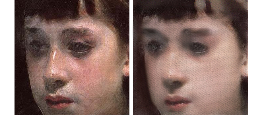 While an observer might surely see the smoothed-out areas on the right as “rendered,” we can see from the image on the left that the removal of brushstrokes was done via a means of blending and not strict rendering. A strict rendering process would have minimized or diminished the appearance of the brushwork without compromising so much visual information.
Ok, so how do we pull all of this together so far?
Well, as we stated earlier–it is VERY common for HDR efforts to have smooth, homogenous surfaces so as to facilitate the effective communication of high-resolution visual information. Aspiring HDR artists with less experience will see this, and using a blend of cognitive heuristics (specifically availability and representativeness)–will often conclude that this surface is achieved by a process that is probably far more familiar–blending. (This latter assumption is supported by the fact that the type of rendering described in this article requires not only a very specific tool and procedural sequence but also significant pressure control that is developed via experience.)
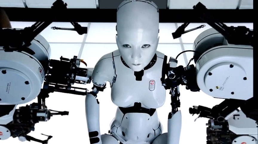
I am sure that many of you have heard talk of the common perils of excessive blending (over-modeling, over-working, material contamination, etc.), but the effects of the uncanny valley are just as common–although far less appreciated. For example, less experienced artists will tend to make a habit of blending larger areas far more than smaller areas. Just like we see in the above demonstration with Sargent’s “Young Girl Wearing a White Muslin Blouse”, the larger areas of the face are blended into near oblivion while the smaller areas, with seemingly more complex structures, (eyes, nose, mouth) are less so (otherwise they might be lost altogether). This tends to leave us with smaller regions that may look very realistic (holding the information from an earlier application stage) against regions that become simplified, generic and relatively homogenous in appearance. The disparities between the small-scale, information-rich features and larger, more homogenous, information-poor regions increase–and before you know it you are flirting with a Bjork video.
I hope you can see how this scenario can lead us toward the valley and how awareness of it can help you to avoid it. However, the story does not quite end there.
So, this is mostly applicable to those who frequent the portrait of figure genres, right?
Not quite. We need first to understand that we all have an amazing tendency to anthropomorphize (to ascribe human form or attributes to) a vast multitude of objects. In much of my writings on pictorial composition, I reference this tendency often in regard to how prediction tasks may govern much of our experience with a picture.
I first took notice of our collective propensity to anthropomorphize objects when teaching a college still life class in the late 90s. When soliciting direction from the class regarding the arrangement of subjects for the day, students would refer to an object without a salient front or face (like an orange) and say—“No, face it the other way.” I was intrigued by how common this was from one class to the next, so much so that I would arrange scenarios that would elicit judgments from the class on this.
Give it a try for yourself:
Take a quick look at these three oranges. Limiting yourself to answers via standard clock positions, which way do you think the following oranges (a, b, and c) are “facing?” 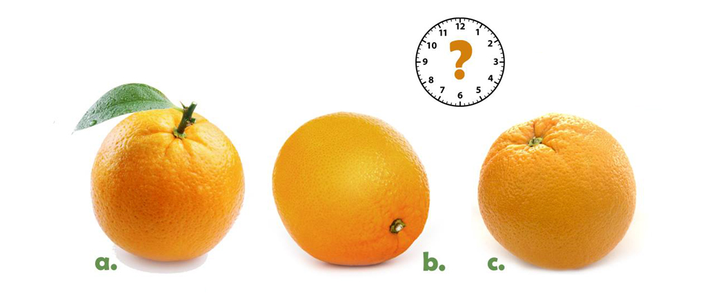
Did you come up with some directions? If so, you are anthropomorphizing these oranges. (You might see where this is going at this point.) So if we find the “uncanny” in those representations of humanity that get close but just fall a hair short—could that arise from the objects that we are assigning human attributes to? I think so–at least to a degree.
If we substitute a simple subject like an apple into the uncanny valley graphic that we used earlier, we can see that much may still hold true. From the more utilitarian representations up to the HDR percept surrogates, we seem fine until we hit the cliff with a rise in attributes that may seem overly artificial or generic—something that just takes us one step back from a natural appearance.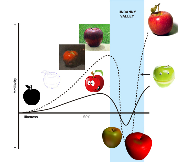 Now I don’t want people to think that I introduce this phenomenon merely to teach aspiring HDR artists merely to avoid it. Rather, like most of the aspects of visual perception and cognition that I study to improve my approach to picture-making, we study such phenomena to learn how to USE them. Of course, this may include diminishing or avoiding the effect altogether—but it may also mean USING the effect to your advantage when you want something to appear creepy, unsettling, or just plain uncanny. It is important to keep in mind that the arts reflect much about the human condition, and that includes more than just all things “sugar and spice.” Sometimes we want that trunk to become a snake, and I hope that by better understanding these concepts, we can all make that happen.
Happy Painting!

