
Whether it is your first time making observational decisions at the easel or you fancy yourself a finely-tuned realist veteran, you must contend with the fact that there is a significant disparity between observable physical stimuli and their subjective correlates, or percepts. Biological visual systems cannot accurately measure the properties that define the physical world nor do they generate a “picture” of what actually exists in front of the viewer at any given moment. Rather, a biological “image” is a reflexive response to stimuli generated from statistical information (accumulated experience, frequency of occurrence, etc.). However, it is important to understand that effective representational communication is not locked in one’s ability to reproduce a perceived subject—but rather in the ability to reproduce the factors that give rise to the phenomenology of a visual engagement with a subject. So how do we contend with a system that does not have a linear correlation to the physical world?
Let’s consider luminance (A stimulus that most representational artists would record with value.)
“Luminance is an objective measurement of the overall intensity of a stimulus expressed in candelas/m2 (photometers used for this purpose measure radiant energy with a filter that mimics the sensitivity of the average human observer, thus specifically measuring light). The resulting sensations are called lightness and brightness. Like all sensations, lightness and brightness are not subject to direct measurement and can only be evaluated by asking an observer to report the appearance of one stimulus relative to that of another. Although in ordinary usage the term brightness often refers inclusively to sensations of light intensity, in visual psychophysics brightness indicates the extent to which the apparent intensity of light coming from a given portion of a scene is attributable to the region in question being a primary source of light. Lightness, conversely, refers to the apparent intensity as a consequence of surface reflectance: that is, the extent to which an object appears as it does because it reflects more (or less) light to the eye than other surfaces in the scene…
…A common sense presumption is that an objective measure of light intensity (i.e., luminance) and the ensuing sensations of lightness or brightness should be directly proportional because increasing the luminance of a target stimulus increases the number of photons captured by photoreceptors and thus the output activity of the retina at any given level of background light (Sakmann & Creutzfeldt, 1969). A corollary is that two objects in a scene that return the same measured amount of light to the eye should appear equally light or bright. It has long been known, however, that perceptions of brightness or lightness often fail to meet these expectations.” — Perceiving the Intensity of Light -PURVES, WILLIAMS, NUNDY, AND LOTTO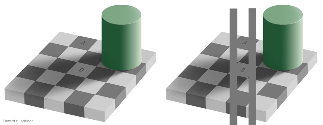 Many popular examples of the aforementioned disparity between physical stimuli and their subjective correlates can be found textbooks that explore visual phenomenology. In the above “checkerboard illusion” from MIT’s Edward Adelson, the checkerboard segments A and B are identical in their luminance. However, their perceived lightness or ‘value’ is different. Additionally, when the lines are added to connect A and B (demonstrating that in fact A and B are of the same luminance value) many will see the lines grade to match the assigned (perceived) difference rather than the other way around.
This is just another example that demonstrates how our visual system works to generate responses to visual stimuli to elicit successful behavior in the physical world. The mere measure of luminance is not sufficient to achieve this as luminance, reflectance and transmission are all conflated in the retina. It is therefore reasonable to deduce that the visual system employs a number of mechanisms to derive useful information from the incoming conflated stimuli.
“As with many so-called illusions, this effect really demonstrates the success rather than the failure of the visual system. The visual system is not very good at being a physical light meter, but that is not its purpose. The important task is to break the image information down into meaningful components…” Edward Adelson.
So what does all of this mean to the aspiring (and now possibly discouraged) observational realist regarding the communication of observed lightness and brightness (values)? It means that a process to effectively communicate the subjective correlates of physical stimuli will be far more effective if linear correlations CAN be developed by which an appropriate context may emerge. This way, our observational drawing or painting process is akin to a Bayesian inference process in which the probabilities for unknowns are factored as evidence is acquired.
So let’s take a closer look at how context influences our perception of lightness and how we can build a correlation between the physical and psychophysical for more effective recording of it: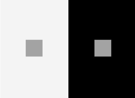 This familiar textbook illusion, sometimes referred to as the contrast illusion, demonstrates the idea that the perceived lightness values of specific targets (squares) are affected by the influence of their surround. Although the two central target patches are equal in luminance the target on the dark background appears lighter as the target on the lighter background appears darker.
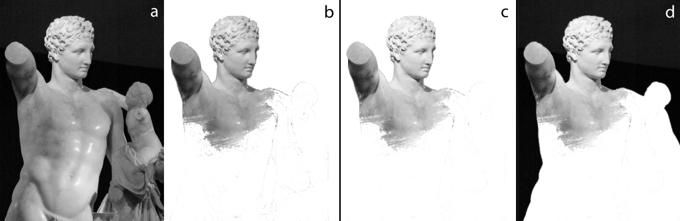 If we look to this simulation of a cast drawing exercise we can see one of the most common scenarios of context influence on lightness perception. Figure (b) demonstrates a somewhat common process seen in many cast drawing exercises. The form of the subject is established and modeled often with a context (surround) that varies greatly from the observed subject (a). If we compare figures (a) and (b) we may be quick to judge that the value structure of figure (b) is noticeably darker than (a). As such, the artist may be tempted to lighten the value structure (c). If the value structure is lifted evenly (c) than the outcome may be perceived as successful as long as the surround (background) present during value judgements is maintained. However, when surround values vary greatly we often find that relationships are skewed most near the outer edge of a subject. What this means is that while inner value relationships may be maintained with systematic observational comparisons—the regions nearer the varied surround may prove problematic as the context is completely different. When these out regions are married to inner regions we may tend to see the emergence of a ‘luminance chimera’ in which judgements have been made from multiple-contexts.
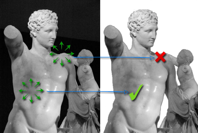
Be aware that as we make value judgements we look to the influence of surrounding context factors (circles of green arrows). Notice that the translation of value relationships further from the subject’s overall surround may translate just fine if the nearby value relationships reasonably correlate. However, value translations between areas of differing contextual surrounds (as in the shoulder area) may present a potential problem.
In addition, if the observed surround is added post subject-modelling—as most developing artists tend to do—-you will be quick to notice that the entire value structure will appear significantly light-shifted (d). This is an extremely common experience for many inexperienced observational representationalists.
So how do we contend with this issue? Anchors.
Anchor values are values added first as benchmark correlations by which subsequent value relationships can be more accurately judged. These values most often correlate the darkest/lightest observed values with the darkest/lightest values attainable by the materials used. These values anchor the observed subject and the pictorial landscape so as to avoid unwanted ‘drift’ from a myriad of influencing factors. In regards to a Bayesian inference process—these values are the evidence by which the probabilities for unknowns can be factored.
Artists immersed in the Waichulis Core Curriculum/Language of Drawing first actively encounter the role of anchor values with their first value scale. These five-step lightness scales are created on a mid-tone paper with the anchors defined by the value potential of the materials available. This initial value scale build establishes a basic framework for value-anchor application in a budding drawing process.
First, the five cells or step chambers for the scale are established. Next the anchors are assigned: the darkest dark, the center cell (the value of the mid-tone paper), and the lightest light. The two intermediate cells that remain are then determined by an estimated half-steps between the anchors.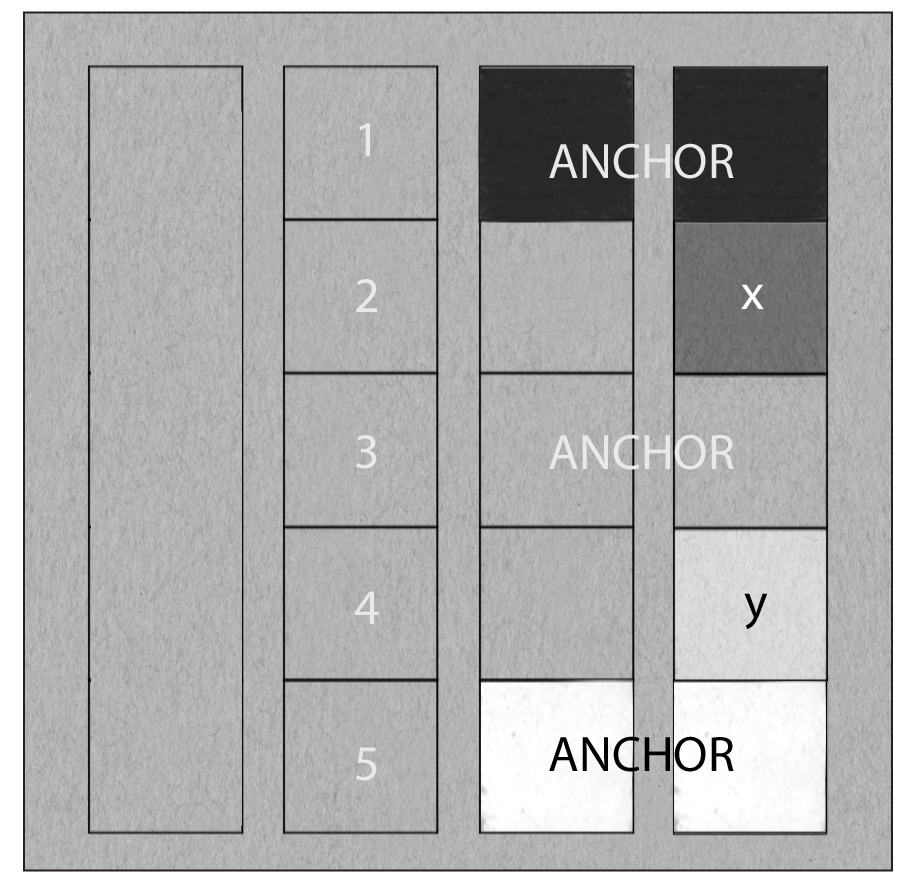 This simple scale exercise (which ultimately acts as a judgement guide for another exercise) is particularly challenging as the mid-tone paper is often not a true midway point between applied material extremes. In fact, on a scale of 0-100 (0 being darkest) our paper of choice is about a 70. The darkest dark that the charcoal can generate here is about 15 and the white pastel registers about a 98. Even with these anchors established the halfstep estimations are a good challenge. Now imagine trying to establish the halfstep values (x,y) shown here without the anchors. While it may seem ridiculously Sisyphean to do so—the exaggeration is an apt comparison for estimations that are bereft of contextual benchmarks.
Without given variables or context, our attempts to determine brightness probabilities are nothing more than wild guesses.
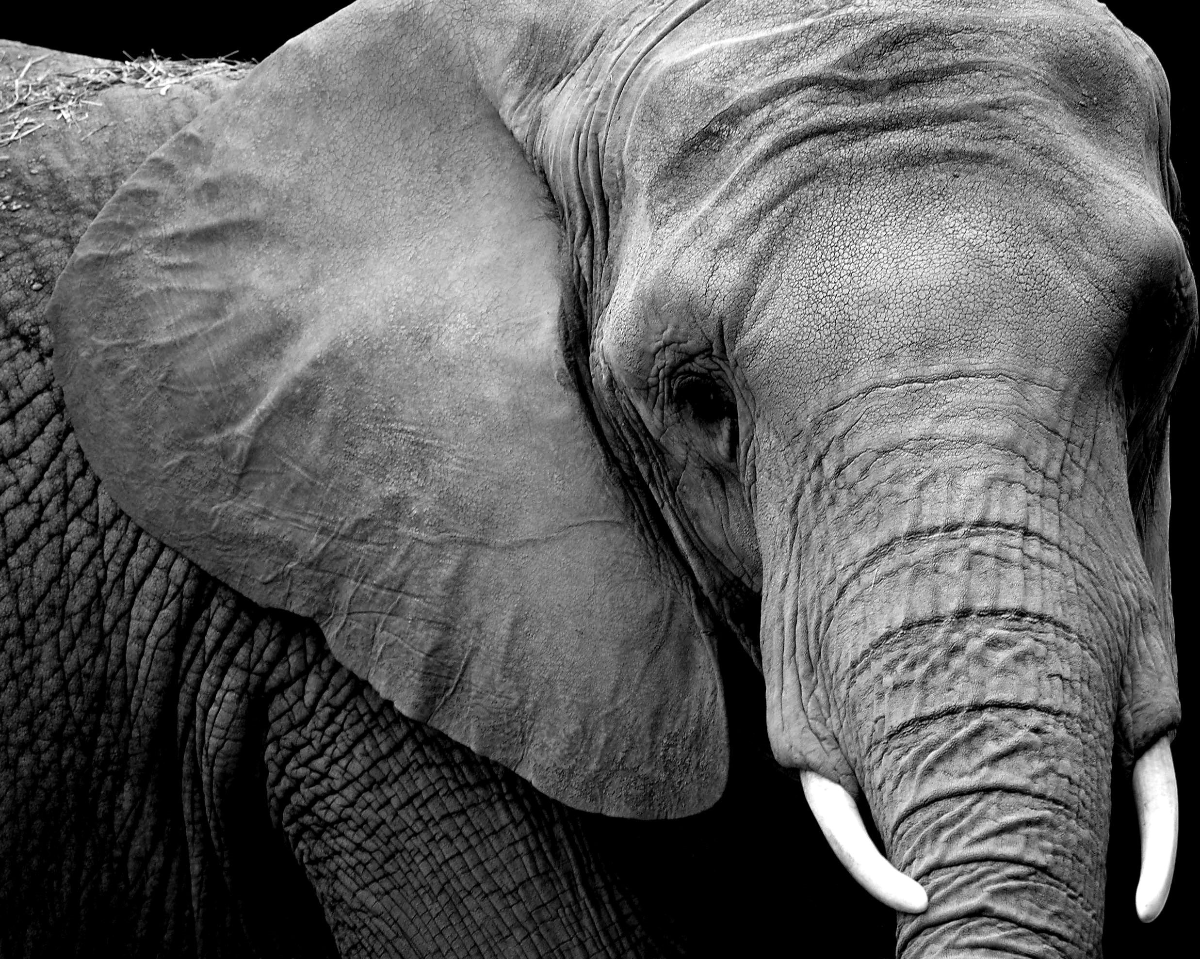
Often, with careful analysis of your subject you will find a number of easy anchors that will align with your material potential (lightest lights or darkest darks) but other times you will need to build with less. I would establish only one anchor for the below flower—the dark surround that engulfs the flower. I would then move to the dark values under the petal fold and move in small incremental steps until I had enough context to establish a light anchor with reasonable confidence of contextual accuracy. Again, you may not be able to hit the outer perimeters of the observed lightness values in context but you can bracket with your materials to maintain contextual relationships (much like the value scale referenced above.)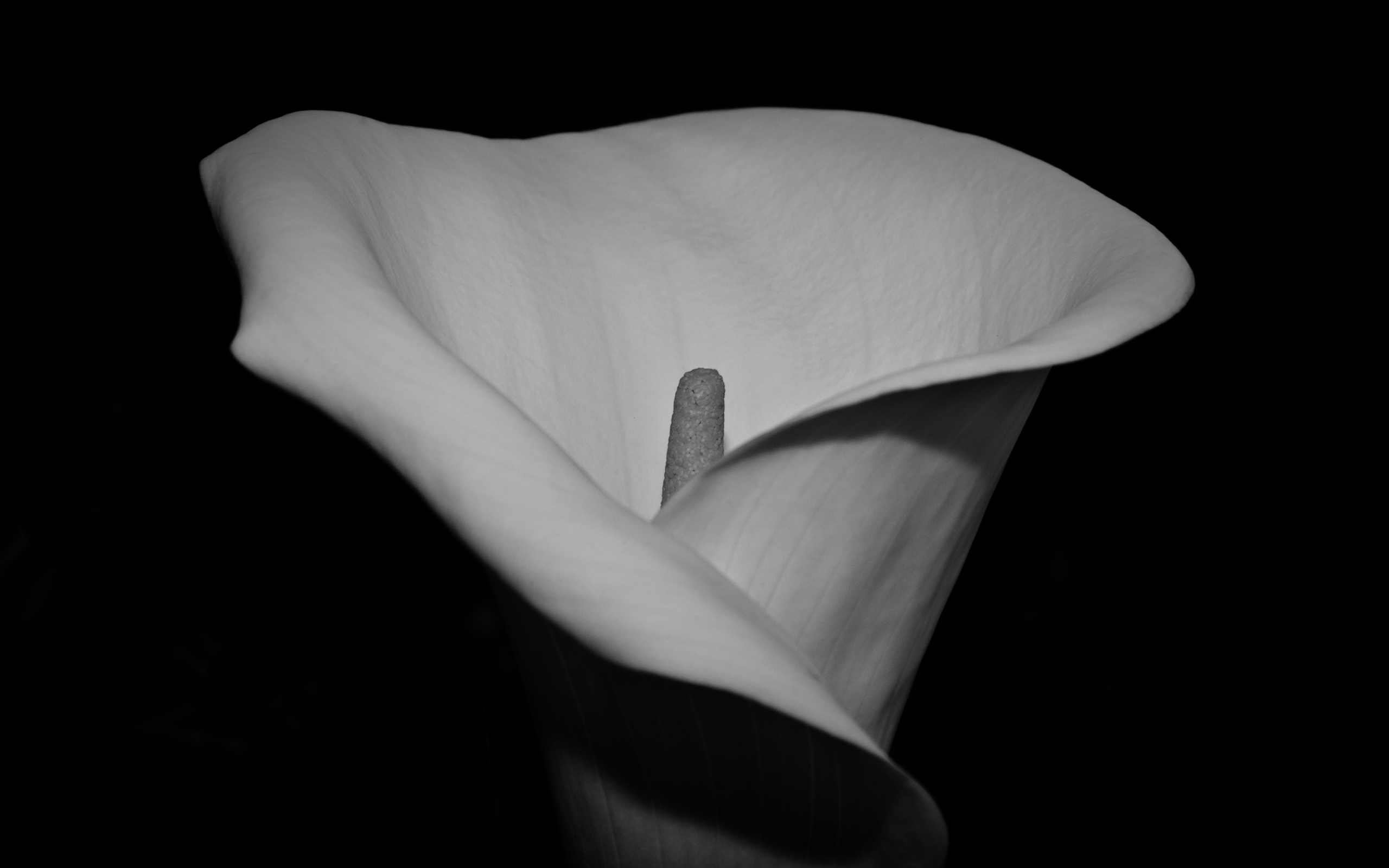 In closing consider how you might approach these subjects. What value anchors would you establish first to begin to establish context?
Excellent food for thought, thank you. As you have seen some of my work, you know I am partial to high contrast. I find it interesting to start with a midtone gesso and working from background to foreground, the first color applied is usually black.
By the way, I appreciate vastly your approval of using black (I have four different ones in my work box). Sometimes I have to contend with those folks who eschew black paint on their palette.