I have long struggled with the challenge of managing complexity in my creative endeavors. From my earliest days with pencils and paper I can recall trying to cram tons of information into whatever I was drawing. The urge to add excessive amounts of “detail” plagued each and every creative effort that I embarked upon like a gushing faucet that I could not slow or turn off. Fortunately this impulse was eventually tempered by a group of very thoughtful and generous teachers that taught me the effectiveness of focusing selective complexity. Their contributions to my development allowed me to use my affinity for complexity to amplify visual communication rather than losing it to an overflow of visual noise.
Throughout this period of development for me there was one idea that came up from time to time regarding complexity and composition that I never seemed to adequately grasp: “resting places“. These visual “places” or “spaces” were often defined as regions of a pictorial composition where a fatigued eye can find respite from the demands of a complex image. In fact, there are quite a few books, magazines, and websites that still frame the concept of a visual “resting place” in this manner:
“…background shapes are known as the “negative” space, and is that area the artist would not intend to draw attention to. So long as the positive elements are much less in total space in the picture plane, the negative space will act as a resting area or “neutral” zone which demands nothing of the eyes, and makes it easier for the eyes to follow along in scrutinizing the positive elements.” –Composition: Understanding it – Using it! by Larry Seiler
“Another element that impacts rhythm and tempo is what we may call visual “rests.” Quiet spaces for the eye add importance to busy areas because they change the rhythm and provide contrast.” –A Painter’s Guide to Design and Composition by Margot Schulzke”
“Sometimes blank space is just as important as space filled with lines, shapes, and colors. If the focal point is very busy, the eye needs a resting place in the picture. Leave some blank areas (in an interesting shape of course) for a resting place.” Acrylic Painting For Dummies by Colette Pitcher
“Negative space is sometimes thought of as a resting place for the viewer’s eyes.” –The Design Elements of Composing a Drawing (For Dummies).
The idea of a “resting place” can be found in resources for numerous pursuits such as drawing, painting, graphic design, advertising, interior design and gardening. While some resources present the above mentioned concept in regards to a visual “resting place”, there are many that present it in a much different way. Let’s start by looking at a book that was written during the 1920’s:
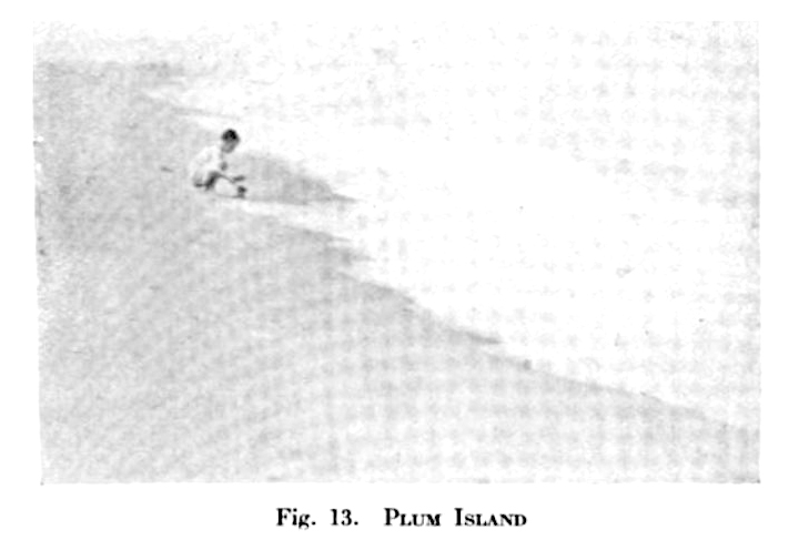
“Emphasis can be obtained in many different ways; by isolation, by the elimination of everything else that might compete with the principal object, by the position of the principal object in the picture-space, by the radiation of lines leading the eye directly to the principal object, by contrast of tone, and so on. The little child in Plum Island (Fig. 13) is obviously the chief object of interest in the picture. He is the only human being in sight, he is placed in a strong position in the picture-space, the line of the surf leads the eye directly to him and he is strongly emphasized by contrast in tone. Thus we have, in this picture, a definite object to provide a resting place for the eye and to prevent it from wandering outside the picture margins, and a feeling of unity is established.” –Pictorial Composition in Photography by Arthur Hammond 1920. (I should point out here that Hammond’s comment, “radiation of lines leading the eye directly to the principal object” may have more to do with a response to a simulation of optic flow and not the erroneous claim that the eye instinctively follows any specific line.)
Now that sounds like something completely different than the earlier definition. That makes a “resting place” sound more like what many would understand as a focal point. Let’s take another look at a fun resource I found that may be one of the best walk-through presentations for a “resting place”:
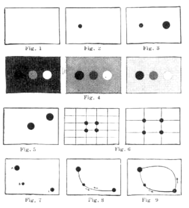
In addition to these older resources we can find this latter explanation of a visual “resting place” in many contemporary resources. But… which one truly makes more sense? Which interpretation of the concept is actually correct? To best answer that we can look to a fascinating field of experimentation called “eye tracking”. Eye tracking is the process of measuring either the point of gaze/fixation or the motion of an eye relative to the head. For these experiments a device known as an eye tracker is used to measure eye position and eye movement.
In the 1950s, Russian psychologist Alfred L. Yarbus performed important eye tracking research and his 1967 book is often quoted.
“Human eyes voluntarily and involuntarily fixate on those elements of a visual scene that carry essential and useful information. The more information is contained in an element, the longer the eyes stay on it. The distribution of fixations on the elements of a scene changes depends on the purpose of the observer, i.e., it is determined by information to be obtained and the thought process accompanying the analysis of this information. Hence people who think differently also, to some extent, see differently”. – A. L. Yarbus (1067) Eye Movements and Vision. New York: Plenum Press (Translated from the 1965 Russian edition by Basil Haigh.)
Yarbus’ experiments showed the task given to a subject has a very large influence on the subject’s eye movement: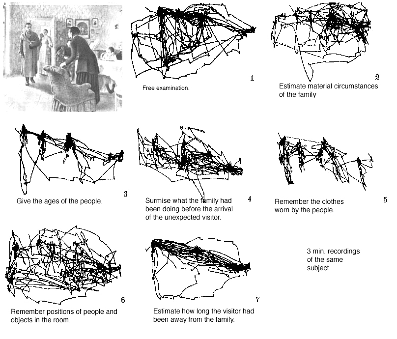
“Yarbus suggested an alternative logic to the distribution of attention, speculating that the eye instinctively gravitates toward details that promise to “explain” an image…. our patterns of looking relate to the task of solving a picture, by which he meant discerning its narrative logic. Presented with an image, the eye begins a rapid fact-gathering mission, filtering out extraneous visual information and honing in on bits of explanatory detail. Given opportunity for extended looking, we do not turn our attention to an unexplored corner, but compulsively reinvestigate those elements that “allow the meaning of the picture to be obtained.”2 Ways of Seeing by Sasha Archibald – – Issue 30, The Underground Summer 2008
Another famous example of Yarbus’ eye tracking work: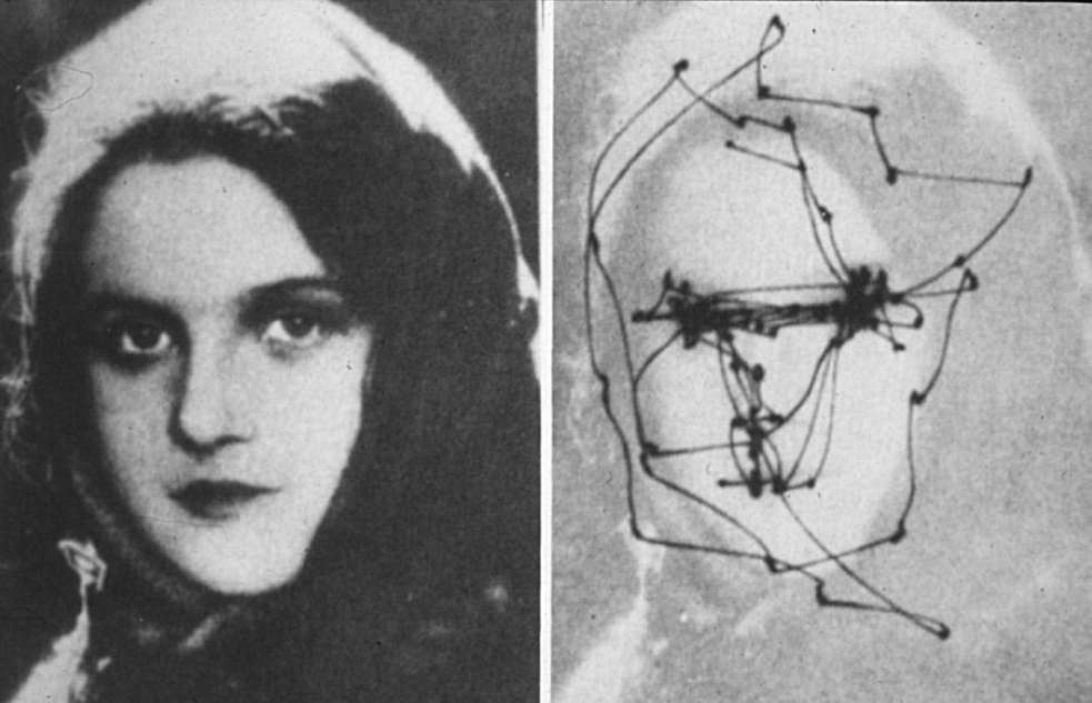
So if we are taking the work of Yarbus into account, it seems that a “resting place” is more akin to a focal point than a piece of negative space. Saccadic movement stops at a fixation point, gathers information, and then continues on in the search to investigate further. While cones of the eye can become fatigued (leading to the commonly experienced “after-image” color phenomenon), I am unaware of a specific “image exploration fatigue” that would force the eye into some negative space for recovery.
In any case—I hope these ideas help to clear up your understanding of what a visual “resting place” actually is.
Happy Painting!

A very interesting read Anthony! Where DO you find the time?
LOL! I wish I knew Tanya. I need more hours in the day.
Very interesting … I wonder what an experiment would show whereby the eye track is measured in relation to an initial eye track when the title of a work is unknown versus an eye track once the title is known. Presumably a different track .. The first a search for a meaning or aesthetic or emotion which makes ‘some’ sense to the viewer, the second for a potential specific meaning conveyed by the title as two different tasks are being undertaken. If the resting points strengthen the concept and or title I guess this helps anchor and cement these in the mind of the viewer. Interesting compositional device.