Each spring I would find my college classrooms filled with a number of students intending to continue their educational journey after graduation. They would often ask about which schools or programs were “best”. I would always meet their question with one of my own: “What do you intend to do after school?” It was their answer to my question that would ultimately answer their own.
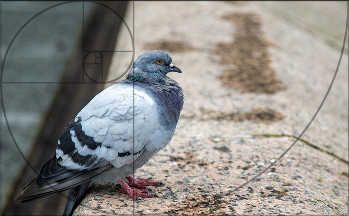
In the summer of 1947, renowned psychiatrist BF Skinner published a study regarding the behavior of a group of pigeons in isolation. The research for the study involved the observation of the pigeons as they were fed at regular intervals regardless of their behavior. What observers soon witnessed was that the majority of pigeons began to exhibit consistent, seemingly superstitious behavior—believing that by acting in a particular way, or committing a certain action, food would arrive.
The behavior of the pigeons in this study is not unlike the many creatives struggling to uncover the means by which to consistently produce a “successful” picture. Artists that are hungry to understand the mechanisms of image-building entertain everything from the application of complex geometric armatures to the mathematical analysis of seashells to uncover the key to producing consistently “strong” imagery. Unfortunately, the majority of educational information regarding pictorial composition is a mixture of colorful fictions, inconsistent heuristics, and aspects of personal taste passed off as “rules” or “laws”. Pursuing such compositional devices often amounts to little more than the behavior exhibited by our well-fed pigeons.
Let’s look at this excerpt from Pictorial Composition by John Michael Angel:
“A simple, abstract element should be placed on the page such that the left and right margins are equal to each other, and the bottom margin is the largest of the four. The top margin can be the same width as the sides, or can be slightly smaller. However, a figurative element (a figure, a head and shoulders, a jug, a mass of flowers, a group of trees, whatever) looks better when placed slightly off-center. This gives more interest, more animation, and hints at an increased realism, as nature is rarely seen perfectly centered.”
This excerpt seems to confidently state that your imagery will hold “more interest, more animation, and hints at an increased realism” if you follow these instructions. The problem is that there is no evidence to support this claim other than the fact that some celebrated artwork in the past has been created with similar margin considerations and an “off-center” element. Furthermore, to state that “nature is rarely seen perfectly centered” demonstrates a significant lack of understanding of, or appreciation for, the mechanisms of visual perception since the center of our gaze holds the greatest acuity. Therefore, we often work to center objects of interest in the center of our gaze to elicit the greatest amount of visual information.
Unfortunately, this example is typical of many contemporary educational resources regarding pictorial composition.
So are there devices or viable information that can allow an individual to consistently generate “successful” imagery?
Of course. However, such resources are not the static, arbitrary global operations that you might be familiar with. They are dynamic, adaptable considerations that are defined by our biology. Let’s first define pictorial composition and then explore how biology may define its component parts.
Pictorial composition can be defined as the specific content of an image as well as the spatial relationship of its elements with respect to aesthetic quality and communication efficacy.
Try and read this sentence: Now try to read this one:
![]() Now this:
Now this:
Jane walked down the street.
All three sentences are constructed with same content and grammar. How they differ is in the visual elements that manifest that content and grammar. The characters of the first sentence are so thin and spatially condensed that parsing out the individual letters to successfully read the sentence is nearly impossible. The second sentence offers no contrast between the background and the foreground characters. This lack of contrast also produces a stimulus that is incapable of conveying the intended information. These first two examples demonstrate one way in which our biology may define successful communication. Light outside the visible spectrum, contrast lower than our minimum contrast sensitivity, or a stimulus that is on a scale beyond the limits of our angular resolution is not going to be of much use in regards to visual communication.
The third sentence above is constructed with a configuration of visual elements that allows for a reader, fluent in the conventions of the English language, to successfully elicit the intended meaning. The reader can quickly garner that at some point in the past, an individual named Jane had walked down a street. The sentence is a visually viable, self-contained unit of meaning that effectively conveys information according to the logic of the language’s grammar.
This example does bring to mind one of the ways in which I feel that visual imagery may hold an advantage over other forms of communication (written/spoken language) in that the conventions of visual perception are more prevalent among the species than are the conventions of any other standardized form of communication. The adage, “a picture is worth a thousand words” epitomizes this idea.
For example, here is the same sentence translated into Yiddish (via an online translator).
דזשיין געגאנגען אַראָפּ די גאַס.
While the visual elements are perceptually viable, if you cannot read Yiddish, and have no means of translation, then the intended meaning of the sentence is unavailable to you. The sentence may have optimal content as well as optimal construction—but may fail to communicate due to lack of shared conventions with a target audience. This type of problem may arise with creative efforts that seek to be extremely novel. If an effort to communicate is so novel that it completely abandons all existing convention, communication will be severely diminished.
Now, if my intention was to communicate that Jane walked down the street and I composed a sentence that read,
Walked street Jane the down.
then the sentence would be deemed problematic. The content is fine, but the arrangement of the subunits (words) within the unit (sentence) causes a diminishment in the clarity of the message. Furthermore, if I wanted to communicate that Jane walked down the street, and I wrote,
Jane is taller than Michael.
the sentence would also be problematic. The sentence is well constructed as far as the conventions of grammar are concerned, but the words do not communicate the intended information. Therefore, the construction is successful, but the content is not appropriate to communicate the intended message.
OK, that offers an introductory glimpse into the idea of communication and the respective role of biology, but what about the “aesthetic quality”?
Even with our short, simple sentence there is an aesthetic quality worth our consideration. Our behavior is constantly influenced by the aesthetic qualities of external stimuli. These qualities are the characteristics of a stimulus that elicit adaptive responses that have evolved to reinforce or discourage specific behaviors. We may prefer one type of sensory experience over another—describing one as repulsive and the other beautiful. However, aesthetic qualities should not be confused with individual tastes. Many refer to aesthetic properties as personal preferences and this, I believe, is a serious mistake. Like most concepts involving evolution, concepts of “aesthetics” and “beauty” seems to be most productive when considered on the level of populations and not the individual. For example, it is not important that Jane may prefer Vanilla over Chocolate—but rather that Jane, if human, would most likely have a biological predilection for sugar and fat.
Paul Bloom touches on this topic in his 2010 book How Pleasure Works: The New Science of Why We Like What We Like:
“It is true that we can imagine cultures in which pleasure is very different, where people rub food in feces to improve taste and have no interest in salt, sugar, or chili peppers; or where they spend fortunes on forgeries and throw originals into the trash; or line up to listen to static, cringing at the sound of a melody. But this is science fiction, not reality.
One way to sum this up is that humans start off with a fixed list of pleasures and we can’t add to that list. This might sound like an insanely strong claim, because of course one can introduce new pleasures into the world, as with the inventions of the television, chocolate, video games, cocaine, dildos, saunas, crossword puzzles, reality television, novels, and so on. But I would suggest that these are enjoyable because they are not that new; they connect—in a reasonably direct way—to pleasures that humans already possess. Belgian chocolate and barbecued ribs are modern inventions, but they appeal to our prior love of sugar and fat. There are novel forms of music created all the time, but a creature that is biologically unprepared for rhythm will never grow to like any of them; they will always be noise.”
Oliver Reichenstein, the founder of Information Architects, also addresses the problem with discussing individual tastes when exploring design and aesthetic concepts in his 2013 paper, Learning to See:
“Whether I like pink or not, sugar in my coffee, red or white wine, these things are a matter of personal taste. These are personal preferences, and both designers and non-designers have them. This is the taste we shouldn’t bother discussing.”
So then what would be the aesthetic considerations for “Jane walked down the street”?
The content of the sentence seems somewhat banal. I suspect that the statement regarding Jane, her actions, and the street would not make the six o’clock news or the New York Times best-seller list without further development. It might be considered the equivalent to the trite artistic concept of an apple sitting on a table. However, there is an aesthetic component worth considering in the succinctness of the sentence’s construction. The structure is just as long as it needs to be to communicate exactly what was intended. The sentence does not overwhelm our working memory with unnecessary or redundant variables that may cloud comprehension. This type of bias is known as a fluency heuristic. This is a cognitive heuristic in which, if one statement or idea can be processed more fluently, faster, or more smoothly than another, the mind infers that this statement has a higher value. In other words, the more skillfully or elegantly an idea is communicated, the more likely it is to be considered seriously, whether or not it is logical.
This is not to say that long sentences are any less capable of being aesthetically pleasing for a myriad of reasons. In fact, I would argue that it requires more skill to entice a reader to follow a long and winding road of text. After all, it could be argued that it may present less of a challenge to visually communicate that apple on a table as opposed to a robust Civil War scene—and displays of virtuosity indeed carry an aesthetic influence.
Take for example this lengthy gem from All the King’s Men, by Pulitzer-winning poet/author, Robert Penn Warren:
“I ate roast duck stuffed with oysters and yams and that wonderful curry they make in Savannah, which tastes good even to a man like me who loathes food, and drank rye whisky, and walked down those beautiful streets General Oglethorpe laid out, and stared at the beautiful houses, which were more severe than ever now, for the last leaves were off the arching trees of the streets and it was the season when the wind blows great chunks of gray sky in off the Atlantic which come dragging so low their bellies brush the masts and chimney pots, like gravid sows crossing a stubble field.”
Now while this lengthy sentence may indeed exercise the working memory of a less experienced reader, it is indeed well constructed and rife with lush content. It is also unfair for me to take this lengthy text out of its original context for assessment—but I felt it necessary to further the point here. If “Jane walked down the street” is the equivalent to an apple sitting on a table then Warren’s sentence is more akin to John Atkinson Grimshaw’s Evening Glow.
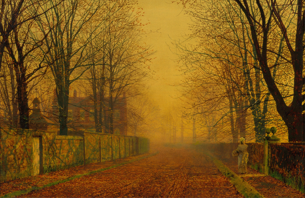
John Atkinson Grimshaw, Evening Glow, 1884, Oil on canvas, 286 mm x 432 mm
It is with these examples that I hope it is starting to become clear that aesthetic qualities are also ultimately defined by our biology. If we had evolved differently, then we just might, as Paul Bloom states, “line up to listen to static, cringing at the sound of a melody.”
Ok so now that we have a basic framework for understanding how biology defines both communication and aesthetic quality—what about content?
As demonstrated earlier, content can be ideal or problematic in regards to effective communication and/or aesthetic quality. Exploring concepts of content can be almost Sisyphean in scope, so, for now, we will limit its contribution here to the previous examples.
So then, what about spatial relationships?
Spatial relationships can influence the perception of visual content, impact communication, and affect aesthetic quality. Let’s look at what altering the spatial arrangement of our previous sentence’s characters might result in:
Janewa lk eddo wnth estre et.
As you can see, the content remains the same, the sequence of characters remains in line with the previous examples of a grammatically correct sentence; however, the spatial relationships now significantly impact both communication and aesthetic quality.
Some visual elements can be perceived very differently when influenced by spatial relationships. Simultaneous brightness contrast, simultaneous color contrast and contextual effects are just a few of the consequences that spatial relationships hold on visual elements.
Look at these two sentences:
The group traveled together.
The group traveled to get her.
Both sentences contain the same letters in the same sequence but have very different meanings due to minor changes in the spatial relationships of the characters.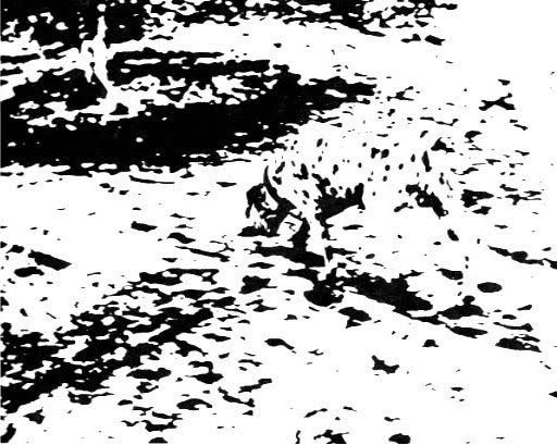 By studying the spatial arrangement of visual elements rather than merely the characteristics of the visual elements alone, we can find new dimensions of visual information. Just ask this Dalmatian.
With this rudimentary framework for understanding the general variables of pictorial composition, let’s take a moment to examine a graphic that can help us to understand how communication viability and aesthetic qualities may work in concert to yield a specific product.
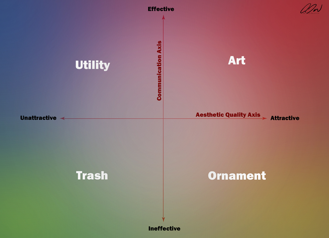
In the above graph we can see how factors of communication and considerations of aesthetic quality can allow us to successfully categorize a product. If we find that a product communicates effectively AND is aesthetically attractive, then we would most likely consider it a work of art. In contrast, if a product can effectively convey information but LACKS aesthetic qualities, it is often deemed utility (think of a street sign). If an object holds aesthetic quality but does NOT convey any information, it may be regarded as ornament. And lastly, a product that does NOT effectively convey information, NOR holds any aesthetic quality, is often deemed trash.
It is important to note that these categories are not as clearly defined as the central axes may imply. For this reason, I have added a background of overlapping colors to better demonstrate the nature of these quadrants (Art/Red, Utility/Blue, Ornament/Yellow and Trash/Green). As a product approaches the outermost corners of the graph, it would be considered a stronger representation of that quadrant’s category. However, due to the dynamic nature of our biology, I am not sure if anything could ever truly reach the perimeter of any quadrant.
Now that I have presented a general overview of biology’s role in the facilitation of viable communication and the experience of aesthetic quality, I would like to address the influence of context on all of this. However, this will require some rudimentary understanding of visual perception. It should be understood that the conflated images generated by a biological vision system do not accurately portray the physical world. The chasm between the physical and the psychophysical is significant and as such we need to acknowledge that what we “see” is a construct of evolved biology—not an accurate measurement of an external reality. The mechanics of the visual system should not be confused with devices that can garner reasonably accurate measurements of the physical world (e.g., caliper, light meter, spectrophotometer, etc.). Rather, the visual system interprets stimuli based on past experiences and stored information in an effort to yield successful behavior. It is not the external reality alone that weaves the image we “see”–rather it is the biology of the viewer.
Neurobiologist Dale Purves writes: “Using the only information available on the retina, a wholly empirical strategy gives rise to percepts that incorporate experience from trial and error behaviors in the past. Percepts generated on this basis do not correspond with the measured properties of the stimulus or the underlying objects.
A plausible answer to this puzzle is to simply abandon the long-held assumption that vision involves seeing or estimating physical properties. In this alternative interpretation, vision works by having patterns of light on the retina trigger reflex patterns of neural activity that have been shaped entirely by the past consequences of visually guided behavior over evolutionary and individual life time. Using the only information available on the retina (i.e. frequencies of occurrence of visual stimuli, light intensities), this strategy gives rise to percepts which incorporate experience from trial and error behaviors in the past. Percepts generated on this basis thus correspond only coincidentally with the measured properties of the stimulus or the underlying objects.”
With this scaffolding of visual perception in mind, we must acknowledge that the context in which a particular stimulus is observed is a vital contributor to the resulting percept. For example, we may perceive the length of a particular line differently as the surrounding context of the line is altered (both red lines are physically identical in length.)

The Ponzo Illusion. Both red lines are of the same length but appear different due to surrounding context.
Dejan Todorović wrote in the 2010 Review of Psychology: “In our everyday perception, when we look at an object, intuitively it seems obvious that what we are aware of are just the properties of that object itself, and not of something else, beyond the object. However, contextual effects do exist, ranging from weak but noticeable to strong and perplexing, and present major challenges to our understanding of the working of perceptual mechanisms and cognitive processes in general.”
Let’s try an experiment that might better communicate these ideas regarding context, perception and experience. See if you can “read” the following text: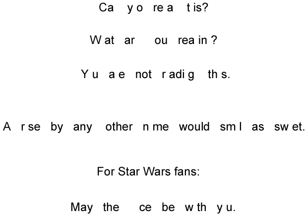 The image above shows several strings of spaced letters that can be “read” as sentences. The first three sequences are used by Dr. Beau Lotto (director of LottoLab) to successfully demonstrate how the visual system uses past experience/frequency of occurrence data in perception. We insert the letters that our experience deems “most likely” based on the available information.
The quote from Shakespeare (“a rose by any other name would smell as sweet”) contains the letter grouping sm l in the sentence which could easily become the word smile instead of the word smell. I would think it may be reasonable to suspect that some aesthetic “word-preference survey” could easily yield that, independent of context, the word smile would find aesthetic preference over the word smell (as the concept for the former may be generally more attractive than the latter for a number of biological reasons), but in the above context, if your past experience warrants, your brain opts for smell over smile.
The same holds for the more common pop-culture phrase made famous by the popular Star Wars franchise (“may the force be with you”). You can just as easily fit in the word peace instead of force. Again, you can probably conduct a survey to find that more people would prefer the word peace over the word force in isolation, without supporting context–however, we again find the potential aesthetic preference of an individual variable surpassed by context.
Let’s look at another sentence:
Ja e w ked down t e street.
Did you read “Jane walked down the street”? Why did you not read, “Jake walked down the street”? Why not “Jane worked down the street”? Well, maybe some of you have, but I would be willing to bet that the majority of you perceived the same sentence that we have been revisiting throughout this paper. You augmented the sentence with the most likely characters to coincide with the existing context.

What is being represented in the center of this graphic? Is it the number thirteen of the letter B? At the risk of flirting with the abuse of the aforementioned fluency heuristic, I think we can agree that more often than not:
Context can override ev ryth ng.
So we arrive at the end of my first installment on the concept of pictorial composition. I hope that I have clearly demonstrated the components of the definition presented at the onset of this paper. Additionally, I hope that I have been able to establish a groundwork for you to better evaluate the many contributions of contemporary compositional devices that plague art education today. I will also present practical alternatives based on actual scientific studies into aesthetic preference and visual communication. I hope you will stay with me for the journey!
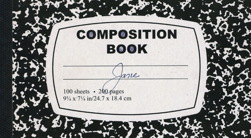
Meet Jane.
I would like to extend a special thank you to Leah Waichulis, Stephen Sebald, Alex Hovesky, Rachael Bills for their assistance with this project.

This is likely the best article I’ve read ever, and I read a lot. Thank you. Looking forward to more…
Thrilled to know you enjoyed it Melissa. Much more on the way— 😀
Very inter st ng art cle, th nk y u or sh r ng. Lo k ng forw rd to r ading m re.
Excellent—- 😀
hi Anthony,
I’m currently a student teacher of visual art. I am finding your articles to be extremely useful for an alternative, logical point of view, from the regular resources I come across in art education.
cheers
Greetings Dave,
I’m thrilled to learn that you are finding my posts useful. There is much more on the way my friend. Best wishes—
Superb! Off to read the rest of them.
Glad you enjoyed it Juan! More on the way my friend— 😀
Interesting start. Will continue to read.
” ‘What do you intend to do after school?’ It was their answer to my question that would ultimately answer their own.” – Sounds a bit like the underlying design strategy of the Constructivists.
Also, much of what you are saying relates to Gestalt, and the dynamic of “completion.”
Such company might give you “naughty boy” status among some of the ARC folks, hahaha!
LOL! Yes it may indeed. Hope you enjoy the read Miles. 😀
Excellent discussion. Thank you Anthony for sharing your thoughts and giving us insights into your knowledge so freely.
Harold Speed, in The Practise and Science of Painting, commented that composition is the “entire unteachable thing really” (sorry no page reference unless I go hunt it up). Implying strongly that you can either put together an interesting image or not, that the technicalities can of paint and pencil etc can be learnt and practiced, but that conceptualising, and being sensitive to the qualities of aesthetics and meaning is instinctive. Perhaps, or perhaps he was responding differently than you to a similar frustration with the proscriptive, rather archaic, geometric, and mathematical theories of composition that were in dialogues in the art world then, as now.
I’m off the search your the following articles.
Mary
This first article has captured my attention! I’m self taught and not a big fan of institutionalized educational norms which makes these articles of greater valuable to me! Thank you.
I very glad to know that you find the information that is presented here helpful Luis. Much more on the way my friend.