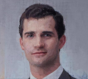
Yesterday, I found myself drawn into an interesting discussion regarding the recent completion of artist Antonio López Garcia’s portrait of the Spanish royal family. The painting was 20 years in the making.
However—the lengthy production time of the painting was not the focus of the discussion but rather his process. Due to the nature of this project Garcia was limited to photographic reference. In addition, he apparently decided to build the image with visual information garnered from his available reference though the employ of grids. We know this as he made an aesthetic decision that I found very interesting—he left his grids and notes visible over much of the finished piece. While the choice to incorporate these construction elements captured my attention in what I felt was a good (interesting) way—-this overt glimpse into his process had led some of my esteemed colleagues to cry “foul!”
Negative reactions stemming from Garcia’s process ranged from “disappointment” to “egocentric” and even “disrespectful”. I was not particularly moved by the piece but in general I am not a huge fan of commemorative portraits (I thought the addition of the construction elements added much interest overall.) In any case—my response to these emotionally charged reactions was predictable:
“While context does heavily influence the manner in which we perceive the quality of an endeavor—an assessment of quality focused almost solely on self-imposed dogmatic limitations is utterly absurd. You can draw that line (pardon the pun) anywhere—“it’s a lesser effort as he used pre-made brushes, didn’t grind his own paint, established a horizon line or visual survey, used plumb bobs and knitting needles”—you name it. To me the work is an impressive result of creative innovation employed to meet a commissioned target result. Aside from a visible grid on the finished work I do not see obvious procedural detractors or an effort plagued with the inherent ‘flaws’ of incorporating imaging technology (I use a great deal of imaging technology and therefore have become quite sensitive to it.)”
When I had pressed my colleagues for specifics as to how (exactly) Garcia’s evidence of process detracted from the ‘success’ of the piece (aside from offending their self-imposed dogmatic limitations) I was faced with an argument that I had not heard before—I was informed that his process degraded the effectiveness of something called ‘Form Sense’.
I have never heard of this aspect of the creative process before but further discussion revealed that “it’s the way different artists perceive or conceive of the same form in different ways from one another.” In addition, visual imaging/information tools like grids or photography “completely robs the unique form sense of their particular “hand”.
Now while I agree that to alter the artist’s observational experience would affect the potential processing of information—I would vehemently disagree that it would necessarily negate the ‘signature’ dynamics of how the artist inherently records that information.
As the discussion continued it was explained that “The artist drawing by eye will make slight unique deviations from their perception, even if they are unconscious of this, and even if they are slight errors. Yes, errors. These slight errors make up the unique “fingerprint” of the artist.
So, by this reasoning—once an artist employs a system or device to manage, control or organize the flow of visual information he or she ceases to use the eye(?). In fact, by way of the statements above one can conclude that any such tools/devices that may help to manage visual information (assuming a goal of objective representation) is inherently, artistically problematic. By all accounts it seemed that the “Form Sense” experience arises when the artist is engaged only in ‘unencumbered or unassisted natural observation’ (assuming a photo cannot be naturally observed by the eye). If this is the case then the argument can be effectively advanced to conclude that someone wearing glasses would be only capable of a ‘lesser’ or limited version of the experience.
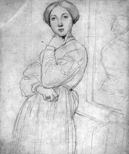
Several other colleagues had chimed in stating that lauded works of notable success could never be achieved with a grid system. An Ingres work was submitted to show an example.
Yes, before you object—a very short search can produce a number of Ingres images confirming Ingres’ grid use.
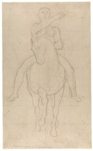
Other objections implied that a grid may negate the employ of a more free gestural drawing dynamic. Now while you might think “Why would you employ a grid if you wanted a more gestural, less rigid drawing dynamic?”—even that particular melding of device and dynamic is not unheard of. In fact, I was able to provide an example—by guess who? , yup—-Ingres.
Now while this “Form Sense” argument attempts to rationalize the discarding of particular visual information gathering mechanisms—to me it sounds like yet another attempt to disguise a set of self-imposed dogmatic limitations as a legitimate objective qualifier. I have a very hard time taking the leap to conclude that the increase of available visual information (to the artist) would necessarily negate a personal aesthetic or ‘artistic signature’. I do not think that any one of us runs the risk of losing the ‘things’ that define our voice (mistakes included!) due to our impulse to be innovative.


