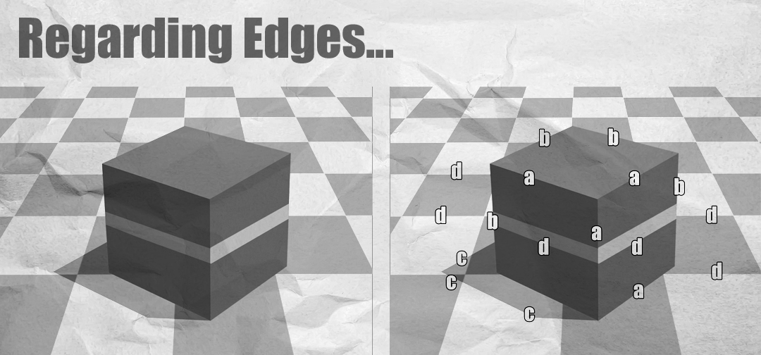
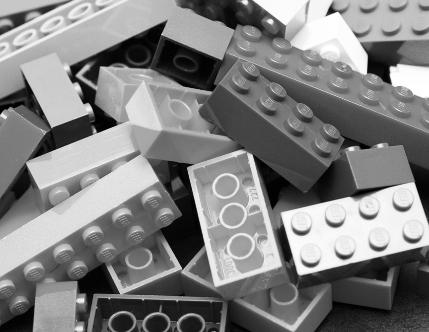
The strategic contrasting of visual elements can lead to strong simulations or representations of real world percepts. For the practicing representational artist, successful contrasts are the key to generating percepts of great depth and volume. However, understanding which qualities of a family of visual elements allow for contrast is different from understanding the function of those contrasts.
Now, if we are speaking of strict observational replication, we do not need to conflate our process with anything more elaborate than standard “ground-level” classifications of visual elements. Let’s take value for example. If my goal is limited to the strict replication of a spherical model, my aim is to apply and arrange values in such a way so as to mimic the value relationship information observed in the source percept. At this level, I only need to perceive and replicate relative lightness and darkness relationships—the qualities of value. But if I am looking to deliberately manipulate particular aspects of form and volume successfully, I may find advantage in the organization of distinct elements by contextual “function” rather than by perceived quality alone. This means that I may begin to consider a functional organization of value in terms of higher level contexts of form such as highlight, midtone, shadow, terminator, etc. Now while the later consideration of value organization may allow for a more deliberate ‘fine-tuning’ for form and volume representation, conflating early development with such information may be problematic. I’ll come back to this idea at the end of this paper.*
While classification by element quality and/or function makes sense to most practicing representational artists regarding value—what about edges?
Edges are almost always defined by quality rather than potential function. They are presented most often as “sharp, firm, soft, lost, found etc.” While this is a perfectly viable way to organize edges in terms of quality, the absence of higher “functional” organization(s) may leave certain representational translation strategies limited. However–these higher level organizations via function do exist for edges. It is just that they are found almost exclusively in books on visual perception rather than those regarding visual art.
Let’s start our examination of the edge by defining what an edge actually is (in regards to visual perception):
An edge can be defined simply as a discontinuity in luminance. While that may not sound like much, specific configurations of such discontinuities can give rise to strong visual percepts of volume and depth. As I mentioned before, the qualities of edges can be quite successfully described as sharp, firm, soft, lost, found etc.–but what about function?
In vision science, analysis of surface perception breaks down edges into four categories: Orientation, Depth, Illumination and Reflectance.
a. Orientation Edges are discontinuities that are perceived due to changes in surface orientation. These edges tend to have virtually no space between the surfaces involved in the discontinuity but are not necessarily part of the same object. (see the image below in which the meeting of the cube and the cube’s resting surface are labeled (a)).
b. Depth Edges are discontinuities that are perceived due to depth between surfaces (via occlusion).
c. Illumination Edges are discontinuities due to changes in the amount of light falling on a virtually homogenous surface.
d. Reflectance Edges are discontinuities due to a change in light reflectance properties.
Each “edge function” mentioned here can be relatively sharp or soft depending upon the context in which it is represented. There may be context-driven limitations as to how soft or how sharp a particular discontinuity should be, however these existing heuristics, (i.e., soft turning edges and sharp plane-change edges) should not be seen as dogmatic.
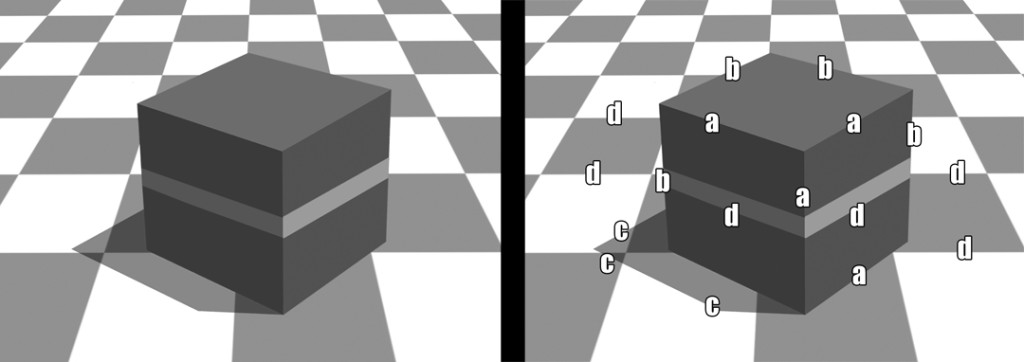
The image on the left contains edges with little to no variation. The image on the right indicates orientation(a), depth(b), illumination(c), and reflectance(d) edges.
Just as with the organization of values into a form-function, contrast-reliant hierarchy, we can organize edges into a hierarchy of contrast that can be deliberately manipulated to create or diminish percepts of volume and/or depth. For example, with value, we would most likely assign one of the lightest values at our disposal as our highlight value in contrast to the dark end of our available value spectrum which would be most likely reserved for shadows or other areas of low illumination. As such, we may reserve softer-edged shadows for illumination edges as opposed to reflectance edges. (Again, this is a general heuristic and should not be taken as dogma.) It is worth special note here that while we perceive four types of luminance discontinuity in the perception of surfaces in the 3D world, the representational 2D painter or draftsperson can only use reflectance edges to simulate all others. Representations of orientation, depth, and illumination edges are all created with changes in the reflectance properties of a drawing or painting surface.
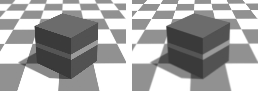
Here both images contain edge variations. On the left we find the common edge function assignments–sharper depth, orientation and reflectance edges with softer illumination edges. The image on the right changes the softness assignments to produce a different depth percept.
In an effort to make this feature more interactive I have designed two exercise images for you to explore the potential of the above mentioned edge functions. The first is a simple identification task. Explore the first image and see if you can identify orientation edges, depth edges, illumination edges, and reflectance edges. The second image is an exercise in varying edge “softness”, or the rate of change of the discontinuity, so as to manipulate the effectiveness of edge function. All edges in the sphere image are of similar quality. Load the image into an image editor like Photoshop and with a blur tool, add variation to edge softness to see how the percept of depth and volume is altered.
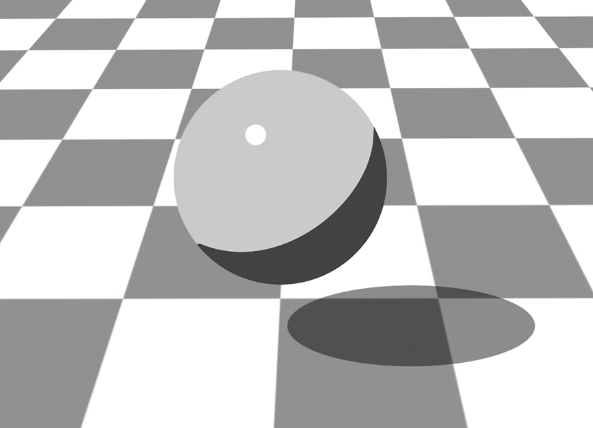
Save and edit the above sphere image in an editor like Photoshop. Using a blur tool, soften whichever edges you feel need to be softened. Think about the function of the particular edge and how your choice affects the overall context.
*Lastly I would like to address the issue of strategic sequencing in regards to skill development. There exists some debate over when certain ideas or concepts should be introduced within a development program. Skill-development programs should always aim to follow a theoretically sound process and rational sequence. The educational activities within a program of development should be capable of yielding the desired outcomes, as indicated by empirical research, and should be carefully ordered in a developmental sequence so as to form a coherent educational experience based on the intended outcomes of the curriculum. As such, our Language of Drawing program makes little mention of edges or edge function in favor of a more contextually appropriate series of gradations and transitions to describe all discontinuities. This choice is deliberate so that developing artists are not trying to incorporate more complex concepts into exercises that are geared less towards augmented translation and more towards observational replication. While our “form build” exercises do introduce value functions similar to the previously mentioned highlight, midtone, shadow, etc., our earliest exercises in value replication do not address much beyond lightness quality.

